

At the end of the last digital design tutorial I had gotten to the point where the final sketch had been composited together. Today I'm going to cover the second half of the process looking at inking, blocking in, colour pallets and using the layer options panel.
1. Digital Inking
There are several ways to ink a digital design but the method I've chosen to use is probably the most straightforward. I'm going to be drawing over the sketch using a small round brush and my graphics tablet. Admittedly if you don't have a graphics tablet your mostly likely going to want to use the pen tool method.
The upside of the way I'm going to do it is that it's typically quicker than using the pen tool and any line thickness you want to work into the design can be done by varying how hard you press the pen to the tablet right then and there. you also tend to get a more dynamic image where the pen tool would give you something a bit more technical.
The downside is that you lines are going the be rasterized and therefore not infinitely scalable with pristine edges which could be an issue later on if say we wanted to blow the image up huge but we are going to mitigate this a bit by working at a really high resolution, at least 300dpi but probably 600.
What we need to do to get nice flowing lines then is use long quick assured movements to draw smooth clean brush strokes. Moving slowly or using short strokes is going you lead to wobbly lines or messiness. Similarly we don't need to worry if we draw the line further than we need to since we can clean that up later in fact you will be intentionally drawing longer than you need to most of the time especially on curves. If you make a mistake or don't think the line looks quite right just hit undo and draw it again.
For a more manageable less stressful time later in the process its also best to start breaking the image into sub sections. A layer for the shape of the face, another for the eyes, for the hair, and so on until you have a collection of layers that can all go in one folder marked Head. Keep working through each section until you have folders for each body part and then move on to the next character or whatever else is in the image.
Once the lines are done and you have cleaned everything up next you have to decide if your shadows are going to be inked like mine are or if your going to use another style theres no real right choice just preference and how you want the final piece to look.
These shadows are done in much the same way as the outlines, for example make a new layer for the foot, decide where the light source is and start colouring with the brush tool and tidying up with the eraser. Here I'm trying to use the shadows to emphasize shape and texture especially in the J-Rex's skin you wont need to worry about sooth lines so much at this stage the eraser will help keep the edges clean what I am after is trying to get a sense of volume or weight.
2. Blocking in the Colour.
Now we know where the lines are we can start colouring the image. Its tempting to flatten everything and then try to draw inside the lines but that's actually quite time consuming and will hinder later progress. Instead we are going to make more folders full of layers and each of these layers is going to contain a colour shape that corresponds to an area bounded by the black outlines. The J-Rex's foot folder for example is going to contain layers for the foot as a whole and each individual claw.
Some of these shapes are going to cover vast areas others are going to be tiny, it will depend on the area in question. Large parts of green on the J-Rex for example are all one shape but then there will be other colour layers above that to provide additional detail or more localised special effects or markings.
 You can block in the colour in three main ways. A) With the brush which is quick and good for small areas but may miss bits on larger sections. B) With the lasso tool which can quickly be used to follow the outlines and then filled with colour from the paint bucket or C) With the pen tool which will give you the most control, wont randomly decide to close the loop like the lasso tool has a tendency to do, and can be set to generate vector shapes.
I used all three techniques on this image. Here for example you can see three vector shapes drawn with the pen tool because its going to give me the spikes I'm looking for and because if I was to try and do this with the lasso it would just get frustrating.
Once your done blocking in you should have a group of folders that look a lot like the group for the outlines. You can also now start messing about with how all these blocks of colour are displayed.
3. Colour Pallets
I'm going to keep the number of colours in this image relatively low since I'm going for something thats a bit pop art in style and near the end I will be adding at least one halftone pattern for a similar effect as the test images in the first part on this tutorial.
3. Colour Pallets
I'm going to keep the number of colours in this image relatively low since I'm going for something thats a bit pop art in style and near the end I will be adding at least one halftone pattern for a similar effect as the test images in the first part on this tutorial.
The five colours I've chosen to go with for J-Rex can be seen in this image, Paige's colours, the blues and yellows, come from an additional 5-6 colour pallet although if you go look at the final image you can see I've cut the use of yellow significantly by that point. It's also possible that I should have made the red light sword one of the purple colours, however I stuck with red mostly because the blue/red laser sword rivalry already has cultural weight and meaning. Its a lot easier to tap into context people already understand than having to explain something new.
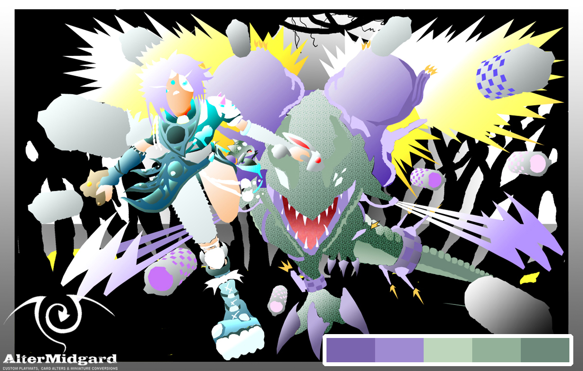 Looking at the J-Rex pallet there are three greens, a light, a dark, and a mid tone. I could have just flat shaded the whole of his body using these three colours, and technically thats the case but then I decided to add gradients which have filled in all the greens between the lightest and darkest shades.
Next we have the 2 Purples. On the colour wheel purple (well magentas and reds) are opposite the greens so putting them together gives you a high contrast which can be useful for making the image easier to read or in this case more appealing to the eye.
The purples are missing the mid tone in this image but the light and dark purple have been selected to have the same colour value as the equivalent green (the green light and the purple light have the same level of lightness). Again once all the purple areas were placed gradients were applied.
The easiest way to build colour pallets is to chose a colour you like and then feed it to an app or website and it will give you back suggestions for colours that work well together. The blue/teals in Paige's pallet were suggested this way although looking back now I'm not entirety sure its exactly right or perhaps I just needed to add more of it to the rest of the image. Then again because of the way I went about creating this image if I wanted to swap those colours out it would be relatively straightforward as we will see in the next section.
4. Layer Options
Its worth bearing in mind I didn’t see my first proper computer until I was about 7 or 8. what I'm trying to say is that A) there wasn’t exactly much in the way of image editing software back then and B) chances were pretty high that we were as likely to know how something worked in an IT lesson as the person teaching it.
Which is a long way of saying, having taught myself most of this stuff I've tended to use it in a particular way.
Having to teach someone else how to use it though, well thats a whole different ball game and so it was that I suddenly found myself presented with the layer options/style screens in photoshop and an actual understanding of what they were for and how much time you could save using them.
For example you draw a figure and then decide later you want to change the hair colour:
- You could paint over it.
- You could add adjustment layers, masks, or mess with the hue and saturation from the menu at the top of the screen.
- Or you could double click on the layer containing the hair colour and scroll down to Colour Overlay mess with some option and click ok.
 Admittedly this last way is only an option if you have separated all the sections into separate layers but not only is it quick it is also infinitely adjustable and most importantly reversible.
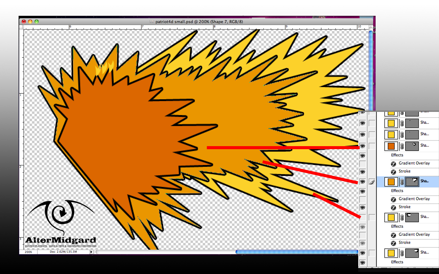
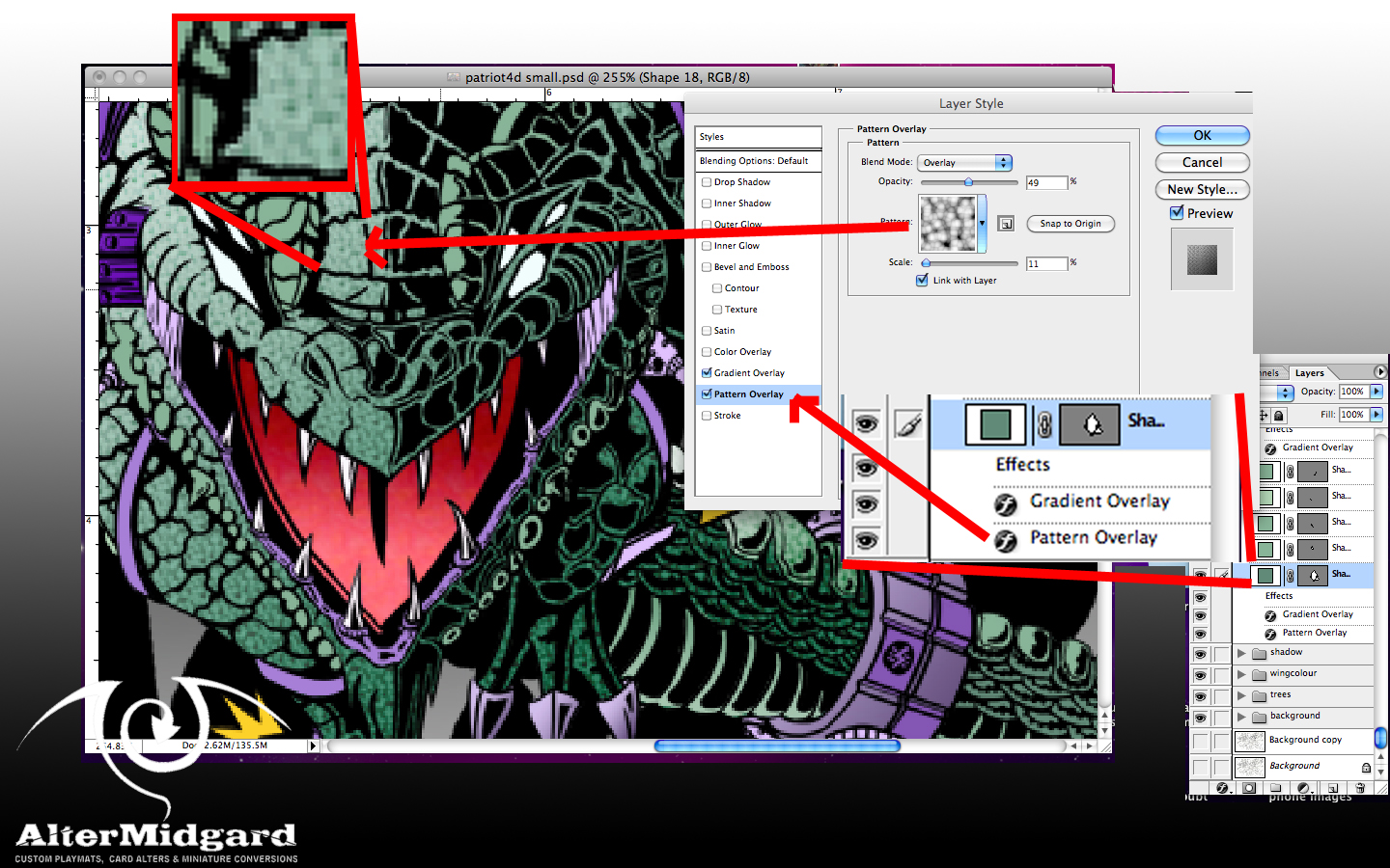
I didn’t just stop with adjusting colours though. The main way this tool was used in this project was to set up gradient overlays because the options provide extremely fine control of size and direction. Also once you are happy with the effect you can drag and drop it on to other layers to replicate it exactly.
In the above example you can see I have also added a textured pattern overlay to the J-Rex's skin, didn’t really have to but since the style panel letter you experiment without really messing anything up it was one of those things that I tried and decided I quite liked.

Once you have set up all your special effects you end up with something a bit like this. There's still quite a lot of work to do on the background which aside from the halftone pattern is done mostly the old fashioned paint it all in one layer style. Theres also quite a lot of fine tuning left to do especially on the missile trails but since everything is set up to be coloured via layer styles it's just a matter of going in and changing a colour here or a gradient there.
And considering the amount of layers and the image size and resolution theres also the fun game of making sure my computer doesn’t overheat.
But I'm going to end this here because you can go back and see the final piece in Part One and more importantly this post has been about the fun you han have getting there rather than the destination.
Next time back to our usual programing (looking at hand painted mats)


