3 July 2013

Custom Playmat Retrospective Part 2 Mats 18 to 34

If you haven't had a chance to red part one heres the link  http://altermidgard.blogspot.co.uk/2013/06/custom-playmat-retrospective-part-1.html

Where was I? Right we had just got to the Vader mat and while I have been numbering them for easy list making they most likely didn't occur in that order. Still arbitrary or not you get the general idea, and probably a sense that it might be best to keep some form of record.

By about mat 12 I had lost track of what the next number should be and it didn't help that digital mats were part of the order it became quite apparent that I was increasingly going to end up miss-numbering mats, it is for example entirely possible there are two 7's. With this in mind today we start by looking at the Missing Numbers Series mats. While I had been hiding them before now mats would only get a signature and it was more likely to be relatively obvious I will therefore be basing this list on the image date created time stamp.

Missing Number Series


Mat 18: Goodwin Lava Golem LINK


This is still the only mat where I have moved straight from a basic small scale sketch into starting on the material directly. Partly because my mats have gotten increasingly complex and partly because drawing all over a blank mat in pencil is not the best idea especially if your colours are quite translucent.


Mat 19: Boba Fet LINK


I wouldn't be surprised if having ran all my mats though some sort of colour checker you told me the most prominent colour had been orange, Blue and purple wouldnt be too far behind either. A large amount this is because these colours last longer and have more pigment than the pale colours but more importunely its probably because I like orange.


Mat 20: All Hail Starscream! LINK


Poor Starsceam, things never quite go his way, its mostly his own fault to be fair but one cant help thinking that not long after this image Galvatron turns up and blasts him into dust. As for the blog post well if your looking for info on the first few stages of my production process this is the first time I switch from just talking about the mat to discussing art tutorials in general.


Mat 21: Tytannial LINK


Letting a mat sit for a while placed in just such a way as you cant possibly ignore it can lead to some interesting decisions. Primarily it lets your brain work on the problem subconsciously while you do other things so when you do come back to it you can get straight on with improving it. In this post I also go over how it can be helpful to check your designs flipped over so you can pick up on any problem areas.

Mat 22: Kung Fu Pander Vs Snowman Eater LINK


A jade sky makes a nice change from the typical orange and this is another one of those images that I would have never have though of myself, my imagination is good but not this random. User Interface design is very important, even if it is a made up one on a static image,  if your users cant use the program then you have wasted rather a lot of time and money. Its also best to assume people with no computer experience will be using it, this is why Nintendo have susch a good track record with the non core audience.

Mats 23: Zoroark LINK 


I made a video! Well ok more of a time-lapse still it was more time consuming than I would have liked which is why you haven't seen many others, maybe if I had a tripod and video camera I would them more often. My obsession with orange sky's also reaches a peek here so unless someone wants a Sky's of Arcadia mat or something I cant see it being beaten...hmmm.


Mat 24: Dark World LINK


Ohh card zones that doesn't happen very often, well ok twice. Already an anamoly this mat takes things one stage further and sticks to using mainly blues and purples also skulls lots of em its almost like its 40K or something. A quite useful project in the long run since it gave me some experience drawing the dragon that I would need later on.


Mat 25: Walking Dead LINK


Between this and the previous mat I have once again run out of black, It turns out to be a recurring issue and the best way to alleviate it isn't exactly cheap. Working on this mat was interesting because this style wasn't really my thing but then you have to leave your comfort zone if you want to improve. You do have to be carful with the black though, its quite difficult to fix errors.  


Mat 26: Gravekeepers LINK


Its not quite as big an orange sky as the Zoroark mat but close. Posing characters can be complicated, its one of the reasons I spent some much time watching Reborn since I wanted to know the personalities and postures, in this instance I had the opportunity to make up the personalities myself. When you have to get across information with a constrained amount of data its no wonder TV shows tend towards archetypes.

Mat 27: Hellsing LINK


Sometimes things just come together, In this instance I had the pose in my head for a very long time and this was really the first chance to use it. Its also one of those mats where I have to pose myself to help get it right, even if I did somehow manage to get the hands the wrong way round initially. Having seen the mat around the white areas could do with a refresh as they have picked up a pink tint from somewhere, it could be because of the high red concentration I guess, but that would require a substantial amount of rubbing.

Mat 28: FMA Homunculi LINK


Or the seven and a half deadly sins. Ok so sight mistake on the research front but to be fair the female Sloth character model is in brotherhood, just not as Sloth, Wiki is not always your friend. On the other hand the image would have been a tad female light without her and its not like she's taking up anyone else's space so I see no reason not to include her. Especially as several of the other homunculi from the original series are hidden in the background.

Mat 29  Moon Princess LINK


My first vanguard mat, well finished one anyway and by this point my mats are also starting to use a second brand of colours, it has a tendency to flow more but thats does mean you ca cover a greater area and should mean I can do water colour effects although I havent tried that yet. I have also started putting my signature on the back of mats by this point, the earlier ones written in gold while these later models use white.

Mat 30: Persona 3 Nyx LINK


This is another one of my all time favourites and also another one on which I spent quite a bit of time on research. Luckily I was over half way though the game when I got asked to do this mat but the extra hours put into the optional dungeon without knowing I needed new game plus first were a bit of a waste. Its also the first one that uses the second set of colours extensively, they tend to be brighter than the other set which explains the neon orange.

Mat 31: Star Wars Good Vs Evil LINK


After doing the characters on the Nyx mat the scale must have stuck with me since I kept the scale for the majority of the people on this mat as well. Only this time I have to actually draw faces since they are facing forwards and as you may have notices most of the time my characters are about twice the size of theses. Lightsaber glow effects stars that appear and disappear as you move past the mat and a somewhat worried looking 3PO are all features of this mat.


Mat 32: Bayonetta LINK


I did go a tad overboard on the line work on this mat, it had been a while since i had done the lines first and with a new liner I may have done to much detail. Conversely the colours are a little weak and nowadays the mat would probably be a lot darker. This mat is also designed to work either way up, mainly since I figured Bayonetta would prefer it that way.


Mat 34: Goku Vs kazuma Scryed Vs DragonBall LINK


Lets finish for today with something completely the opposite to the Bayonetta mat where in this instance its totally about the shapes and colours doing all the work rather than the lines. Also a good place to end since its more like the 2013 mats than those from 2012 what with being the test mat for the first extra layer of protection. Who would win? I think thats one of those questions that may never get answered satisfactory. 


Thats the main 35 pre 2013 mats covered next time I will look at the South West Yugioh Champion Mats and the EX Series.

27 June 2013

Custom Playmat Retrospective Part 1 Mats 0 to 17

I'm closing in on, if not having already passed, my 50th mat and since I have written quite a number of blog posts about them perhaps its a good idea take some time top reflect and look back as well as providing links back to older mats and  posts for people who may have missed them.

If we were to go right back to the beginning everything would begin at what I believe is now called comic con but while that event has many tales associated with it, a transport system's attempts to thwart our progress or a mob of vengeful Yugioh players descending on a hapless Dark Armed Dragon-napper being just two examples, they are stories for other times and places, mat wise we begin here.

MAT - 0: Transformers: LINK


Did I mention I'm part programmer? As such we start things off with mat zero, a mat which I still own. This mat its rolled up and lives with all the mats i've won or acquired over the years so looks essentially the same as the day I finished it and while I still think it needs a companion piece the large areas of while space make me less inclined to create one. I could always add a background of course but somehow thats feels wrong.


Hidden Numbers Series  


Mats one to somewhere around the Star Wars Vader heads mat have my signature hidden along with the date somewhere along the edge of the mat. The main reason I stopped doing this was because it was getting increasingly difficult to hide them in creative ways.

Mat ! (or 2): Twilight: LINK & Mat 2 (or 1) Alien: LINK


These two mats along with the Transformers one are the only three mats that I created from Individual elements recombined at the end of the design process, Turns out I didn't really like working that way and soon after moved to designing them at full scale 1 to 1 and it really shows. The background complexity increases and designs become more holistic you also become more able to use standard layout techniques such as rule of thirds or the golden ratio.


I like to hope the Twilight mat is still out there, somewhere traded from person to person, it may have seen more places and events than I have, which could be a tad depressing i guess, or maby its living a quiet life rolled up somewhere like Mat 0.

Please note that these probably aren't in proper chronological order, they are close but the numbers on the actual mats give the correct sequence.

Mat 3 Dark Magician Girl: LINK


Never was there or has been since a mat with so many problems revolving around getting images of it. The first Design going missing is one thing but only have this one image of the final piece is quite another. Once again we have a member of the minimalist background phase I was in at this point. To be fair this sort of background does still happen occasionally when people don't know what they want or if a design calls for it. I have recently be asked to do another Dark Magician Girl mat so it will be interesting to see how the two compare.


Mat 4 (or possibly 5): Oppression LINK


Ok thats more like it, although thoughts at the time ranged from argh I have to draw a horse to I'm still not sure about the colours. Looking back now its definitely trippy and I guess you could say this is where my tendency towards orange skys starts, theres even teal in it hows that for movie style! Seriously though this thing isn't subtleand I quite like it that way.

Mat 5 ( Blackwings: LINK


How many characters can you get on one mat? We wont find out for a while but this is where it starts getting properly complicated. One of the main features of these early mats is that I am relying quite heavily on the line-work and while the shading is quite good on this one the outlines are very obvious. it could probably do with being a bit darker rin places as well but at the time I didn't have a great range of colours.

Mat 6: Bleach Squad 11: Link


Still a favourite though its seen a lot of use over the years and I wouldn't mind cleaning it and giving the colours a bit of a refresh. Theres definite something to be said for bright geometric backgrounds and primary colours. I am a tiny bit surprised its the only Bleach mat I've been asked to do though, having only watched as far as episode 42 I can only guess people got burnt out of all the filler between this and Naruto at one point in time.

Mat 7: Reborn: LINK 


These days I don't have quite as much time to put into research as when I was working on this mat so don't expect me to watch every episode of One Piece or Gintama! Still definitely an interesting approach to research and its interesting how mats tend to group together in this instance a pair of anime mats. these guys would probably look quite cool done in the style of the One Piece mat.


Mat 8: Stun City: LINK


This is actually probably more like mat 4 or 5 but whatever. The easiest way to avoid issues with scanning mats is not have to many vertical lines or detail that intersects the very center, as you can imagine this one caused problems. Its another mat that I would be fun to go back and add a load of lighting effects on. Have you also noticed my very obvious naming conventions for mats? Its all fine until I ever have to do more from the same series or characters.

Mat 9: Infect Infernity: Link


Its taken some time but we have finally starting to see some proper shading and movement away from the block colours, although this mat may also come before the two anime mats. I don't do MTG mats nearly enough, I keep meaning to do some but some but other design work tends to get in the way.


Mat 10: Naruto back to back: LINK


One of the main things I have learnt recently is that hands are often bigger than you would think Sasuke's are probably a tiny bit too small here. While I like the clean cell shaded look on this mat I could also see it going the other way with strong lighting effects probably blue on the left and red on the right at the time not something I was all that experienced with.


Mat 11: Red Dwarf: LINK


I don't recall what I originally thought this mat would end up looking like but I'm pretty sure this wasn't it, at least not the level of detail anyway. At some point I will have to talk about the use of the vortexes I'm always on about since five of the mats so far have made use of them. Also they are not too big its a trick of the light, and fabric, yeah lest go with that.


Mat 12: Vampire Commander: LINK


And the award for most characters and objects crammed into one design goes to... Putting this one together was something of a jigsaw puzzle, things that could fly clearly go in the top half everybody else down below and size based on a totally made up metric of how useful / cool any given character is. It still holds its record, but thats not though lack of trying on my part.


Mat 13: Star Wars mat 1 or Vader and Friends:  LINK


We will and this part of the list with the first Star Wars mat since it marks the end of one phase of mats and the beginning of the rise of the use of lighting. Still one of my favourite mats everything just seemed to come together as I was colouring it. The signature is hidden as part of the troopers gun. Thinking about it it could also be a precursor to the style used on mats like One Piece.


Other early mats that haven't got a post about them yet include:-
Mat 14: Orkz Party!
Mat 15: Goblin Bombardment
Mat 16: Samurai
Mat 17: Walace and Grommet

Thats it for part one, in part 2 I will cover the Lost Number Series, SWYC Series, EX mats, and Digital.


19 June 2013

Naruto Custom Playmat 2

So this mat is based on a scene from the Naruto manga, even so I spent some time looking at various versions of it mainly to give me a better idea of the movement and action of the image and also partly because I have only watched two episodes of Shippuden and wanted to be more acquainted with the art style. The end result is therefore a bit of an amalgam of ideas from the manga and the anime.

One of the things I found interesting is that there isn't a great deal of difference between the two characters outlines. As someone who hasn't got to know them over the course of several volumes/episodes they are basically two guys with long black hair and red armour, most of the differences come from their accessories.

Making sure your characters can be easily identified by their outlines is one of the most important elements of the design process, if people can't tell characters apart from their silhouettes then those characters need more work done on them, and if that means giving one of them a gunbai and the other a big scroll than thats just what you do. Its also why the Pokemon anime can do the whole 'who's that Pokemon' thing because aside from the ball shaped Pokemon and the butterflies the vast majority are easy to tell apart, not an unimportant factor when you have 500+ to deal with and only a bunch of small sprites to render them (at least originally).

To alleviate the problem for people who don't know them you place them on the correct sides of the image and have the backgrounds match whats going on in the top frame, I've also had element from the top image run into the lower ones, some of the trees for example and the way the fox's tail follows the shape of the hair. I have also slightly exaggerated the style of the characters hair making the one on the right marginally more thin and pointy while on the left emphasising the curves 


There are a number of things a mat does not like, any piece of art really for that mater, and the two biggest are direct sunlight and oils from human skin. Which is why you will find important paintings behind special glass and while thats a little unreasonable for a playmat there are a number of things you can do to alleviate things.

Originally my mats were au natural it would take the colours days to set, the blues especially with their higher pigment counts would take forever, there had to be a quicker way. So I just started experimenting, I had a relatively good idea of places to start but as you can imagine after spending time creating something using it for testing can make you slightly apprehensive.

The first layer of defence I added was therefore based on observation, it takes time to set the colour is there a way to speed that up? Thats all the reaction seal is really about, speeding up the drying time, it also has the added benefit of removing excess pigment that the mat couldn't absorb.

Seal layer one got added at the beginning of this year, it adds some water resistance and UV absorption and acts generally as a stabiliser for the colours. don't use hairspray though contrary to what teachers tell you that doesn't actually do much and in this instance can damage the colours depending on your medium.

Seal layer 2 has only been used on two mats so far and was more of a gamble, you cant use lacquers or varnishes directly on the colour because depending on your medium they may melt it. Still I wanted something extra on top so whent for a product thats meant to add a sort of plastic layer to things. Again it adds to the water resistance and UV absorption, its also supposed to be a gloss finish but is a little hard to tell after adding the previous layer.

The mat and the colours themselves also have a element of water resistance built in, the only thing you should avoid is getting the mat wet and then rubbing it to hard.

In the end the main factor of the lifespan of a mat like any piece of art or clothing is how well you look after it, don't leave it in direct sunlight to long, and try and avoid to much rubbing.

Next time, er, I dunno 2013 mat 10 I guess, and maybe i tell the story of how I number things.

13 June 2013

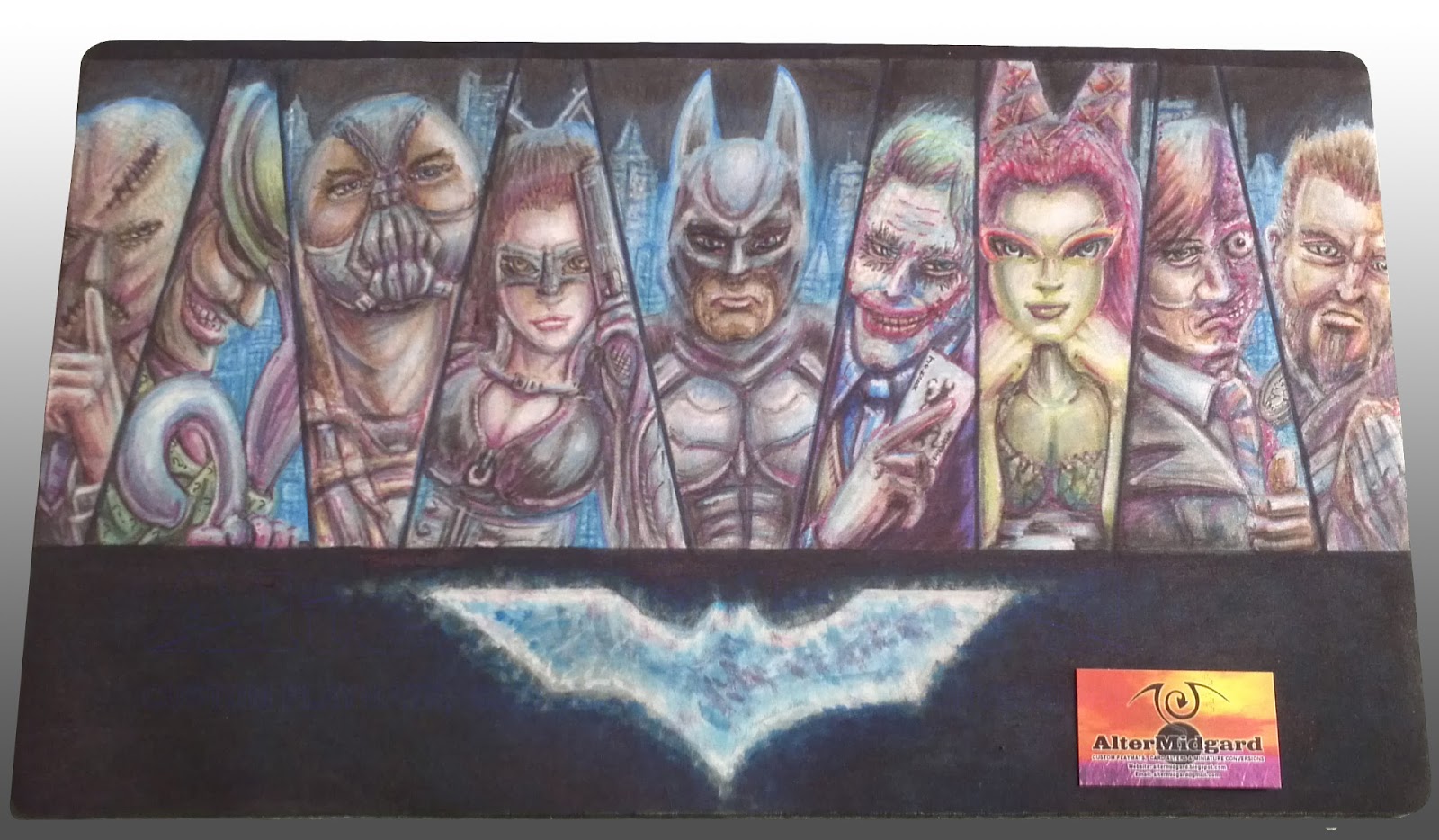
Batman Custom Playmat

So I had planned to do a post on art in general but it turned into something of rant, I think, so that can go on my other blog over at Infinity Flawed. The general Idea of it though was that I have come to the conclusion that I could probably teach people how to draw, the basics anyway, so instead of  'telling' like I do in that post I decided to 'show'.

With that in mind today I'm going to look at the production of the Batman mat and hopefully give some insights into it's production and things like shadows and highlights. but I'm getting ahead of myself lets start at the beginning.


1. I start by masking off the areas I don't want to get colour on just yet, this is something I have been doing a lot more of lately and helps in the creation of sharp lines. I mentioned on the muppets mat that you would start seeing more complex cut outs and heres the first of them where I'm using masking tape to create the shape of the logo. Its a little bigger than the logo needs to be but then the colour has a tendency to expand anyway even under tape in some cases.  

2. I find it helpful to start with a light colour and just block in the important detail. the other option is to go in and do all the line work now but the problem with that is that you can find yourself having to redo the lines at the end anyway. You can see that the colour got in under the tape and into the area I would have preferred it not to. This was because the background colour isn't pure black, I was going for a cloudy blue effect and that meant keeping the colour quite wet. Its not really an issue we can sort it out later when we start using the second type of colours over it. I will discus colour flow in more detail in a future post.

3 & 4. It seems to be quicker to get the large colour blocks out of the way first, in this case after the hands and faces there is quite a bit of grey in the image. The same goes for the green. While having one of each colour is ok having a full range of greys or greens from light to dark makes things so much easier, especial since if you make a mistake with the dark colours the lighter ones will often go over it to change it back. The only thing you have to watch out for is that you dont overload an area with colour since no matter how many times you add a lighter colour it will start to go muddy and you wont be able to get back to white without using the remover. 


5 & 6. You can see that the characters that are most complete were the ones that were mostly made up of the large blocks of colour from earlier, Joker's face is white so I have to be careful not to add too much colour to quickly and Scarecrow is brown so he's only got as far as the same shade of Bane's coat. Catwoman has a big hole for a face because I didn't like how the sketch turned out and decided to redraw it. 

All the characters are based on the actors who played their movie versions, while most of them are from the Nolan movies Riddler and Ivy are more like composits of their actors from the older films with elements from the comics. I do a fair bit of research when making these mats and this particular one requited a quite considerable amount. Its also useful to have a mirror about, in this case Scarecrow's, Joker's and Two Face's hands are all based on poses of mine.

7 & 8. I have done a few of this style now and while its nice that people like it I tend to like mixing things up a bit. Which explains why while the first two mats had glowing blank backgrounds this one moves things forward slightly and adds a cityscape, albeit one that is slightly disjointed.  From the beginning I knew I wanted the background to be the inverse of the first two though, it is Batman after all, the idea for the glowing buildings came later and the blue is quite nice as it turns out since it ties that section of the mat in with the logo. You can see I have also started to blend the blue into the shadows and highlights to make the characters fit a bit better into the world they inhabit, the shading on Riddler's cane or Batman's chest for example has become a lot more natural between 7 and 8.

9. Poor old Raz got left until last, somebody or something always seems to. One of the things I noticed when I started working on the mat was his sword was up to high on his chest, it was an odd position so that got fixed. On the plus side he does benefit from everything else I have learnt on this mat and he is one of my favourite elements especially the hair.

10. Finally, like so many of my mats, I work on the eyes I also go around darkening the shadows and doing the other line work. After all the time i spent on the shadows I don't really want it to be to obvious but because of the way the colour flows there is a certain amount of tightening up that has to be done.

Thats the stages of production out of the way now lets look at some smaller sections in more detail. It's worth remember thing though that these are blown up from camera images so the resolution would likely be higher had I remembered to scan the final mat in, have I mentioned I would like a scanner that was playmat size?


Not that easy to see on the prior images due ti the way I have displayed them this time but there is quite a bit of incidental detail on this mat. Wether its the tiny question marks on Riddler's jacket or the face on the coin, even Scarecrow's tie is more detailed than it probably needed to be since you can barely see it. The areas I like most though are things like the end of the gun, places where light and shadow come together to give an impression of texture using the technique described bellow.


I'm still not entirely sure why it works, something to do with our eyes most likely, since the real world doesn't really work like this. To get more natural results if the edge of your image is light add a dark line to it and vice versa. The end of the gun, for example, is just a dark cross hatch structure but because each cell created has a small light line on its upper edge it trick the brain into thinking thats the direction from which the light it falling on it. In the case on the edge of the faces the two girls are more successful while the guys cheeks are almost there but I don't think the light area on the opposite side of the dark line is quite light enough, at least not at this size and cut out from the rest of the image.


Additionally dont be afraid to shade using colours that arnt anthing to do with the base colour of your image, metals especially pick up shadows and highlights from the lights and other objects around them, Riddler's cane, for example, is picking up the purple of his gloves and the blue of the lights of the city, there is also a slight hint of green from his coat. Also skin looks a lot more interesting when its not just shades of pink, people don't tend to be pink anyway not really. 

I'll leave it at that for now since this post has run quite long, next time I will look at the constant quest to find ways to keep mats safe from the terrors of human skin and the oils it produces