29 January 2016

Vaporeon Friendship is Magic Custom Playmat: A Look at Depth of Feild


Today I'm going to look at the Vaporeon Friendship is Magic Playmat and talk a bit about something I seem to have managed to avoid having to use on most of mat mats, depth of field.

Field zero:

The mat came out of nowhere and initially I was slightly sceptical, what was I going to do with a set of instructions like these?

Main focus Vaporeon – Ok fair enough, I can do Pokemon mats.. Vaporeon
My Little Pony characters – Um, not where I was expecting this to go but ok.
Rainbows – I don’t think the weather conditions have ever been a requirement before.
Unicorns - ???
Pink, lots of it – I'm sensing a pattern here.
Its a present for someone under 10 – That explains a lot, ok so if it wasn’t obvious from the fact its a Pokemon mat lets keep things family friendly.

In my head I was drawing a blank, Vaporeon was there smiling at me but what were the ponies doing and how do you fit a load of rainbows in?

Rainbows, rainbows... well I can't just have them appearing for no reason so how do they appear in real life? Rain obviously, and waterfalls, well Vaporeon is a water type so... hot springs episode?

Ok lets do this.

Field one: 


We will start things off just after drawing the final design onto the mat. In terms of the colour scheme I'm initially thinking pastels so lets start lightly shading the areas that are definitely going to be in shadow.

I've been doing much research lastly and one of the things I noticed was that I seem to have gotten away with not having to do much in the way of depth in my mats, especially the older ones or those with patterned backgrounds. While it wasn’t one of their requirements I have added:

Attempt to create a sense of depth.

To the list of project requirements. I'm going to do about that in two major ways the first comes at the design stage and explains the pink grid over this image.

The first thing we need to work out is were the horizon is, for the sake of simplicity lets say its the red horizontal line at the center of the picture but it could be at any height, if it was one of the lower red lines the it would seem like we were looking down at the scene conversely the higher the horizon the more it will seem like we are looking up. I would say the real horizon in the image is about where the shortest line just above the central one is we are almost looking straight on but not quite.

Next you want to find the vanishing point. It will be somewhere on the horizon the point in the image where all the diagonal lines converge. In this example its dead center but the actual images vanishing point is up slightly and to the left.

With those two things figured out you go about filling the scene, if you want an object to be closer to the observer make it big say Vaporeon herself since she is the main subject. Need to make it look like something is distant make a bunch of them getting progressively smaller as they get nearer the vanishing point, there are three sizes of tree in this image the large foreground blue ones the medium mid-ground orange ones and all the tiny ones in the background. This is how we trick the brain into thinking the objects in the image exist at different distances when really its all just a bunch of lines.

Field Two:


It's not just scale the brain uses to work out distance it also relies on the intensity of the colours.

What would you say was closest to us in this image? The tree on the left and flowers on the right most likely. On the other hand the brain expects the stuff in the distance to be lighter more washed out or hazy.

Which is somewhat convenient for game developers when you think about it, imagine if they couldn’t get away with lowering the level of detail and texture quality as the distance from the player increased.

If your eyes are really good you might even notice that I'm halfway through colouring the image and have already drawn in everyones eyes. If I'm going to colour the image like this example though the pastel idea is somewhat out the window, but then I don’t really like leaving white space anyway.

Field Three:


Initially the blue trees all had quite stark white highlights but I'm gradually replacing them with light blues since the the closest objects should have the highest amount of colour in them anyway.

The trees aren’t just the foreground they also serve as a boarder one I have extended across the top of the image using a darker sky colour. The end goal being to give the impression of a tunnel or the sense your being draw inwards, we don’t want the eye escaping

Unconvinced by the blue of the sky it;s likely the next thing to be axed, well we do need more pink in the image after all. I've even managed to sneak a unicorn in, which may be surplus to requirements with two of the pony’s covering that base

The only thing that could sink this depth experiment at this point is twilight, she was fine in the sketch but no with the lake fully defined if I draw the water up to her chin its going to look like she’s at the same distance as the trees behind her, if I don’t I have to find something to so with her arms.

Finally for this section this may be a post about depth but that doesn’t mean there aren't spirals in this image, at least two major ones but I'll leave you to find them for yourselves.

Field Four:


Making the sky more dynamic had the added benefit of letting the mountains be slightly darker. Which in turn meant the waterfalls had to be filled in more, to be honest I think its better as it lets the white water around the rocks pop more, after that naturally the rainbows have to get brighter and one thing leads to another and you have a cascade of colour intensity upgrades radiating out across the image.

This has shrunk the space slightly, since the back of the image now seems smaller to us but I'll trade that for more detail and a more vibrant image since we didn’t lose the sense of depth,

The Twilight conundrum in the end was an easy fix I just added a rubber ring. Ok she might have a bit of an issue getting it off but it gives her something to be doing with her pose that the initial sketch didn’t have.

The finishing touch was to make sure Vaporeon didn’t end up looking evil, a concern that had raised its head after revealing the initial sketch. All early evee's have this issue its to do with the fact they don’t have whites of the eye. To avoid the issue I’ve increased the size of the eyes to give a sense of youth and also tried to blend in purples and greens to give them more depth. To really make sure I added massive highlights and flowers, perhaps all the pink was getting to me.

So I think thats about it for today, theres more to talk about but best to keep them for other posts, I think I met the goals I set out for this project, I definitely learner a lot along the way so hopefully going forward you will see more focus on depth.

Next time lightning strikes.

Until then it's more of a mauve.
16 September 2015

Majora's Mask Custom Playmst


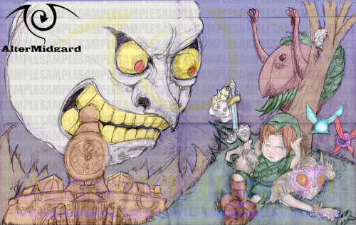
This time I’m going to be looking at the various steps involved in taking the initial sketch of the Major’s Mask playmat from initial sketch to something that can be used as a basis for the final piece.

Phase 1. Sketch Up.

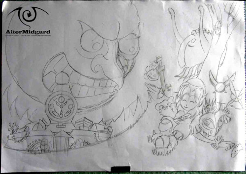
Most of the time I will go into a project with a series of small thumbnail sketches to work from. However occasionally its nice to just grab a sheet of A2 paper and start drawing this is a case of the latter. I had a strong idea of what the image should look like in my head so drew out the mat size guide lines at the top and bottom of the page and attempted to recreate that idea on the page.
All that considered the initial sketch turned out relatively strong, there are a number of issues I will discus shortly but on the whole not much changes between here and where the final piece ends up. At least, in terms of technique  things move significantly forward but I’m getting ahead of myself again.

The other thing that I think is worth noting is that this is the only version of the sketch that has shading. Its being used as a bit of a quick and dirty crutch, expressing shapes quickly without worrying to much about creating perfect lines. Having read any of my recent posts where I talk about using light and shadow to create shapes why then worry about how the lines look in the sketch? The main reason is that if I’m going to transfer the image to the mat having crisp perfect lines make things so much quicker, I can always ignore good lines when they are in place but muddy indistinct lines make things more time consuming in the long run.

Phase 2. Colour Check.

In general this is another step that I wont get to until later in the process but since I wasn’t creating this mat for anyone in particular I wanted to make the black and white image more readable and breaking it up with digitally with colour is a quick and easy way to do that. It also gives me a rough guide to how I might want to colour the final mat.
There are a number of colour choices that make it all the way through while others fall out of favor in the intival between this phase and the next. Meaning I put the design aside to concentrate on projects that were more pressing.

Phase 3. Long Time No Sketch.

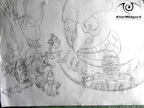
Some time and much experience later I finally find some down time to do anything I want. Looking through my unused sketches this one deems the most interesting and so the first thing to do if I’m going to work on it is to redraw the initial image concentrating on the lines and fixing some of the more glaringly obvious flaws.
First up the moon isn’t exactly round in the original skect is it. Craters causing bumps aside that’s sort of an important thing to get right, as is the fact that the nose seems to be missing a nostril for some reason.

Next up while I want Clocktown to be slightly wonky and disturbing looking it would be nice if the clock tower was at least a little more symmetrical especially since the face of the clock itself  preferably needs to be round.

The mountains have also changed, I realized that having them pointing all over the place wasn’t helping the flow of the eyes around the image so now they bend either left or right depending on the side they are on.

Finally inspired by the way I’ve drawn the giant I want to go for a style thats a bit more inspired by the current generation of western cartoons so smooth curves and long limbs are the order of the day. Having fixed those things and now with an image whose lines are much more obvious there are still some things that need sorting.

At the end of the day this is just a copy of the original with slightly adjusted lines if anything the level of detail has actually decreased.

Phase 4. Up Detail.

It’s time to flip the image and find more errors our eyes hadn’t noticed before. The first things I notice are that the areas below the town and the size of the moon have to be adjusted. The face of the moon just always felt like it was too big for the size of the moon itself so that got a boost pushing it off the page slightly.

After changing the mountains the grassy area bellow the town just wasn’t working for me anymore so I adjusted it to follow the same curve as the moon. Now I found myself with an image thats made up of a series of concentric circles radiating out from the moon, not really what I was going for but you cant do golden spirals every mat i guess. While I’m undecided at this stage whether the town should be falling to pieces as the moon crashes down it’s clear having the mountains crumble adds a nice touch and helps connect the various circles.

The rest of the upgrade mainly involves adding detail and making as many lines as possible into  S’s (just look at the moon’s face for a good example, especially the nose). This is also the first point in time where Skull Kid’s feet get fixed they should never have been both facing the same way, on the downside I will now need to redraw his hands before I move to the mat because they have lost detail somehow.

Phase 5. On The Mat
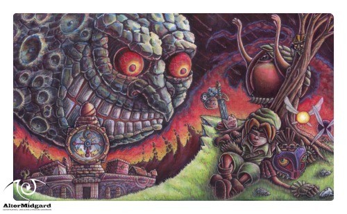
The only major changes after phase 4 are that I add in a bunch of craters to the non face section of the moon to make it more interesting and a rather intense fire suddenly appears from nowhere to act as a way to make sure the two sides of the image are definitely connected and to guide the eye up and around the page (and yes maybe to add a spiral back in).

I chose blue for the moons colour scheme in the end since I seem to have coloured quite a number of yellow moons it was a nice change and I figured the darker shades would look more sinister.
Not that Link seems to care, perhaps he’s finally ok with his perpetual groundhog 72 hours.

21 August 2015

Moon Princess Vanguard Custom Playmat Refresh

 
Final refresh for a while. I'm going to wrap this series up by taking a look at the moon princess mat.

When I made this mat originally I think what I was aiming for was an anime style flatness, bright colours, sharp shadows and highlights. Looking back at it now and it just feels like it could have done with greater sharpness, as if I didn't quite commit to making certain areas as bold as they probably could have been.


The main focus of this refresh then was going to be increasing the level of detail and sharpening the edges I was going to keep the colours relatively intact.

Then on a whim I decided to add a black shadow to the beads and things took a much darker turn.
 
And so, much like the other mats in this refresh series I ended up focusing on light and shadow. None of which were particularly consistent in the original, especially since there was a large round yellow light source behind her and it was having no effects on the lighting.

So I recoloured it orange.

That didn't look quite right either and I realised that both versions were having a weird effect on the way the figure in front of them stood out. You see the darker areas were fine, they had nice soild edges that worked well against the yellow, but the light areas had a nasty tendency to blend in. The opposite was also true when things transitioned to the black background, it was all a bit frustrating.
 
So I coloured the moon black.
 
That sorted the problems with the light areas (brought them up quite nicely in fact) but still left me with the problem of sorting the feathers on the black background.

At about the same time I decided the main light source would be above the princess (It's probably slightly in front of her too). this way I wouldn't have to mess around too much with the light on her hair and it also meant I would have more solid understanding of where shadows and highlights would need fixing, dont wing it is what I'm saying figure out your lights first.
 
With this all sorted I could get on and finesse the wings, adding a white line to the lower edge and generally chopping them about until they looked a little more like they were all about the same size.

I dyed her hair black which was interesting because then the outlines ended up being a light colour and that's not something that's really happened before and its an interesting effect that I might what to try elsewhere. I straightened the sword because even though the bulge in the original image is due to scanning it still want totally straight, changed the way the shield's mirror works and then realized something was still missing.
 
So I coloured the moon white.
 
Not an especially easy task but luckily the underlying layers still remembered they had originally been yellow, if they had been black to start with it would have been much more difficult.

Final touches were to tighten up all the line-work and the edges  then smooth out the transitions between colours. Somehow I had gone from cartoon shading to gradients almost without realising still I definitely think prefer it this new way especialy the way the princess seems to stand out more.

The last thing I considered was adding card zones, but then I thought 'for which game?' I'ts probably best to leave it as it is and let whoever may eventually want it decide if they want something specific.
 
Next time another moon, just a decidedly less friendly one.


17 August 2015

Lightswprn Playmat Refresh Steps 1 to 5


Originally posted on my Facebook page over the course of a week this post collects all the text and images together into one place. I'm going to leave the text as it was written to maintain the feel of progression.


Monday

This week I'm going to be refreshing the Lightsworn playmat and I thought it would be interesting to show the progression from original image today to however it ends up turning out on Friday. As such each day there will be an image (or images) plus some text about whats going on or perhaps tips and techniques.


Best to start at the beginning though, so here a pic of the mat as it stands now.
There are a number of goals I have for this refresh and they are:

A: Find a way to push the background into the the background: While I like it, if this was a TV show both the foreground and background would be in the same focus which isnt ideal. What we really want is for the characters to be the main focus so we need to drop the background back a bit, either by lowering the detail or making it less sharp.

B: To remove as many tangents a possible: More on that in the days to come
C: Generally increase the level of detail: we might not want to go too crazy but lets see what happens.
That's it for today, assuming I don't mess it up somehow tune in tomorrow for the next stage of the process.


Tuesday

This week I'm refreshing the Lightsworn mat. Tune in every day to see how it's going.

So where are we at?


Well the first thing I did was give the background a light wash of grey. this knocked out some of the green, evened out the colours across the whole background and started to fade the lifework. However I then realized that all the characters are shades of white so a grey background might not get me much closer to completing goal A.

Next up was to try adding a glow around the characters, you may have noticed almost all Yugioh mats use this trick to separate the monsters from the backgrounds so I figured why not give to a go. Orange / Red were basically the only choices with the characters all being blue and white and the glows being green and it definitely makes them stand out but I'm clearly not quite there yet.

For Goal B I've already identified a number of areas that need adjustment (as seen in the red circles). Places were lines intersect causing the viewer to misinterpret what they are seeing or making it more difficult to read. For example the one in the bottom left, is that an ear or just another part of his robe? fixing these areas will help to make the individual monsters... well more individual.

Goal C is more of a gradual process, I've started increasing the shadows and highlights and noticed there are a number of areas that weren't quite finished. Why for example is there a large empty space under Lumina's arm? (It's possibly a crystal like the one below but doesn't really read as that) There were also one of two small areas of background that had detail but no colour , very odd.
Next time, find out what colour the background ends up.


Wednesday

This week I'm refreshing the Lightsworn mat. Tune in every day to see how its going.

Day 3 and its time to talk techniques.


First though you will have noticed the background is suddenly very red. In an effort to have the outlines match the background better I just decided it may as well be. I have used a gradient though and the heaviest layers of red are applied to the outer edges since I want to try and keep the glow in the center. Once again this has softened the linework, too many more layers and I might want to start adding it back but we will see.

What I mainly want to talk about though is how I've been going around adjusting lines the general idea being that if you have one side of an object that's very bumpy using straighter / smoother lines on the opposite side simplifies and makes things cleaner while not impacting the detail too much. In the lower images which show the beginnings of this the red lines represent parts that have been smoothed while the blue lines show... well the opposite. The green line shows were i have started work on smoothing out that side of the arm by strengthening the white highlight that separates the arm from the adjacent character but still have things to do like add the shadow to the adjacent character that should accompany that line.

Which is the other major thing. This time around like the other refresh mats I'm moving away from black lines defining edges and trying to go a bit more realistic. I'm not going to push it too hard on this one since I still want a slight cartoony look but we will see how it goes.
Having separated the characters from the background the next thing to do is spend a bit mote time separating them from each other, adding more detail and maybe starting on lighting effects but thats for next time.


Thursday

This week I'm refreshing the Lightsworn mat. Tune in every day to see how its going.


Thursday and I'm working my way around the image increasing the detail and fixing problems as I find them. Problems like the area inside the red circle in the lower right image where we have a number of monsters overlapping.

If you go back to a previous image you will see that the arm is behind the hat and the nose of the dragon intersects the arm. Neither of which is right since the dragon doesn't even need to overlap anything and the character wearing the hat is meant to be behind everyone else.
The dragon is an easy fix just shorten his snout and fill the space with the background colour but while I've moved the hat in behind by redrawing the arm slightly i have noticed while writing this post that it could still do with some slight adjustments to make it look a bit less like its connected to the yellow line next to it.

Its been the same sort of work across the whole mat, erasing or moving lines, sometimes just a nudge, others more extensive changes to fix the little things that I didn't see or wouldn't even have considered the first time around and we will see more messing with little details tomorrow, especially the faces..
The other major job before writing this post was to work on the edges of characters. If there was a light edge then I would make sure it was as light as it could be and that the area next to it on any object behind it was in shadow. Similarly if you have a dark edge then the area in the figure next to it will most likely be lighter. Doing this we start to move away for relying on the black outlines to define edges insted we are tying to use how light works.

I also noticed that the background was missing something. There are areas around the edges that felt a bit empty so I started adding in more green blobs. Since the blobs glow that led to bringing up the brightness of the lighting effects something i was going to have to get around to at some point anyway.

Tomorrow sees the final post and there's still quite a bit to be done, we will just have to wait see how it all turns out.


Friday

So this week I set about refreshing the Lightsworn mat. I thought it would be interesting to show the progression from the original image on Monday to the final changed piece today so lets see where we got to in terms of the goals I set out on Monday


Goal A :Push the background back: Well its much darker now and a great deal more even across the whole mat both of which help prevent it from drawing your eyes away from the focus of the image which is the characters.

Still it's nice I didn't lose the detail entirely I had thought I might have to overwrite the whole thing with black or something just to get rid of it but in the end I dulled it down just enough to stop it being so dominant and that was enough.

B: To remove as many tangents a possible: This was the most time consuming part of the process luckily I could combine it with goal C to move things around and increase the detail at the same time. There may have been a magnifying glass involved in this process just saying.
I think I managed to get most of them, all the glaringly obvious ones at least, some things I just couldn't alter because of how the image was initially drawn. If I was to draw it now I might take negative space into more consideration.

C: Generally increase the level of detail: Using light and shadow to show edges really allowed me to get more detail into charters that are quite small. Hair and faces have seen a big jump in detail for some of the figures not to mention all the gold banding has much more depth now..
Then there were things like Lumina getting a face lift because i was working on the image upside down and didn't really feel her original head was quite the right shape, her skirt got extensions for the same reason. Neither task was especially straightforward, funnily enough its much easier to add colour and lines than remove them.

Final Verdict: I achieved all that I set out to do mostly to the degree of success i was hopping for and in terms of all the extra detail possibly more so, I'm not sure these is where i though I would end up but the journey is part of the fun.

The final oal I set myself was to write a post everyday for one week, some of yu may have noticed however that the first three days posts were all written at once that's because while I wanted to have a post a day, the actual refresh didn't take a week sometimes you have to bend spacetime for a good story. Perhaps next time I'll live steam the process or something?

Next week, that's no moon, well it was until i refreshed it.