21 August 2015

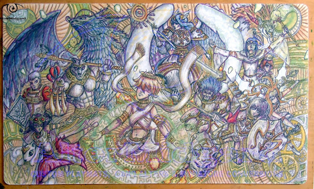
Moon Princess Vanguard Custom Playmat Refresh

 
Final refresh for a while. I'm going to wrap this series up by taking a look at the moon princess mat.

When I made this mat originally I think what I was aiming for was an anime style flatness, bright colours, sharp shadows and highlights. Looking back at it now and it just feels like it could have done with greater sharpness, as if I didn't quite commit to making certain areas as bold as they probably could have been.


The main focus of this refresh then was going to be increasing the level of detail and sharpening the edges I was going to keep the colours relatively intact.

Then on a whim I decided to add a black shadow to the beads and things took a much darker turn.
 
And so, much like the other mats in this refresh series I ended up focusing on light and shadow. None of which were particularly consistent in the original, especially since there was a large round yellow light source behind her and it was having no effects on the lighting.

So I recoloured it orange.

That didn't look quite right either and I realised that both versions were having a weird effect on the way the figure in front of them stood out. You see the darker areas were fine, they had nice soild edges that worked well against the yellow, but the light areas had a nasty tendency to blend in. The opposite was also true when things transitioned to the black background, it was all a bit frustrating.
 
So I coloured the moon black.
 
That sorted the problems with the light areas (brought them up quite nicely in fact) but still left me with the problem of sorting the feathers on the black background.

At about the same time I decided the main light source would be above the princess (It's probably slightly in front of her too). this way I wouldn't have to mess around too much with the light on her hair and it also meant I would have more solid understanding of where shadows and highlights would need fixing, dont wing it is what I'm saying figure out your lights first.
 
With this all sorted I could get on and finesse the wings, adding a white line to the lower edge and generally chopping them about until they looked a little more like they were all about the same size.

I dyed her hair black which was interesting because then the outlines ended up being a light colour and that's not something that's really happened before and its an interesting effect that I might what to try elsewhere. I straightened the sword because even though the bulge in the original image is due to scanning it still want totally straight, changed the way the shield's mirror works and then realized something was still missing.
 
So I coloured the moon white.
 
Not an especially easy task but luckily the underlying layers still remembered they had originally been yellow, if they had been black to start with it would have been much more difficult.

Final touches were to tighten up all the line-work and the edges  then smooth out the transitions between colours. Somehow I had gone from cartoon shading to gradients almost without realising still I definitely think prefer it this new way especialy the way the princess seems to stand out more.

The last thing I considered was adding card zones, but then I thought 'for which game?' I'ts probably best to leave it as it is and let whoever may eventually want it decide if they want something specific.
 
Next time another moon, just a decidedly less friendly one.


17 August 2015

Lightswprn Playmat Refresh Steps 1 to 5


Originally posted on my Facebook page over the course of a week this post collects all the text and images together into one place. I'm going to leave the text as it was written to maintain the feel of progression.


Monday

This week I'm going to be refreshing the Lightsworn playmat and I thought it would be interesting to show the progression from original image today to however it ends up turning out on Friday. As such each day there will be an image (or images) plus some text about whats going on or perhaps tips and techniques.


Best to start at the beginning though, so here a pic of the mat as it stands now.
There are a number of goals I have for this refresh and they are:

A: Find a way to push the background into the the background: While I like it, if this was a TV show both the foreground and background would be in the same focus which isnt ideal. What we really want is for the characters to be the main focus so we need to drop the background back a bit, either by lowering the detail or making it less sharp.

B: To remove as many tangents a possible: More on that in the days to come
C: Generally increase the level of detail: we might not want to go too crazy but lets see what happens.
That's it for today, assuming I don't mess it up somehow tune in tomorrow for the next stage of the process.


Tuesday

This week I'm refreshing the Lightsworn mat. Tune in every day to see how it's going.

So where are we at?


Well the first thing I did was give the background a light wash of grey. this knocked out some of the green, evened out the colours across the whole background and started to fade the lifework. However I then realized that all the characters are shades of white so a grey background might not get me much closer to completing goal A.

Next up was to try adding a glow around the characters, you may have noticed almost all Yugioh mats use this trick to separate the monsters from the backgrounds so I figured why not give to a go. Orange / Red were basically the only choices with the characters all being blue and white and the glows being green and it definitely makes them stand out but I'm clearly not quite there yet.

For Goal B I've already identified a number of areas that need adjustment (as seen in the red circles). Places were lines intersect causing the viewer to misinterpret what they are seeing or making it more difficult to read. For example the one in the bottom left, is that an ear or just another part of his robe? fixing these areas will help to make the individual monsters... well more individual.

Goal C is more of a gradual process, I've started increasing the shadows and highlights and noticed there are a number of areas that weren't quite finished. Why for example is there a large empty space under Lumina's arm? (It's possibly a crystal like the one below but doesn't really read as that) There were also one of two small areas of background that had detail but no colour , very odd.
Next time, find out what colour the background ends up.


Wednesday

This week I'm refreshing the Lightsworn mat. Tune in every day to see how its going.

Day 3 and its time to talk techniques.


First though you will have noticed the background is suddenly very red. In an effort to have the outlines match the background better I just decided it may as well be. I have used a gradient though and the heaviest layers of red are applied to the outer edges since I want to try and keep the glow in the center. Once again this has softened the linework, too many more layers and I might want to start adding it back but we will see.

What I mainly want to talk about though is how I've been going around adjusting lines the general idea being that if you have one side of an object that's very bumpy using straighter / smoother lines on the opposite side simplifies and makes things cleaner while not impacting the detail too much. In the lower images which show the beginnings of this the red lines represent parts that have been smoothed while the blue lines show... well the opposite. The green line shows were i have started work on smoothing out that side of the arm by strengthening the white highlight that separates the arm from the adjacent character but still have things to do like add the shadow to the adjacent character that should accompany that line.

Which is the other major thing. This time around like the other refresh mats I'm moving away from black lines defining edges and trying to go a bit more realistic. I'm not going to push it too hard on this one since I still want a slight cartoony look but we will see how it goes.
Having separated the characters from the background the next thing to do is spend a bit mote time separating them from each other, adding more detail and maybe starting on lighting effects but thats for next time.


Thursday

This week I'm refreshing the Lightsworn mat. Tune in every day to see how its going.


Thursday and I'm working my way around the image increasing the detail and fixing problems as I find them. Problems like the area inside the red circle in the lower right image where we have a number of monsters overlapping.

If you go back to a previous image you will see that the arm is behind the hat and the nose of the dragon intersects the arm. Neither of which is right since the dragon doesn't even need to overlap anything and the character wearing the hat is meant to be behind everyone else.
The dragon is an easy fix just shorten his snout and fill the space with the background colour but while I've moved the hat in behind by redrawing the arm slightly i have noticed while writing this post that it could still do with some slight adjustments to make it look a bit less like its connected to the yellow line next to it.

Its been the same sort of work across the whole mat, erasing or moving lines, sometimes just a nudge, others more extensive changes to fix the little things that I didn't see or wouldn't even have considered the first time around and we will see more messing with little details tomorrow, especially the faces..
The other major job before writing this post was to work on the edges of characters. If there was a light edge then I would make sure it was as light as it could be and that the area next to it on any object behind it was in shadow. Similarly if you have a dark edge then the area in the figure next to it will most likely be lighter. Doing this we start to move away for relying on the black outlines to define edges insted we are tying to use how light works.

I also noticed that the background was missing something. There are areas around the edges that felt a bit empty so I started adding in more green blobs. Since the blobs glow that led to bringing up the brightness of the lighting effects something i was going to have to get around to at some point anyway.

Tomorrow sees the final post and there's still quite a bit to be done, we will just have to wait see how it all turns out.


Friday

So this week I set about refreshing the Lightsworn mat. I thought it would be interesting to show the progression from the original image on Monday to the final changed piece today so lets see where we got to in terms of the goals I set out on Monday


Goal A :Push the background back: Well its much darker now and a great deal more even across the whole mat both of which help prevent it from drawing your eyes away from the focus of the image which is the characters.

Still it's nice I didn't lose the detail entirely I had thought I might have to overwrite the whole thing with black or something just to get rid of it but in the end I dulled it down just enough to stop it being so dominant and that was enough.

B: To remove as many tangents a possible: This was the most time consuming part of the process luckily I could combine it with goal C to move things around and increase the detail at the same time. There may have been a magnifying glass involved in this process just saying.
I think I managed to get most of them, all the glaringly obvious ones at least, some things I just couldn't alter because of how the image was initially drawn. If I was to draw it now I might take negative space into more consideration.

C: Generally increase the level of detail: Using light and shadow to show edges really allowed me to get more detail into charters that are quite small. Hair and faces have seen a big jump in detail for some of the figures not to mention all the gold banding has much more depth now..
Then there were things like Lumina getting a face lift because i was working on the image upside down and didn't really feel her original head was quite the right shape, her skirt got extensions for the same reason. Neither task was especially straightforward, funnily enough its much easier to add colour and lines than remove them.

Final Verdict: I achieved all that I set out to do mostly to the degree of success i was hopping for and in terms of all the extra detail possibly more so, I'm not sure these is where i though I would end up but the journey is part of the fun.

The final oal I set myself was to write a post everyday for one week, some of yu may have noticed however that the first three days posts were all written at once that's because while I wanted to have a post a day, the actual refresh didn't take a week sometimes you have to bend spacetime for a good story. Perhaps next time I'll live steam the process or something?

Next week, that's no moon, well it was until i refreshed it.