Showing posts with label Yugioh Playmats. Show all posts

29 August 2016

Refreshing a Custom Playmat: Persona 3 Nyx Mat


Chances to upgrade a piece of art don’t come along that often. After all by the time anyone gets around to even thinking about it your probably several hundred years dead. On the other hand Playmats are art that has to withstand the rigors of constant use, occasionally they may require a bit of a spruce up. Thats going to be the topic of today's post as we take a look at what was involved in refreshing the Persona 3 Nyx mat..

Four years in the breaking

It's been a while Persona 3 Nyx mat, how've ya been? Bearing in mind I had no idea about sealing mats at the time I think it's done well for 4 years of use. What we are seeing is that the colours have faded slightly and there is understandable wear around the edges, both from use and living loose in a bag.
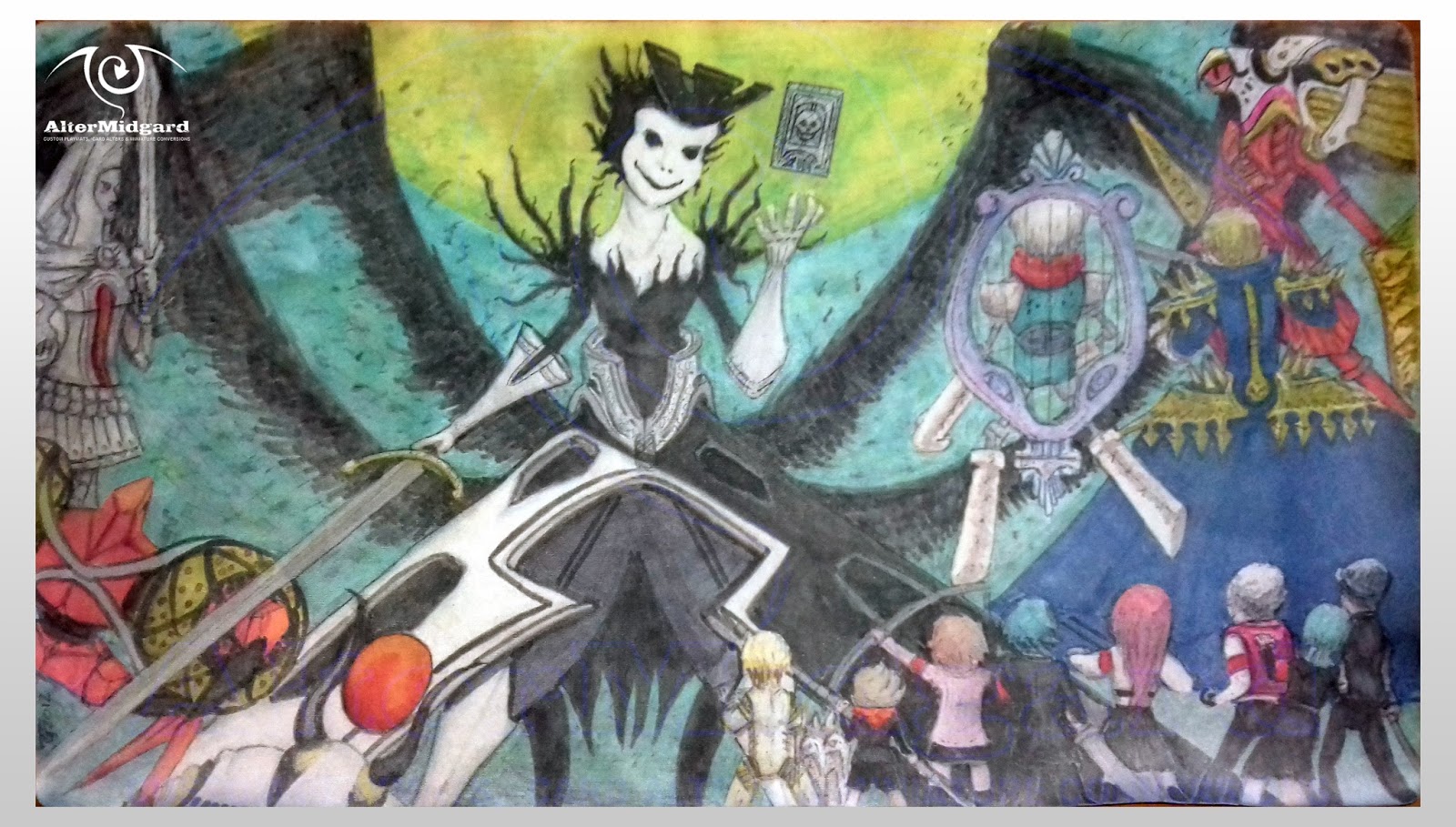
A tiny bit the worse for wear but overal you've done well soldier

It's the black thats faded the most. Which is interesting since usually its the paler colours that are the first to go, must have been something to do with the fact I was using two different mediums. That aside the most striking change is the loss of that vibrant neon.

Here's a little secret though. This image, the contrast has been pushed up to make the blacks darker and the image easier to read, the original was never quite this dark in the first place. Why push the contrast so much? Well you see at the time I didn’t exactly have all that decent a camera and it helps to offset the low resolution. That said with this refresh I'm hoping to get the mat up to this level of colour at the very least. Think of it as finally matching the original vision. First though we need to know why the mat looks as it does not after four years.

Why do things fade? Well there are two main reasons.

Reason one: Wear.

Want to see what a mat looks like without its backing? Any mat thats is, even the printed type? Heres a pic.

Best not to ask why I have the fabric of a mat and not the rubber under-layer. There was an experiment...

Yup its essentially just a bit of fabric, not a particularity thick piece of fabric either and yet one that has to withstand all the card flicks, elbows, greasy fingers, and rubbing from other objects in a bag that occur during a mat's life. It would be like if you only had one tshirt, You wear it wash it then put it on again, over and over for four years. What happens to any images on it or the seams and edges?

Thats right Wear, Luckily unlike clothes the rubber backing of a mat keeps it from falling apart we still have to deal with wear to the image though.

Reason rwo: light.

The sun is trying to kill the colours.

Over time light breaks down the pigments, less tiny pigment particles less colour on the human eyes scale. This is more like a river carrying away the individual particles ,with less of them left behind its impossible to be as bright as before the river appeared.

On the plus side unless you leave your mat on a windowsill while your not using it light is less of an issue. Also gaming stores aren’t renowned for their sunroofs.

On this mat what we are seeing is mainly a wear issue. I can feel the fabric isn’t as thick as it used to be and there are more frayed fibres around the edges. One of the things we will be looking to do near the end of the process is to bulk the mat back up a bit.

Beyond that it's a straight re-colour.

Well it would be but I've come a long way in four years, I think we can do better than that.

The reunification.

In this image I'm about halfway done with the refresh.

There are a number of things that still need fixing.

You can already see things have begun to tighten up. If I was to draw a graph showing level of detail over time there would definitely be an upward trend, I guess thats what you get with practice.

I've been removing as many Tangents as I could find, we've covered this before but to recap. Tangents are where lines meet and form shapes they shouldn’t and in doing so they confuse the viewers eye. In this image for example the way the bow, spear, and Nyx's dress interact caused some confusion originally, at least I wasn’t happy with it at least. Theres still a bit to do to work them apart but you can see the beginnings of the refinement of each object and my atempt to move them apart..

Another thing we can do to improve readability is make sure that dark edges are followed by light areas and vice versa. There are a lot of very small details on this mat, for example the gold spikes, and we can increase the crispness of their edges without putting a black line around them if we use this technique. I've also changed the lighting, on the original I use a grey to shape the black clothes of the characters but if the moon is the primary light source then doing so leads to confusion, where is the light coming from to make their backs lighter than their sides? Just fixing this makes the figures feel much more a part of the rest of the image.

Finally I've begun darkening the edges of the image in order to create an oval of darker colour. This pool into witch we are drawn should help to keep the viewers eyes within the bounds of the image where before with all the figures at the edges it could be quite easy for the eye to wander out.

At this point I'm not sure if I want to outline the everything or not.

0.3 to 0.8

I've outlined the everything.

I'm not sure which I prefer this or the top image.

Had to in a way. Ceaser is all grey, at some point near the edge of a surface your going to need to go darker to create the outline and once you've done that then you start thinking 'well lets just see what the guy next to him would look like' and it's all a bit of a snowball from there.

What I didn’t want to do however were boring lines that were all the same width, you know like I did the first time around because I didn’t have four years more experience. So keeping the Rarity mat in mind I set about outlining everything, making sure to vary the pressure of my stroke. To make doubly sure I went back and added even more thickness to certain areas I wanted it to be really obvious. Then I got an even thicker brush and drew big black lines around the characters.

But that was too much so I undid most of it.

I'm glad I did add the line-work in the end, not only does it make those areas that had lines originally more dynamic but it really helps to make the character pop.

I've been talking about techniques to sharpen the image for a bit now so I guess it's past time to mention colour.

Colour me unsurprised.

In the original image the sky is something of a teal, one I no longer have access to. This turns out to be less of a problem than it seems since the moon is green after all and as I boost it back up to its neon glory I'm naturally drawn to blending out from there using greens rather than teals anyway.
I want to bring more of the blue from the dress into the left of the image as the right is a bit heavy with it so start to tint the greys with a blue shadow. Th blue Itself has held up well over the years, theres no real surprise there its what blue does. Still I want to add in some dynamism so work the dress up to a darker shade and blend out to create folds in the fabric

In the same way I want more blue on the left, the areas that were red and orange before are all now shades of one colour to draw your eye from left to right. There's a nice curve there I think it should be used. Equally the yellows are better matched now, I really wanted to cut down a bit on the number of colours involved, less can be more after all and if it helps strengthen the overall image all the better.

I debated weather or not to add purple clouds. It would have had a nice contrast to the green but theres no taking that back, the sky isn’t really the focus anyway so had I not liked it I would have been stuck with at best very dark green clouds.

Just to add to the eeriness factor I've left Nyx's face without shadows, clearly she can self illuminate somehow – perhaps she is a nightlight. I also altered the smile and reshaped the head. It wasn’t that far off before but you should have been able to see more hair on the right and now she looks like she's enjoying herself more.

Deepen the blacks on Nyx. For obvious reasons we do the black last (hint we don’t want to be trying to put yellow over it) lets also sort out the boot on the right not sure what went wrong there but its not the same size as the one one the left even if you cant see most of it. I could go darker with the wings but as we have learned we want things in the background to not be as bright/strong.

Bring in some green shadows and highlights to tie the figures and the sky together and we are done. Not quite the same style as before but possibly closer to the original anime intent overall, especially on the humans.

Next up lets do something to keep this mat going for even longer than four years.

CFC Free.

With the colouring done its tim for detailing.

Not as in adding detail, more the polishing a car up to make it look as good as it can.

Here that involves:

Trimming any glaringly obvious frays: Being fabric we don’t want to go to crazy it might un-knot.

Painting the sides of the edges of the mat: if it's green at the edge we don’t want to see white over the lip.

And adding an undefined number of layers of sealant.

This last point involves a spray so you will want to do this outside in calm dry weather. Here I've gone with a mat sealant, mat as in not gloss rather than specifically for mat's. As I mentioned earlier I want to improve the mat's thickness so it takes a fair few coats to bring it up to where I am happy with it. Adding the sealant helps for three reasons. First it locks in the colours, second it takes the wear before the mat itself and third a decent sealing product will have some form of UV protection or be lightfast in some way.

Basically it helps slow the process of ageing.

For art that is, I advising against any attempts to use it in any other way.

Once this is dry your done and ready to once again take to the battlegrounds.

...

I just wish I had a blacklight, see one of the ways I got the brightness back up was to use glow in UV colours. It woulds be nice to know if the sealing process turned them off or not.

Obviously thats a story for another time, until then remember art isn’t ever a finished thing theres always room for a refresh.

Although I'm not sure how I would feel about someone else messing with my art 100 years form now.

11 April 2016

Winged Kuriboh LVL10 Custom Playmat


 It's rare that someone comes to me knowing exactly what they want, today's mat is one of those rare cases.  Text this week is going to focus on expanding on ideas covered in the images.

... 

(Conversation shortened and dramatized for added drama)

'I want that one.'

They were looking up at where the Majora's Mask Mat hung from the ceiling but that's not exactly what they meant. 

'That design, but with Winged Kariboh LVL10 on this side.' They waved in the general direction of Link and the tree I waited, it seemed best to let them finish.

'Then over here Winged Kuriboh's going into lighting and Kuribandit's coming out.' They looked up at me expectantly I had to ask for more detail. This wasn't your typical briefing.

I managed to get a more detailed description. They liked the design of the Majora mat so it seemed only natural to them that they should be able to get the same design but with other characters. Well I wasn't going to say no to a challenge even if it wasn't something I had ver though about doing before, the first step would be to look at the characters I had to work with and see how they matched up with elements of the Majora mat.


The main question was how big to make LVL10. The size I settled on flips the weigh of the image keeping the underlying design but mixing things up so it's not just a carbon copy and also means that there's going to be a guaranteed level of detail even if we do loose one wing off the page. 

Another question is how small can I make the other characters Ive got to tray and get eyes on all these puffballs.

With the initial sketch sorted its onto digital colouring, something I've been doing more of lately since it clears up things like where the light source is before I get started on the mat propper.


Like last times My Little Pony Mat this mat sees me trying to implement things we all know at an instinctive level but that can be hard translate into art without someone actually explaining it to you. Here I wanted to make sure the sea faded into the distance. It's funny how the sea ended up being a very similar colour to the hill in the Majora mat, I hadn't meant to make that connection it was just the way things developed.

With the colour sketch sorted it'd a skip ahead to the final mat.


If you look back at the Blue Eyes Ultamate Kariboh Mat and compare to this it's very obvious how far I've come in terms of both coloring and drawing small characters. Turns out that hair is one of the easiest things to get right this way. Even more helpfully it works just as well at small scales as large so you can get a lot of detail in without relying on outlining the image.

The tree got transplanted to the other side of the mat. it was apparently an important element to keep and while it would have looked odd growing out of the water it serves quite well at joining the top and the bottom of the image together on the left side. I wouldn't have kept it but again they were very clear on what they wanted and I do like the way it ended up

An interesting question is: Had I not had such specific instructions how different would the design have been? It's possible I would have done something that was more of a callback to the Blue Eyes Mat. There were also a number of early sketches that focused on a more aggressive pose for LVL10, we could have seen something more flight orientated.

Next time I look at something a bit rare, until then remember new designs can come out of existing ideas.


17 August 2015

Lightswprn Playmat Refresh Steps 1 to 5


Originally posted on my Facebook page over the course of a week this post collects all the text and images together into one place. I'm going to leave the text as it was written to maintain the feel of progression.


Monday

This week I'm going to be refreshing the Lightsworn playmat and I thought it would be interesting to show the progression from original image today to however it ends up turning out on Friday. As such each day there will be an image (or images) plus some text about whats going on or perhaps tips and techniques.


Best to start at the beginning though, so here a pic of the mat as it stands now.
There are a number of goals I have for this refresh and they are:

A: Find a way to push the background into the the background: While I like it, if this was a TV show both the foreground and background would be in the same focus which isnt ideal. What we really want is for the characters to be the main focus so we need to drop the background back a bit, either by lowering the detail or making it less sharp.

B: To remove as many tangents a possible: More on that in the days to come
C: Generally increase the level of detail: we might not want to go too crazy but lets see what happens.
That's it for today, assuming I don't mess it up somehow tune in tomorrow for the next stage of the process.


Tuesday

This week I'm refreshing the Lightsworn mat. Tune in every day to see how it's going.

So where are we at?


Well the first thing I did was give the background a light wash of grey. this knocked out some of the green, evened out the colours across the whole background and started to fade the lifework. However I then realized that all the characters are shades of white so a grey background might not get me much closer to completing goal A.

Next up was to try adding a glow around the characters, you may have noticed almost all Yugioh mats use this trick to separate the monsters from the backgrounds so I figured why not give to a go. Orange / Red were basically the only choices with the characters all being blue and white and the glows being green and it definitely makes them stand out but I'm clearly not quite there yet.

For Goal B I've already identified a number of areas that need adjustment (as seen in the red circles). Places were lines intersect causing the viewer to misinterpret what they are seeing or making it more difficult to read. For example the one in the bottom left, is that an ear or just another part of his robe? fixing these areas will help to make the individual monsters... well more individual.

Goal C is more of a gradual process, I've started increasing the shadows and highlights and noticed there are a number of areas that weren't quite finished. Why for example is there a large empty space under Lumina's arm? (It's possibly a crystal like the one below but doesn't really read as that) There were also one of two small areas of background that had detail but no colour , very odd.
Next time, find out what colour the background ends up.


Wednesday

This week I'm refreshing the Lightsworn mat. Tune in every day to see how its going.

Day 3 and its time to talk techniques.


First though you will have noticed the background is suddenly very red. In an effort to have the outlines match the background better I just decided it may as well be. I have used a gradient though and the heaviest layers of red are applied to the outer edges since I want to try and keep the glow in the center. Once again this has softened the linework, too many more layers and I might want to start adding it back but we will see.

What I mainly want to talk about though is how I've been going around adjusting lines the general idea being that if you have one side of an object that's very bumpy using straighter / smoother lines on the opposite side simplifies and makes things cleaner while not impacting the detail too much. In the lower images which show the beginnings of this the red lines represent parts that have been smoothed while the blue lines show... well the opposite. The green line shows were i have started work on smoothing out that side of the arm by strengthening the white highlight that separates the arm from the adjacent character but still have things to do like add the shadow to the adjacent character that should accompany that line.

Which is the other major thing. This time around like the other refresh mats I'm moving away from black lines defining edges and trying to go a bit more realistic. I'm not going to push it too hard on this one since I still want a slight cartoony look but we will see how it goes.
Having separated the characters from the background the next thing to do is spend a bit mote time separating them from each other, adding more detail and maybe starting on lighting effects but thats for next time.


Thursday

This week I'm refreshing the Lightsworn mat. Tune in every day to see how its going.


Thursday and I'm working my way around the image increasing the detail and fixing problems as I find them. Problems like the area inside the red circle in the lower right image where we have a number of monsters overlapping.

If you go back to a previous image you will see that the arm is behind the hat and the nose of the dragon intersects the arm. Neither of which is right since the dragon doesn't even need to overlap anything and the character wearing the hat is meant to be behind everyone else.
The dragon is an easy fix just shorten his snout and fill the space with the background colour but while I've moved the hat in behind by redrawing the arm slightly i have noticed while writing this post that it could still do with some slight adjustments to make it look a bit less like its connected to the yellow line next to it.

Its been the same sort of work across the whole mat, erasing or moving lines, sometimes just a nudge, others more extensive changes to fix the little things that I didn't see or wouldn't even have considered the first time around and we will see more messing with little details tomorrow, especially the faces..
The other major job before writing this post was to work on the edges of characters. If there was a light edge then I would make sure it was as light as it could be and that the area next to it on any object behind it was in shadow. Similarly if you have a dark edge then the area in the figure next to it will most likely be lighter. Doing this we start to move away for relying on the black outlines to define edges insted we are tying to use how light works.

I also noticed that the background was missing something. There are areas around the edges that felt a bit empty so I started adding in more green blobs. Since the blobs glow that led to bringing up the brightness of the lighting effects something i was going to have to get around to at some point anyway.

Tomorrow sees the final post and there's still quite a bit to be done, we will just have to wait see how it all turns out.


Friday

So this week I set about refreshing the Lightsworn mat. I thought it would be interesting to show the progression from the original image on Monday to the final changed piece today so lets see where we got to in terms of the goals I set out on Monday


Goal A :Push the background back: Well its much darker now and a great deal more even across the whole mat both of which help prevent it from drawing your eyes away from the focus of the image which is the characters.

Still it's nice I didn't lose the detail entirely I had thought I might have to overwrite the whole thing with black or something just to get rid of it but in the end I dulled it down just enough to stop it being so dominant and that was enough.

B: To remove as many tangents a possible: This was the most time consuming part of the process luckily I could combine it with goal C to move things around and increase the detail at the same time. There may have been a magnifying glass involved in this process just saying.
I think I managed to get most of them, all the glaringly obvious ones at least, some things I just couldn't alter because of how the image was initially drawn. If I was to draw it now I might take negative space into more consideration.

C: Generally increase the level of detail: Using light and shadow to show edges really allowed me to get more detail into charters that are quite small. Hair and faces have seen a big jump in detail for some of the figures not to mention all the gold banding has much more depth now..
Then there were things like Lumina getting a face lift because i was working on the image upside down and didn't really feel her original head was quite the right shape, her skirt got extensions for the same reason. Neither task was especially straightforward, funnily enough its much easier to add colour and lines than remove them.

Final Verdict: I achieved all that I set out to do mostly to the degree of success i was hopping for and in terms of all the extra detail possibly more so, I'm not sure these is where i though I would end up but the journey is part of the fun.

The final oal I set myself was to write a post everyday for one week, some of yu may have noticed however that the first three days posts were all written at once that's because while I wanted to have a post a day, the actual refresh didn't take a week sometimes you have to bend spacetime for a good story. Perhaps next time I'll live steam the process or something?

Next week, that's no moon, well it was until i refreshed it.


16 July 2015

Refreshing a Custom playmat : Inzektors


This mat might look familiar. Way back in the mists of time or 2012 to be exact I created this mat but it looked somewhat different. Today I'm going to look at the Inzektor mat and how it eneded up getting a shiny new look.

The original post for this mat along with a making of video can be found HERE.


There are a number of my mats that over the years for one reason or another I've ended up hanging on to. Mostly I've been using them as test subjects and while I'm pleased they have maintained their condition all this time occasionally I'll walk past them and wonder if I should be doing more with them. Well the other week I walked past and thought since they are test subjects why not have a go at seeing if it was possible to remake them in some fashion, to answer questions like how easy would it be to update a mat? What areas would be the most difficult to change?

For this first test I decided to keep it simple. Update the characters in a way more in line with my current style and change any areas I wasn't completely happy with the first time around. For these reasons I chose the Inzector mat since it's a relatively straightforward design with a number of areas I would quite like to improve. It's also the oldest in the group and didn't have the protective layer later mats have gotten so it should be easier to alter.

...

The first thing to do is clean the mat. It's been hanging in a high pedestrian traffic area for 3 years so I assume its probably picked up at least some dust. In the end I find its held up very well, the colours haven't faded, the pegs holding it to the hanger haven't caused any permanent depressions (in fact I don't even have to iron it) and when I start cleaning it I find there is very little dust buildup. I did come away from the process thinking that perhaps in the future I could improve things further by putting them in clear plastic bags and connecting the haners to that.

If your going to clean one of these early mats I advise getting a soft damp cloth and just giving them a light wipe over then letting them dry naturally, they shouldnt be to bothered by water but heavy rubbing may damage them.

 ...

Mat cleaned we can start on the refresh proper. The first thing I do in this instance is build a new lighting scheme. In the original there is left, right, and central lights but there's a bit of a lack of consistency on my part which makes reading that quite tricky so I'm going to cut the central one and rework where many of the shadows and highlights are to make things more ovious and the shading sharper. 

With a better Idea of where the light is coming from I can change from flat shaded with black outlines to a more realistic shading scheme where edges are defined by areas of light and darkness. Changing from one to the other does however throw up the first problem, the black lines are rather stubborn and in some cases almost imposible to get rid of fully we will see later how this also afects the design choices for the background.

One of the interesting things I discovered while working on this project was watching areas increase in detail. It was as if their clothes went from old school Standard Definition where creases were sort of implied but not really to modern High Definition where you could have seen the stitches, well if I drew them in I didn't go quite that far. I guess its a similar phenomenon to how the sketches go though phases of level of detail increases before becoming the final design, but you know, three to four years apart.

...

The next thing I wanted to do was get rid of the weapons in the background, no one uses those cards and they pull focus away from the characters. The thing was there's quite a lot of line work going on in them and I would rather not have to do the entire background black just to obliterate them.

Some experimentation later I found I could overwrite them with certain dark colours and then take the background back to light colours by applying them in vast quantity's over the top of the new dark patches. the downside is that It uses a lot of resources I was just going to have to get creative and think up some other solutions.

In the end I decided since I quite like the hex pattern in the background perhaps I could make more of that. We need to lose the oranges and yellows in the background anyway since we want to avoid using colours that are on the characters as much as possible so if we make the hex's smaller we can use a bunch of blues and greens and any really stubborn lines can be hidden in darker hexes.

I'm still left with some lines that don't stay in their hex's though so the circuit pattern from the original scheme comes back to do double duty, add some depth to the background and change peoples perception of what they are looking at.

No those arnt lines from a previous design they are circuits. Sometimes it beter to change somethings meaning rather than the thing itself.

...

In terms of use of colour in the background other than the dark hex's to cover things most are random except for the teal hex's at the top and bottom which are very much placed deliberately to squish the other hex's further back near the center of the image to create a feeling like they are in a round room with really odd wallpaper.

I also get to finally make it seem like they are standing on something rather than floating in the air which is not only a  big plus but gets rid of an aspect of the original that had been bugging me for a while.

...

I'm definitely much happier with the final peice after its facelift than I was before I think its a definite step in the right direction. With what I have lernt from this experiment I can start upgrading other mats confident that it is possible, although it does make me wonder if I still have the mat in another 3 years what will I think of it then?

Hopefully I can look back and think there's so much that can still be improved. Because we should always be striving to improve our skills and learn new things.

Until next time. recolour the past.


20 May 2015

Nekoz Custom Playmat (Or) Overcoming Mental Blocks


Some projects have you fired up and ready to go as soon as you hear their details, the flip side however is that sometimes you can find yourself lost on how to move things forward. In todays post I'm going to cover mental blocks or a lack of desire to create and then cover some ways in which you might overcome them.

Part 1: The Problem.

Two designs came in at almost the same time. The difference was that while I had a pretty good idea of how I was going to go about doing one the second just eluded me. As I worked on the first I mulled the problem over, why was it that I was putting off starting the second? What was it about the brief thats was leaving me cold?

There are any number of reasons why you might feel apathetic towards a project but as the first design drew to a close it became more and more obvious that the reason I wasn’t overly eager to start on the next was because I had absolutely no idea of what it should look like.

Drawing a blank so to speak.

Nada.

Zip.

Thats sorta an issue when your whole deal is drawing stuff. If it helps imagine it being in the same vein as writes block theres a blank sheet of paper staring up at you and you have to fill it with words or in this case an image but it just stays blank, a reflection of the lack of concepts in your mind.

We have to be professional about this though, theres no option not to do it, isn’t one of my sayings that I can and will draw anything? Just starting into the void isn’t going to get us anywhere its time to take the fight in other directions.

Part 2: Working Around the Block.

1. If we cant get over the problem its time for a flanking manoeuvre and in the case of drawing stuff that means, well just draw a load of stuff. It doesn’t matter so much about what your drawing as long as you start, although its probably useful if you start drawling things related to the topic your focussing on.

2. Do more research, find cool stuff on the internet or in books. We tend to limit ourselves to small islands of the internet, perhaps its time to follow a few links and wade out into new territory, let inspiring things you find and see refill your creative tanks.

3. Doing a large amount of anything can wear you down. perhaps you need to take a break. Or change mediums for a bit, assuming you don’t have writers block perhaps you should do some creative writing.

So lets see has any of that helped do I know what I'm going to do yet?

Nope.

Dang it.

Part 3: Resolution.

In the end the solution hit me like a mortar while I wasn’t even looking for it. Which in many ways makes the previous section seem less than helpful, still I was doing something else entirely or rather sitting outside not really doing much of anything when it hit me so lets count that as number 3 and press on.

Part 4: The Hook.

That was it then, out of the blue I had the hook I needed to hang the whole thing on and we were off and motoring the brain flips back to 'extremely interested in working on this' mode and the mental block or whatever it was is routed.

Telling a story is just as important in images as it is through words, one of the big reasons I couldn’t decide where the design was going was because I couldn’t see the story. Why are the characters doing what they are doing how does that influence the composition, the poses or the choice background? I didn’t know, which creates concern or worry, in extreme cases you could stop being able to create at all having become so consumed by fear of the blank page.

Sitting there not really thinking about anything I finally realised what the hook was. These characters whole thing is the fact they are dressing up as other monsters the Yugioh worlds equivalent of cosplayers but what about the original creatures their costumes were based on what did they think of this? Where were they?

Well it could be that this is monster hunter and...

no no too depressing this needs to be a celebration of sorts lets go completely the other way how about super deformed mini versions of the creatures the characters costumes are based on?

Because theres nothing that screams insane anime excess quite like merchandising.

Or something, look I didn’t say the hook had to make sense it may not even be what the final designs story is about but having those five extra characters to work with opened up a wealth of design possibility’s and pushed the tone of the piece more towards a sense of fun.

From there all the research and sketching comes back into play and I realise I would quite like to make almost a logo out of the design, you know like one of those games with all the guys holding pointy weapons out of the design and various angles. Thats the second hook then and the block is well and truly obliterated. In the final part we will quickly cover the actual design process.

Part 5: Add Obligatory Spiral.

We are covering a lot of ground now its been a bumpy ride but the goal is in sight. Mostly because we have finished the sketch and its been approved so now we go into redraw and refine mode.

Flip the image, fix errors improve lines and the use of space, no pesky thinking about concepts to worry about here.

Transfer back to digital cut up, rearrange, flip push liquify and scale. Nope just good old fashioned learnt techniques.

Draw one final time and then again on the mat itself and then its on to the colouring.

I'll going to be keeping the background simple for this one, theres quite a lot going on already so best not to distract from the foreground to much. If you squint theres a hint that the overall composition forms the shape of the factions mirror logo thing but its subtle and I gradually made it less of a thing as I made revisions.

We are also going to add a white outline to all the figures because thats something else thats a pretty traditional Yugioh styling choice. That said the characters themselves are going to lean towards the more realistic side of lighting, thats more a byproduct of where I currently am at with my art.

And we are done the victory is ours we have overcome the void won the day.

Until next time keep moving forward, sideways, or backwards if you have to, inspiration will hit you eventually.

Just not across roads, thats not inspiration, those are cars.

3 April 2015

Dark Paladin Fusion Dance Yugioh Custom Playmat

After forays into digital and tokens its time to get back to the main theme of this blog – discussing hand drawn mats that actually exist in the real world 1. Lets get things rolling again and start things off with the
first mat of the year the Dark Paladin Fusion dance mat.

1. That first sentence makes me wonder if I should be reviewing other peoples/official mats too, maybe that wouldn’t go down to well.

Part A. Brief 2.

Dark Paladin, Buster Blader, and Dark Magician with the Paladin as the major focus beyond that I've got free reign. Well this will be interesting.

2. And it was.

Part B. Sketch – Move It.

There are three pieces of card art for the Dark Paladin and as you would expect they all keep things relatively similar. This wouldn’t be an issue but for such an iconic fusion you would think at least one of them might try to be a little less wooden. This being the case I decided relatively early on that whatever pose I put him in he wasn’t going to be standing straight with maybe a slight turn to one side or the other.

This decision would of course come back to cause its own issues at various stages of sketching out the design. The most prominent one of these being theres a very good reason most artists draw Dark Magician variants facing slightly to the side. The reason being because the design of their hats causes them to inherently look wrong from certain angles, its almost like parts of them exist in some sort of higher dimension you can only comprehend from the side 3.

3.The crooked bit at the top and the way the hat is meant to be tilted forward is a real pain is what I'm saying, the USA Magician's Force first edition version who's head is just about front on is a very good example of what happens when part of the hat disappears into hyperspace.

Eventually we get to this sketch. I've decided on a pose where he's exhibiting a burst of speed out of the page while looking up at the viewer. Admittedly this has both the hat issue and the issue of the pointy bit of his front armour obscuring his chest but theres still time to work on that a bit 4. You might be able to make out the outline of a hand reaching forward I discarded this line of sketching in the end for two reasons, firstly I had done something similar before but secondary and more importantly I wasn’t happy with the way the weapon was positioned and needed the arms in a different pose.

4. You cant mess with it too much though since then the proportions start to go a bit wonky.

Part C. The Old New Ways.

I don’t do mats this way these days, Line work first that is, I moved away from this way of working as my skills expanded. Sometimes its worth going back and trying old things though and doing it this way had absolutely nothing to do with me watching someone inking on youtube.

As it happens it was probably for the best that I did decide to do it this way partly to just force myself to mix things up and partly because the background I've decided to do doesn’t really need many lines, if I had done the colour first I might not have ended up with such sharp characters as everything blended together or I missed an important detail hidden under a dark patch of colour.

I continue the inking by adding in the big blocks of black that represent the shadow areas. Perhaps it wasn’t just that video on youtube, maybe doing that digital design is rubbing off on the real world after all.

If you've read any of my other posts your probably expecting me to mention spirals 5.

Well instead today I'm going to talk about vanishing points. You see while sketching the Paladin it got to the point where the pose I wanted was looking more and more like a star shape. Getting the proportions right became easier to repeat when I drew him inside this star so when I got to the point were I added the arms as they appear in the final piece it wasn’t that surprising find several vanishing points naturally forming.

5. There may or may not be spirals in this image we cannot divulge that information at this time.

The main one here isn’t even in the image. You have to find it by drawing lines from the swords and hat up and off the page. There's also a second vanishing point at the knee placed there to make it look like the legs are further back which also influences the way the land slopes from the top corners down but I'm unsure if I should have tightened that relationship or not.

Part D. Lava Dance.

If your going to fuse together and fly towards the front of the image theres probably going to be a good reason and in true DrgonballZ tradition in this image it's because whatever fight you've been having has torn up the environment. The fact that there are pillars of lava everywhere probably means you've summoned meteor or used some overly powerful beam attack to shatter the planets crust but I've done a lot of big rocky environments lately and Fire Lake was a thing in Yugioh at the time so this is the way I ended up going.

The fact that a red background nicely contrasts the greens of the Paladin make it seem almost like I planned it that way all along.

The background goes though some flux during this stage, it takes a bit of light colouring before the look of the lava areas and little bits of rock finally solidifies in my mind 6, because originally there was going to be a bit more solid ground, especially at the front of the scene.

One slight Issue with trying to colour the image after you have done the inking is that you can overwrite the shadows and smudge the lines. It can be helpful if you need to make changes but does mean you will have to go back over them again at some point which in this case helpfully is the next section.

6. Liquid rock pun.

Part E. Push The Colour.

The final stages mainly involve pushing up the brightness gradually, making the metallic areas look more shiny, adding back any black lines or shadows I may have lost earlier, and deciding on a colour for the sky which went though a number of interesting colours before ending up that dark.

Everything’s finished off by adding some glows from the lava to the figures to tie them in to the experiment more and because anything as hot as lava is going to emit some energy as light. I also go around adding any special effects that need to be done in the secondary medium at this stage before giving the piece a good ironing and sealing it.

And then you get to make animated gif's that show the progress through each stage.


If there's a conclusion to be reached here its probably that its worth exploring your past sometimes, I'm not sure how detailed I would have gotten the two small figures working any other way for example 7. The next stage of course its to use this style again but to up the amount of line work across the entire mat 8.

7. Dark magician most likely wouldn’t have eyes or that expression.

8. But that can wait, next time I will be talking about Cosplay, when sounds a bit odd when I write it like that but will make more sense next time 9.

9. Hopefully. 

13 November 2014

Skull Servant Custom Playmat


Last time was quite a long post so lets keep things a bit lighter in this one. Which today is going to take the form of two short stories that while meant to be fun with will weave in elements from the development of the Wight mat. Without further introduction I introduce:

The Master


Upon my arrival at the address my apprentice had scrawled on a scrap of paper I found much to my surprise not a house as I was expecting but a dilapidated graveyard. This sort of error could not be tolerated, I made a mental note to reprehend the scoundrel upon my return. I was just about to turn and leave when a tall moustachioed gentleman stepped out from behind a large tomb and held out a hand in greeting. Sir Wightmare, as I would later discover he was named, was by all accounts a rather jovial fellow which seemed rather at odds with his rather extreme gaunt appearance. I took the offered hand and found it to to be equally if not more desiccated as his face.

Sir Wightmare assured me I was in the right place and escorted me to meet the rest of the family. They were a pleasant enough bunch if like Wightmare perhaps a tad in need of a decent meal or two. I pondered this as I set up my camera, it was rather odd that they could afford my services and apparently a butler but all appeared grossly under weight. Being the upstanding Victorian gentleman that I am needless to say I kept this observation to myself, it wouldn’t do to insult the clients even if Lady Wight appeared to be almost skeletal.

Sir Wightmare and his nephew Wightprince were the only members of the family who were apparently ready for their portrait to be taken, dressed as they were in their finest outfits, also because I am an upstanding gentleman I did not mention that said finery was clearly not of the latest fashion. It almost seemed as if they had been wearing it while rolling around in the dirt, stained and frayed as it appeared.

The way Wightprince ran around with the family hound made me think this was likely ti be the case.

Lady Wight was in something of a state over her dress, she went through a number of costume changes all of which were in a rather rich chocolate colour. After many such changes I felt time slipping away from us and suggested that perhaps she should just go with her newest garment, an outfit who’s lower half featured a strong sharp outline and interesting if somewhat plain fold design. It was clearly within the fashionable trends of the era we are living in, if perhaps a tad basic for a Lady of her apparent standing. Again as the gentleman that I am I did not make this last point to the lady herself.

Lady Wight's husband King was perhaps worse than his wife. Arriving late and refusing to remove his work clothes he was in the end persuaded to put on his most fancy work garment which featured frilled cuffs and a high collar. His brother in law also managed to get him to put on a rather sharp looking waistcoat and tie. I had to admit with the pocket watch as a fine embellishment he almost appeared the very model of a fine Victorian gent. This despite his refusal to wear any shoes.

I never did discover what line of work the head of the household was in, something to do with civil servants I believe.

With all members of the family gathered the next task was getting them all to stand still while the photographic plate was exposed, there was a near constant creaking, Lady Wight had to lean both against a tombstone and her son so frail did she seem. I was glad however that all the horseplay had exhausted the hound since the bat that became entangled in the Lady's hair almost caused the picture to become blurred with its frantic attempts to free itself. 

The delay to calm it gave one of the families butlers time to wander into the frame apparently to offer refreshments. I hate to say it but I lost my composure removing the lens cap I bellowed at the servant to remain perfectly still. 

Being the gentleman I am I of course apologised for my outburst as soon as I had replaced the cap and allowed the family to move again. It turned out the family did not feel overly aggrieved by my shout, the butler in question had been with them a great length of time and was now rather ancient.

I did note however that somehow old Skull was decked out in the most up to date of butler attire perhaps he wasn’t as senile as they seemed to think.

I declined refreshments as I indicated that I must be on my way my next appointment. The family seemed rather upset but I insisted.

When they fell on me and I noted my life flowing out of me I did not make a fuss.

I was, after all, a great Victorian gentleman.

The Apprentice

When I came to open the photography emporium I am apprenticed to I found the masters camera and belongings left on the step of the rear entrance. Of the master there was no trace which was unusual since he is a most punctual man and often reprimands me for my tardiness, even when I am in fact never late.

Once my morning duties which mainly involved the cleaning and upkeep of the store were taken care of I set about developing the plates that had been in the masters bag. By force of habit I also checked the camera and with little surprise found one plate still inside. The master could be somewhat forgetful at times.

The resulting photograph was somewhat shocking featuring as it did what appeared to be a family of skeletons posing in front of a crypt. An otherworldly purple sky was contrasted by eerie green clouds, or trees, or possibly both.

I had to admire despite the subject, that the master had managed to frame the image almost perfectly I did feel however that the way the interior of the crypt was the same colour as the sky needed some slight correction before I handed over the final image.

Applying a selection of chemicals to a number of copies of the original image I managed to produce a number of variations. Most shocking was the variation that seemed to reveal a portal, to where, my sane mind would not let me imagine.

I spent the rest of the day behind the counter awaiting my masters return. Near closing time when he had not I set about wrapping the days photographs for delivery, I would hand deliver a number of them upon closing the shop.

The image for the Wights I would pay to have delivered.


Until next time .