Showing posts with label Comics. Show all posts

23 March 2015

Custom MTG Dr Doom and Doombots Zombie Tokens

Things have been rather hectic of late so I thought it would be a good idea to ease back into blogging with a short post about a set of tokens that I have recently created.

I didn't need to, create them that is, not in the sense that their existence was required at least. On another level however it was vitally important that i got the idea out of my head and sometimes the most expedient way of doing so is just to get on and put pen to paper.

Mostly stylus to graphics tablet in this case, then printer to paper, but you get the idea. Like a song that gets stuck in your brain on loop I couldn't stop thinking about how amusing super deformed Dr Doom tokens would be.

Once you have decided to create Doom tokens however the real issue becomes what creature type should they be? The smart money is on looking at the meta and choosing the most used type but there was just something that felt off about doing them as soldiers or warriors, Dr Doom is no measly 1/1. In the end I went with my first choice and zombies it was.

You cant have Doom doing all the heavy lifting though, no he's got a country to run and superheros constantly messing with his schedule. 

He's a busy man so whats needed are some lackeys and if there's one thing zombies do well its numbers. not so much counting mind, more the physical quantity, although in this instance the fact that they are Doombots should mean they have some basic grasp of maths.

I went with your standard old school basic comic Doombot for the rank and file members of the squad because they would be a similar height to Doom himself and would fit the space better. Then brought in the bots from the Fantastic Four: Worlds Greatest Hero's cartoon to act as the heavies and fill out the background. whichever version you go for the important part of making them super deformed is to make the bodies significantly smaller than the head which usually ends up being at least a thrid of the size of the character.

Finish your squad off by splitting them across a series of cards for that added teamwork factor when you play them to the battlefield, add some fancy glows and a bit of depth of field to get more benefit out of the fact your putting them on foil, then all you have to do is set up a sheet of them and hit print.

Well then you have all the fun of craft tools and glue but the drawing part is over at least.

If there's anything that's defined this year so far, aside from the obvious lack of posts, is that things have progressed somewhat, mostly in therms of my own skills,

Its partly why I wanted to start with these tokens, there's just something about the fact that I can now do rounded corners that makes it seem like things are starting to come together, especially when you combine them with the fact I have started adding my own backs.

I wasn't happy with the way the tokens I had been making were a bit on the thick side. While creating a custom back makes the production process more complex, lining everything up and bonding the various layers together can be tricky, but combined with the rounded corners gives a sense of completeness that some of my tokens had been lacking up until this point.
So in a way maybe they did need to exist, it was just one of those moments where everything comes together to make something cool.


20 June 2014

Bane Custom Playmat

Last time I explained the stages of designing my mats from initial concepts to having the final design laid out on the mat itself. Since the next mat in the stack I have to talk about is also a comic book mat, featuring one of the same characters and a similar layout, today I will take us through the second part of the process, actually colouring it.

The design brief this time:

Bane, the comic version rather than the movie one, with Deathstroke and Solomon Grundy the later of witch is holding a coffin. If you have read the previous post you will probably remember me mentioning that two of the characters on that mat were rather broad shouldered and once again thats the case here. On top of that I've got to fit a coffin in somewhere and they rant exactly small either, so its going to be a tight squeeze again and again the legs are going to be the the casualties. on the other hand Bane and Grundy's legs tend to be thin and smaller than the rest of their bodies would indicate in their comic versions (and especially Bane's animated versions) anyway so its no real loss.

I'll talk a bit about the sketch phase before we move on. You will notice in the top image that there are a series of lines in garish colours covering the image. They indicate how I went about laying out the various ways the design is meant to draw your eyes across the page not to mention make coming up with the initial design much simpler. Frequent readers will note I use spirals a considerable amount so seeing one here is no surprise. The triangles tend to form of their own volition due to the nature of the spirals but theres no coincidence that Bane fits almost exactly inside the blue one. Theres also a forth line that goes from top left to bottom right following the line of the coffin but that one is less obvious. 

On to the actual colouring then and I started with the skin tones mainly because these tend to begin in pastel shades and take longer to work up to full shadows and hi-lights. That and in this instance they are the sections of the image that take up the majority of the surface area on the mat so they have to get done at some point early on. 

In the second image I have started working up the darker areas of the skin and on the various clothing elements. The fact that the light source follows the green line down from the top left is also no coincidence, having a good idea of where your  lights are early on is also very useful . The other thing I'm attempting on this mat is to get the cloth and skin to have some of the properties those surfaces would actually display not that it hasn't been a factor in previous mats just that its something I was more conscious of for this one, probably because of Bane being so veiny on the left side. In any case this means that I'm after keeping flesh more translucent and the cloth less refractive.

By the third image I have started on the black areas, it is after all a comic inspired mat and along with keeping an eye on materials surfaces a more graphic style is going to be a major influence on the final colours. additionally it accounts for why I am more inclined to let the final piece end up darker than I usually do.

The close ups show certain sections of the mat are well on their way, even if others are barley started. That said it's obvious that there is going to need to be several more passes to tighten up the detail.


The darkening continues along with Deatstroke getting a body, the coffin getting coloured, and a number of incidental details like how the venom tubes on the left mirror the way the vines are spreading from the coffin through Grundy on the right. 

In terms of awkward sections to colour Dreathstroke's chest took longer than i would have liked. While its my own fault for putting him in that pose the way his Arkham City costume has both curved and angular surfaces didn't exactly make getting the perspective right easy.

The cutouts show that the level of detail is gradually creeping up as I work though various shades and add black but especially in the case of the skin theres still a ways to go.


The next few phases are mostly about working the dark areas up and around the curves of the various body parts and blending things in, more veins, making sure they go under cloth structures, more folds in cloth and trying to make Grundy look like he is decaying nicely. The background starts to go in I opt for a nod to the city in the background of the batman mat plus I haven't used that much blue so far which will help to keep the contrast up, theres no point working all thins time on the design and then using a brown or pink and having everything get lost in a muddy haze. The buildings go though a number of variations but in the end I decide to tone them back not wanting them to draw to much attention since their vertical lines don't mesh with the rest of the flow.

Cutouts once again indicate that the details are gradually getting there, Deathstroke can now see, the veins have highlights, and I'm starting to make the metal areas look, well, metallic. Its also worth remembering that if your trying to make things look more realistic those things don't normally end up being one colour its worth blending in others. For example Grundy's flesh is a mix of green and yellow / brown and pink shades.

I finish up by adding carbon fiber like effects to Deathstroks suit, adding more vein effects to hands and just generally tightening things up with smaller and smaller brushes. You should get to a point when you can't really do much more to a piece without it fealling like your just messing about with it.

So at that point its best to let it dry and then apply a coat of spray protection.

Well thats the process from initial sketch to final piece across two comic book mats. next time…. hmm I'll have to come up with something different to talk about, no doubt it will involve a Pokemon mat though  


26 May 2014

Judge Dredd Custom Playmat

Today we are going to look at what up until very recently was the latest comic book mat. More on why its now the second to last next time. Since I haven't talked about it in a while this time round I will be focusing on the early stages of production ie the bit with the pencils and lots of paper.

The brief this time around was to get Judge Dredd, Movie Bane, and Deadpool on the same mat with Dredd being the main focus. I've drawn Bane before so know where I stand there and as for the other two while I have a limited knowledge of both I'm going to have to put together reference material on both of them 

That done we move onto thumbnail sketches. These give you a better idea of the possible layouts and any potential problems you may encounter later. They are also worth spending a little time on even if you think you know what the final peice will look like, you could surprise yourself and find you like another layout more.

On this sheet development goes anti clockwise from top left to end up quite close to the final layout in the top right. Theres no particular reason I worked it that way, its just how it worked out.

The first few things that doing the thumbnails made me realise however are that A. Dredd and Bane are both quite broad shouldered, and therefore likely to take up a large amount of space on the mat and B. That as much as I would like Dredd's gun to be on the right of the page for aesthetic reasons he's right handed so it needs to be on the left.

Both factors influenced the final design leading to Dredd posing as if charging forward letting me fit more of him on the diagonal axis while leaving enough room for Bane. Deadpool is relatively thin in comparison so he will have to squeeze in where he can.

The alternative obviously was to just draw the characters smaller and fit more of them in the image. However I have found that faces, especially the more realistic style ones tend to work best at a certain size on mats, if for example you were to put a large black area at the bottom of this design you would find the size of the faces to be quite similar to those in the Bataman and Avengers panel mats. Also unless your doing some sort of fight scene with dynamic movement how interesting are someones legs anyway?

Having decided what thumbnail we are going to work from its time to go full scale. You will likely note however there are a number of issues yet to be resolved primarily Bane's head is a bit too small making him look a bit like a Goomba from that live action super mario movie. 

On the other hand Deadpool is near enough in a final state and Dredd mostly needs some nips and tucks or rotates and transforms in Photoshop terms. I don't, for example, currently like the tilt of his head, he needs to be a bit more symmetrical, and his gun hand probably isn't big enough since its meant to be out in front of him.

I'm still not entirely sure what to put on Deadpool's book at this point, with him it could be anything although if its something a bit 18+ I'm going to have to do some creative censoring which puts me off bothering to draw that sort of thing in the first place. In terms of Dredd's outfit its design is something of a collage of components I decided I liked the most from various iterations of Dredd, there are a number of helmet and badge styles for example. Which isn't surprising really when you think how long the comic has been running and the number of people who must have worked on it.

I'll skip over the editing on the computer and jump back into pencil work since all that really happened on my laptop was moving components around and resizing things. Afterwards the image was flipped and I worked from that to create a more final piece in pencil. 

Usually to do so I would print out the altered image and work from that but with my printer out of action at the time I had to construct another solution. In this instance that solution was to connect an external monitor to my Mac and use it in a similar way to you would a light-box, using the image underneath as a guide to creating a much more detailed final piece. Hence the fact the final piece is made up of smaller components, sticking a A2 piece of paper over a monitor is a tad impractical.

Bane's head is the right size now and all the angles are a bit more sensible, Deadpool is still reading an empty book but I'm sure I'll come up with something soon. Its also worth remembering that that an A2 piece of paper isn't as wide as a Playmat, I still have a little room at the edges to play with.

The next step is to draw the design again this time on the mat itself, yeah its time consuming but each iteration brings in extra detail and weeds out more weird geometry.

As it happened i didn't figure out what the book would be until after I had done the background, which itself was another element that didn't get decided until i had the rest of the design on the mat. Once I had settled on the setting being Mega City One the notion that the book was a tourist guide was quite appealing, the only downside is that theres not a massive amount of reference material for the design of the city, I guess its not something the creators have ever been that bothered about, leaving it a bit abstract leaves you more options to make new stuff up. 

Although if my map is anything to go by its probably not the best tourist destination in the world.

Next time more Bane and some super villain friends.


12 August 2013

Avengers Custom Playmat

Finally I can talk about a mat I created over two months ago, now I just need to remember what I wanted to say about it...

Lets start with the basics; Birthday present so basically top secret, luckily I had a pretty good idea of which characters they preferred which explains this particular lineup. I also knew that doing it in a similar style to the Batman mat was something they would prefer, and now we can have Marvel Vs DC when they play against each other.

On my side I knew I wanted to try something other than a black background and that I wanted to push the design further in other ways too although I wasn't sure what they were yet. With all these things considered and after much research we skip past the initial sketch and go straight into looking at the production  


1. Much like the Batman Mat I have used tape to mask off areas in order to lay the large red area down quickly, also like the batman mat I have to build a stencil to mask off the logo, except this time I have to be much more precise, which is tricky with masking tape especially the tight angles.

I have also started blocking in the general shapes with a pale pink, mostly on the red areas while in figure 2 i do the same with the rest. The advantage here is that if you make a mistake it doesn't matter because the colours will be lost under the finished image anyway.

3. I start shading the red areas since red seems to be the most dominant colour in the image. Ideally you should probably lay down basic block colour for all the elements of the image before starting on the shading but I don't know what the background is going to look like yet and also don't feel like working on certain characters just yet.

In 4 and 5 I move on to the blues since there is also quite a few of them in the image, I skip Wolverine for much the same reason as the previous paragraph, typically if there is an element of the image I'm leaving until later its because I want to give myself more time to think about how to do it, and Wolverine's costume and pose was one of the most time consuming parts of preproduction. I went through half a dozen different poses (remembering that they also had to work in the context of the small space he had to fit in) and several different styles before settling on this final one. 

As we are woking on blue anyway at this point I figure I will also darken the reds while I am at it and add some purple to act as shadows, although I'm still not 100% on where the light source actually is yet.

6. I finally start on darkening and shading Wolverine, I've gone with his costume from the 80's cartoon partly because its one of the more iconic ones but mainly because thats the version I grew up watching so its easiest to remember. Also because it felt he would look a little out of place if everyone else in the image is wearing their costumes and he was just wearing a leather jacket.


Aside from the fact Iron man was always in the middle the final layout came quite late. Thor was initially on the other side and Spiderman wasn't always upside down. Having decided on the final layout of the characters I still had no idea what the background would look like however after working on the mat for a while I did know that i wanted the cells to be more integrated than the other mats. Part of that comes though in the way Hulk is trying to break out of his and Captain America is clearly in front of Scarlet Witch but I also wanted the background to cross the whole image as well. 


7. In the end I decided to just wing it, Spiderman was clearly hanging from something he needs a building behind him, Scarlet Witch may as well share it since she is flying, lets just use the cell wall as a marker and draw parallel lines from that. We also have an image where the center character is at the bottom of a v shape so the other lines can run in that direction and then boom you have yourself your first building.

8. the rest of the background fell into place quite easily after that, many of the buildings are inspired by the skyline from the Avengers movie and I even managed to get Stark Tower and the Baxter building in there. The hardest part was maintaining the perspective, both sides had to work their way down to a vanishing point somewhere behind Iron Man's head. And yes it is another orange sky, but there was no way I was doing a blue one when i had the opportunity to do skyscrapers with orange reflections.

9. Now the background was done and I have a better idea of where the light and shadows are going to be I start working on the areas I have left up to this point. Another thing this mat shares with the batman mat is that many of the characters are a blend of both the movie and comic versions, Iron Man's reactor cover for example was triangular for a while but in the end I decided that I preferred the round one similarly Thor is mostly based on the movie version as is Captain America. That said I'm not all that fussed about exact costume accuracy, the most important thing for me is 'can you look at the image from across the room and tell who these people are?' After that you can get into the minutia of things if your that way inclined.

10. I've skipped ahead a bit because it was mostly finishing touches and colouring the logo but the important thing here is that after walking past the mat while letting it dry a great many times I came to the conclusion it wasn't dark enough. Taking a major risk because my stock of remover was quite low I just went in with a black and started darkening things. A risky move to be sure but it worked out, the image definitely needed to be darker since the light is coming from behind the characters. Really they should be in even more shadow than this but then you just end up with a bunch of black cut outs so you have to take some liberties with physics. 

11. I finish up the hands, start on the magic effects for the two casters and do some line work, I have also toned the black down a bit on Iron Man's armour since I had a gold colour I decided to use that instead. Between this and 12 I add the eyes, do some shading with a bunch of different colours to tie everything in, and add while highlights and Thor's hammer's lighting effects


Finally here is a scan of the mat, It's come up a bit darker than the real thing but between this and the image at the beginning you can get a good idea of how the real thing looks  as well as getting an idea of all the little details like the lightning on the hammer, the magic sparkles, or the fish scale effect on Captain Americas outfit (he's got stubble as well but its more subtle)..

And thats how I assembled the Avengers, well mostly, theres probably another article just about the sketches but we have run long enough for now. I still have a number of other mats to catch up with before we start looking at newer ones again so look out for one of those next week, probably one including other beings that like thunder and lightning. 


13 June 2013

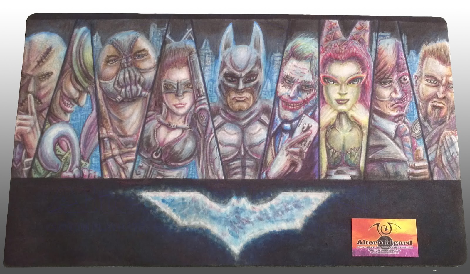
Batman Custom Playmat

So I had planned to do a post on art in general but it turned into something of rant, I think, so that can go on my other blog over at Infinity Flawed. The general Idea of it though was that I have come to the conclusion that I could probably teach people how to draw, the basics anyway, so instead of  'telling' like I do in that post I decided to 'show'.

With that in mind today I'm going to look at the production of the Batman mat and hopefully give some insights into it's production and things like shadows and highlights. but I'm getting ahead of myself lets start at the beginning.


1. I start by masking off the areas I don't want to get colour on just yet, this is something I have been doing a lot more of lately and helps in the creation of sharp lines. I mentioned on the muppets mat that you would start seeing more complex cut outs and heres the first of them where I'm using masking tape to create the shape of the logo. Its a little bigger than the logo needs to be but then the colour has a tendency to expand anyway even under tape in some cases.  

2. I find it helpful to start with a light colour and just block in the important detail. the other option is to go in and do all the line work now but the problem with that is that you can find yourself having to redo the lines at the end anyway. You can see that the colour got in under the tape and into the area I would have preferred it not to. This was because the background colour isn't pure black, I was going for a cloudy blue effect and that meant keeping the colour quite wet. Its not really an issue we can sort it out later when we start using the second type of colours over it. I will discus colour flow in more detail in a future post.

3 & 4. It seems to be quicker to get the large colour blocks out of the way first, in this case after the hands and faces there is quite a bit of grey in the image. The same goes for the green. While having one of each colour is ok having a full range of greys or greens from light to dark makes things so much easier, especial since if you make a mistake with the dark colours the lighter ones will often go over it to change it back. The only thing you have to watch out for is that you dont overload an area with colour since no matter how many times you add a lighter colour it will start to go muddy and you wont be able to get back to white without using the remover. 


5 & 6. You can see that the characters that are most complete were the ones that were mostly made up of the large blocks of colour from earlier, Joker's face is white so I have to be careful not to add too much colour to quickly and Scarecrow is brown so he's only got as far as the same shade of Bane's coat. Catwoman has a big hole for a face because I didn't like how the sketch turned out and decided to redraw it. 

All the characters are based on the actors who played their movie versions, while most of them are from the Nolan movies Riddler and Ivy are more like composits of their actors from the older films with elements from the comics. I do a fair bit of research when making these mats and this particular one requited a quite considerable amount. Its also useful to have a mirror about, in this case Scarecrow's, Joker's and Two Face's hands are all based on poses of mine.

7 & 8. I have done a few of this style now and while its nice that people like it I tend to like mixing things up a bit. Which explains why while the first two mats had glowing blank backgrounds this one moves things forward slightly and adds a cityscape, albeit one that is slightly disjointed.  From the beginning I knew I wanted the background to be the inverse of the first two though, it is Batman after all, the idea for the glowing buildings came later and the blue is quite nice as it turns out since it ties that section of the mat in with the logo. You can see I have also started to blend the blue into the shadows and highlights to make the characters fit a bit better into the world they inhabit, the shading on Riddler's cane or Batman's chest for example has become a lot more natural between 7 and 8.

9. Poor old Raz got left until last, somebody or something always seems to. One of the things I noticed when I started working on the mat was his sword was up to high on his chest, it was an odd position so that got fixed. On the plus side he does benefit from everything else I have learnt on this mat and he is one of my favourite elements especially the hair.

10. Finally, like so many of my mats, I work on the eyes I also go around darkening the shadows and doing the other line work. After all the time i spent on the shadows I don't really want it to be to obvious but because of the way the colour flows there is a certain amount of tightening up that has to be done.

Thats the stages of production out of the way now lets look at some smaller sections in more detail. It's worth remember thing though that these are blown up from camera images so the resolution would likely be higher had I remembered to scan the final mat in, have I mentioned I would like a scanner that was playmat size?


Not that easy to see on the prior images due ti the way I have displayed them this time but there is quite a bit of incidental detail on this mat. Wether its the tiny question marks on Riddler's jacket or the face on the coin, even Scarecrow's tie is more detailed than it probably needed to be since you can barely see it. The areas I like most though are things like the end of the gun, places where light and shadow come together to give an impression of texture using the technique described bellow.


I'm still not entirely sure why it works, something to do with our eyes most likely, since the real world doesn't really work like this. To get more natural results if the edge of your image is light add a dark line to it and vice versa. The end of the gun, for example, is just a dark cross hatch structure but because each cell created has a small light line on its upper edge it trick the brain into thinking thats the direction from which the light it falling on it. In the case on the edge of the faces the two girls are more successful while the guys cheeks are almost there but I don't think the light area on the opposite side of the dark line is quite light enough, at least not at this size and cut out from the rest of the image.


Additionally dont be afraid to shade using colours that arnt anthing to do with the base colour of your image, metals especially pick up shadows and highlights from the lights and other objects around them, Riddler's cane, for example, is picking up the purple of his gloves and the blue of the lights of the city, there is also a slight hint of green from his coat. Also skin looks a lot more interesting when its not just shades of pink, people don't tend to be pink anyway not really. 

I'll leave it at that for now since this post has run quite long, next time I will look at the constant quest to find ways to keep mats safe from the terrors of human skin and the oils it produces