Showing posts with label Digital. Show all posts

1 March 2017

Great Expectation - Pokemon Praposal


When I get asked to create something, for the most part, I tend to assume its because the person asking has some idea in their head they want realised, a cool concept they can't quite bring to life by themselves perhaps or a thought they need solidifying. This can take you on fun and interesting journeys but once you have taken on the mission you start to realise there are expectations beyond those set out in the brief you must also meet, expectations that come from ingrained cultural trends, expectations people aren’t even aware they have since they are subconscious but if you were to leave them out they would know there was something missing.

Today's story is one of meeting expectations, working digitally, and getting a rhino to sit.

So whats the brief?

Two Pokemon: A Drowzee is proposing to a Rhyhorn. The style should be more like the early anime than the modern designs.

Two clear expectations then. The first a conscious desire to replicate a particular look, 1995 era cartoons in this case. The second the unconscious expectation of what a proposal should look like.

Lets take them in order.

Here's the finalised background. Why have I painted the whole thing rather than only the areas that will be viable? That's not really the right question. It should be. How would they have produced backgrounds back when they still used cells and paint?


Your going to have several layers of clear film. The top most layer is going to have the character on it, you could decided that on the lowest layer where your background will be painting the bits that are under the characters would be a waste of time, I mean no one will ever see them right?. Or you could look at it the other way. Why add back in the areas the character moves away from when you can draw the whole background once.

Well its the same thing with digital. Most drawing programs have layers, if i'm going to get that old fashioned feel I might as well take advantage of them. More importantly it means that if I decide to modify the figures in some way, make them smaller or move them about for example I'm not going to have to keep going back in and fixing the background,

The colour pallet for this piece is a bit of a mix. I've made sure to choose colours that match those the characters would have been originally but the background takes most of its cues from modern digital pallet. Did you know that when the show switched from analog to digital colour the staff were worried the fans wouldn’t accept the change? So worried in fact that they deliberately damaged the image quality with special filters. Over time they reduced the effect so by the time they removed it the audience had acclimatised to the new look. I mention this because while the brief was to create an old school feel the human brain is a fickle thing. They’ve been using the digital colours for over a decade now, colours which would have been chosen based on the paints they originally used. Subconsciously these are the colours you expect to see, the originals are the ones that wont look quite right. For another example go back and watch an early versions of the Simpsons, are those the colours you associate with the show?

Background painted its time to release the Pokemon.


Have you ever seen a rhino sit down? I can't say I ever remember having done so either but luckily for me they can because I needed Ryhorn's front legs free.

Have you ever seen someone propose? That's more likely to be a yes but even if you haven’t I bet you can imagine the scene.

What did you imagine? The man down on one knee holding out the ring? The woman with a look of surprise, hands moving subconsciously to protect her face or cover her mouth?

Yeah you and everyone else.

So that's the scene that's expected but how do we do that with one monster who doesn’t really have knees and another that stands on four legs?

We take liberties that's how, the pose is more important than fake creatures anatomy. At least thats what i thought until i started looking up reference material and found rhinos can sit down in a pose that's much like that of a teddy bear.

That frees up the front end now on to Drowzee.

The designs of Pokemon have evolved over the years. Pikachu is the most obvious example starting out pudgy he's slimmed down considerably. Luckily for me Drowzee hasn’t undergone quite as radical a change. He doesn’t really have knees in the original but we can use grass to disguise that we have added some. It's a bit like those images where circles and other shapes obscure parts making your brain fill in the gaps with what it expects to see. More important is to fet the face right he used to have a more pronounced curve in his nose.

I'm painting the characters in a very similar way to  how they would have done back in the day. I create the lines then move on to painting the blocks of colour. It's just I've done the lines in a vector drawing program so they scale to any size without loss of detail and I'm painting with colours that have an undo function if I mess anything up. I could have done the colouring in vectors too but to avoid too crisp and modern a look I decided it was best to stick with old fashioned pixels.

As for the choice of colours for the Mon's. This time I will be pulling from the originals, they aren’t all that different to be honest perhaps a tad warmer, it's more that there used to be more variation between scene and episodes because of noise on the film.

Thats actually the last piece of the puzzle. Once I've got the image finalised I'm going to want to add blur and noise to create that feel. Not too much though we don’t want to lose the detail. The filters that do this have been around almost as long as the drawing programs themselves, its certainly quicker than trying to get the same look using paper (Since, you know we are trying to imitate film)

Putting it all together the last expectation I need to meet is that this image might end up being used elsewhere. What if they want to use it as a wedding invite or on their website? If thats the case the text should really use a fancy curly font. A clean white boarder would also seem appropriate but a square image seems a tad uninspired.

To keep things interesting I go for a non standard edge to the image, making the white background feel more connected to the image by turning it into the silhouette of foreground grass and the edges of the trees This phase is really where working digitally saves time and opens up options. With access to almost limitless numbers of fonts (Don’t go to crazy) theres bound to be one that suits your project. Not only that but you can move them around and resize things until you get everything just right, I don’t envy the designers who used to have to build magazine layouts by hand.

When you think your finished you send it to them and hope you met all the expectations you needed to cover. Digitally, via email or message obviously. If you haven’t, well you have your file still, its easy enough to make changes.

Like I did to this post's introduction. Originally I was going to concentrate on the working digitally side of things. By the end it was obvious it wouldn’t have met that expectation.

Thais all for today.. expect a more analog related post in the future.

25 May 2015

Without A Doubt Gaming Custom Playmat

I don't do a lot of multiples of the same design. That's intentional on my part for a number of reasons but when it comes right down to it the big two are:

A: I want the person I'm making the mat for to know its a one off. Theirs is the the only one in existence anywhere and even if I was to do another design featuring the same set of ideas or characters I would come up with a different image. I realize it's possible this isn't that big a deal consciously to many people but it is important to me and looking at it this way helps make sure I always try and come up with new designs whatever the subject. 

B: Since I'm making these by hand no two are going to be exactly alike anyway, my hand might travel just that tiny bit further, a colour that was mixed perfectly for one might be a shade lighter on the next, or I might have picked up a bunch of new skills or leveled up since I did the original and they may influence how the second version looks (that may actuality be the topic for another upcoming article) If someone wanted twenty of the same mat for example they would definitely be better off with me providing a digital design that could be printed. I mean if someone did want that many mats hand drawn I'm not going to say no, I like a challenge after all, but it might take a while.

So we have established that one off's are in general the rule but like everything in life from time to time rules are meant to be broken, or at least circumnavigated, in this particular instance the brief was to create three mats for members of the 'Without A Doubt Gaming' Guild/Group.

Everything in the design would be the same.

Except the names.

Hey look now the mats aren't identical! Joking aside the design we eventually settled on is quite involved for something I have to draw mostly the same three times, in part 3 I'll talk a bit about how i went about keeping them as similar as possible but first we need to step back a few stages and talk a bit about how we got to this design in the first place.

Part 2: A +2 Bonus to Engineering.

One of the best things about computers is that you can iterate a design and make corrections or changes very quickly. Tweak a colour here, scale a selection there add filters and lighting effects like there's no tomorrow.

Ok you have to be a bit careful with thoes last two or you can end up with a right mess but heck I once wrote a program whose sole purpose in life was to iterate and create variations, its a computers strength is what I'm saying. 

Anyway to the left you can see a collection of variations on the design. The initial brief called for two copy's of a blue logo with yellow text and the players names underneath but just to be on the safe side, and because I'm not the biggest fan of mirroring, I provided this set of designs to be reviewed.

I had a feeling the fourth one down would get picked, you start to get an intuition about these things after a while, its either that or certain sketches universally resonate with people above and beyond all the other choices they are presented with.

The version of the design locked in there was only one thing to do before starting to work in the physical world. go back to yellow text, since it makes the design easier to read and stands out more and then start wishing I hadn't come up with something so very digital looking.

Ok that's two things but take a look at a larger digital version of the final design here on the right. I have to take something created by firing photons towards your eyes with its tiny curvy lines and large amounts of text and make that to look as close to the same as possible on canvas using a medium that gets darker the more you add and has a number of limiters on how small you can go, there's a reason most people hand drawing mats avoid doing text.

And I've got to make three of them. 

Like I said I like a challenge.
 

Part 3: Build Macros to Save Time on Repetitive Actions.

The first thing to do is get the design down on the mats themselves this will usually involve pencils. You could use anything that will mark the material but keep in mind for this design we are looking for precision.

It's best to get all the details that stay the same between mats down first and then draw in whats different. We don't want things changing scale or position just because our eyes are thrown off by the placement of an 'o' on one mat that isn't there on another. We also do them all at once before starting coloring because the best way to keep them similar is to take it steady and do each stage on each mat before moving onto the next thing, We don't want to suddenly find we are out of black because we have finished one mat and the other other two are three stages behind for example.

It also helped that I marked out a grid on both the design and the mats beforehand and to make even more sure the names have placement marks built into their design that will be covered by colour.

I mentioned photons earlier. Digitally it doesn't really matter which way around I work, especially with vectors, but in real life if I were to lay all the black down first I would have a hard time getting back to the lighter ones. 

Which is a bit of a shame since its the colour that covers the greatest area and if i got that out the way early things would certainly take less time. Instead I stared with a pale yellow, like I often do, and blocked in the bright areas move to the next mat repeat and ditto for the last, an added benefit is that if there are any deviations between the pencil lines, say some aren't as easy to see as on another mat, you tend to find yourself using what you know from mat 1 to inform how you colour number 2 and that combined knowledge helps with 3.  

Then you move up through the yellows and the oranges, the greens and light blues and you find that along the way there's a rhythm to the colouring that plays repeats, repeats, then begins again. the images begins to tighten up, you add the reds and dark blues with little fuss because you know where everything goes now and then finally you have to add the black.

At which point the game changes and now I'm playing match the light area with the corresponding dark space. It wasn't even something I had considered while designing just one of the pitfalls of using filter effects you could say because when it came time to add the black I suddenly realized that every light area had edges that butted up against a dark one.

What could have been a simple fill in the blanks now turned into a practical tutorial on how light works I would add black, check the original image, make sure the edges lined up, add some more black, push the edges to meet where they didn't, refine lines where I needed extra sharp definition, and make sure I remembered what I had done on one mat to repeat it on the next.

Finaly I add the curvy lines in and these I do use a lighter colour to go over the black with because while it requires more brute force it gives a finer line.


Part 4: Server Down for Maintenance.

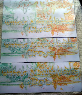
Admittedly not the clearest of images, since finding space to lay out all three next to each other and having a high enough resolution is tricky, this should still hopefully show how close the three final mats are to one another. That being said each does have its own personality and quirks just by virtue of the order I was creating them in and becuase they are hand drawn.

Since I did each step on the same mat first every time it became the most spontaneous, one of the other two has more red and blue mixed with the black its slight but adds a minimal temperature variance, the third obviously benefits from the things i learned from doing the other two. There are no doubt countless other little things like that which make each mostly the same but still very individual.

So yeah sometimes breaking the rules leads you down new paths, it certainly seems to have improved my concept of light and dark with has been handy subsequently.

That's just about all I've got space for today, until next time try and make the mass produced unique. 


24 November 2014

Digital Playmat Design Process: Part One


Something a bit different this time as I'm going to go over the first half of the process of creating a piece of art digitally. Usually you see a bit of this as I work my way through producing a mat by hand but this might be the first time I've shown the process end digitally. In this first post I'll be covering concept art, compositing, and going over the production of 3D elements. I'll save a look at the processes of colouring for part 2.


Step One: Concept This.

Theres no real design brief for this project outside of 'do whatever you want but keep it to the dimensions of a playmat with 0.5 inches around the edges clear to allow for colour bleed' if the design gets printed.'

With free reign to do whatever I like the first decision I make is to do something completely original, I'm going to avoid using existing characters from existing media. This limits things slightly but in the grand scheme of things and with the vast worlds of my imagination to pull from it doesn't really feel like it helps much. We need to narrow the theme down a lot more before be get started on any drawing.

I quite like the idea of working with a limited colour pallet. Since I'm working digitally a super-flat style is an option its a style I've been coming back to since secondary school but always end up philosophising about how its not truly flat until you can produce things one atom thick 

Day at the beach,
warning neon
Trees. 
I start going through a collection of colour pallets, I'm very much aware that none of my art teachers ever really tried to instil in us a proper working knowledge of colour theory, 'heres a colour wheel get on with painting those flowers' was about it so while I'm very comfortable working in black and white having colour swatches, saved pallets from previous projects, samples from films and TV shows and an app that can check my colour choices is rather reassuring.

Finding some halftone patterns in rather garish shades of blue and pink that I quite liked I decided to do some quick digital sketches to see how it might look. Its not quite super-flat but I do like the mix of elements and colours. The idea of having so much black in the image will come up again in part two.

At about the same time I start wondering about the story the mat is trying to tell and end up in a train of thought that goes something like this. Its a design for a competition where I can draw what I like but whats the end result for? Prizes for competitions? Who gets one of these, the winners? The best of the best who have clawed their way up through rounds of swiss and then a knockout top cut? Apex predators? People like dinosaurs right?

Perhaps its about how sometimes you find yourself sitting down opposite a monster, maybe that player who for whatever reason you just cant beat or one of those big fish you hear about who play at the big events. I like dinosaurs. If you strapped jet engines to a T-Rex it would be at least twice as cool right? Maybe thats too obvious? What if the T-Rex wasn’t the biggest monster in the image? What if the T-Rex could fire missiles?

A rather odd chain of logic to be sure but it was enough to get me to somewhere to start, there was nothing for it but to draw a Jet-Rex and some missiles.

The initial missile concept came out of one of the designs I had done for a project at university which involved a round smiling character with weird eyes which even before that had started as a doodle of a potential signature. The T is upside down the M in the form of teeth. You could also say this line of thinking eventually led to the Altermidgard logo but as much as I like logo design that is a topic for another time.

He was called Byte, and now he has some firepower.
At this point I also had the idea that it might be fun to make some elements in 3D which is why I ended up drawing the Missiles from various angles, working out how the thrust vectoring would work, nosecone variations, possible fish based missile launchers and so on. As I drew it became apparent that there was a distinct animals as objects theme creeping in.

J-Rex came fully formed, it took quite a while to work out his pose, I had to go and research T-Rex skeletons before it started looking right but once it did he almost drew himself. The main differences between this image and the final piece is the placement of the head to make him look sleeker and the way the tale wraps around.

On the flip side Paige came about because I had noticed I was drawing animals and so just started sketching armour made out of them. Paige became the real villain of the piece when I drew the mini J-Rex in the bag, 'well of course' I thought, 'she's wearing all these dead animals, why wouldn’t the J-Rex want its kid back'

Then I wondered what weapons she would use, they would be animal based obviously, initially drawing a rabbit laser sword was just a joke but then I drew the cat to make a pair and wondered why not? The fact the ears and tail make very good hand guards was just too amusing not to use. Its not as apparent in the final piece but the reason the weapons are different colours is because the rabbit was sun themed and the cat themed for the moon.


Step Two: 3D That.


It had been some time since I had done any 3D work so this was a perfect opportunity to get back in shape as it were (that shape being a teapot). Since I wasn’t going to be using these models in a game engine or anything and I also didn’t want to spend too long on this step since in terms of the project as a whole it would be eating time while only providing reference for the final piece I therefore didn’t worry to much about optimising the mesh of the missiles. They could have been lower poly especially in the spherical areas but as reference images they would be fine.

The swords on the other hand were done properly. Starting with one polygon and extruding the edges to gradually build up the object until I had what amounted to half of the whole object. Because obviously if you make half of something that looks the same on both sides it takes half the time and you can guarantee both sides are the same when you apply a mirror modifier to it.

Being more confident and having remembered the skills that had lain a bit rusty, by the time I made the cat sword I decided to go back and remake the rabbits spine based on the cat's so as to make the two look a bit more like a pair. they both also needed a bit of rescailing to bring them in line size wise. After that I spent some time messing around with materials trying to find something that would look cool when rendered the glow effects were nice enough but in the end I didn’t use any of them and just smooth shaded them ready for use in the final image.

I also had a go at adding particle trails to the missiles but since I wasn’t making a movie they never looked quite right, I had this idea in my head that stars would make an interesting trail, perhaps I would try that.

Finally in this stage I had to figure out Paige's pose, at which point I got a bit stuck and ended up going back to basics and testing the poses out on a mannequin. I could have got what I was looking for by using a program like Poser but sometimes its just quicker to do things the low tech way with wooden figures Blutack and Gundam weapons.


Step Three: Composite All.

All the disparate elements now created I could start putting things together.

production pipline. Imagine all the images
from above feed into here.
First things first lets work on the sketches. Paige is still a bit basic at this point and I wasn’t happy with J-Rex's head.  Combining the various parts on top of an image full of golden ratio spirals (heres one I prepared earlier) I cut, cropped, rotated, moved, squashed and stretched until I had things lined up where I wanted them, mostly following the patterns of the spirals and points where they intersect. For example Paige is built entirely on the idea her head is placed at the top left intersection of the rule of thirds grid and her limbs and swords follow other spiral lines. Once I had everything set up the way I wanted I went through a few stages of redraws and then the image was ready to be combined with the 3D elements.

On the other side of things I pulled the various 3D models into one scene and placed a box that I could apply the 2D sketch to so as to get a better idea of where the missiles should go. Placing each instance of the missile model became a case of moving them closer or farther away from the camera and rescaling them where required, if you could look at the 3D space in motion it would end up looking a bit like one of those perspective tricks you see on that car advert at the moment.

Placing the swords was a similar process slightly complicated by a slight issue with one of the rotation axis. Once everything was in place I set the render options up to give me a bright background I could chroma-key out later and after making sure the camera was in the right position I rendered the scene in the highest setting I could.

The 2D and 3D sides of the project are then combined, and flipped in the case of the 2D, part to create another image that I will print out at full scale and use to redraw the final image so I can add the final stages of detail. The star missile trails get added, J-Rex finally gets his long metal fingers sorted and Paige's clothes are finished.

Once scanned back into the computer the job of colouring it digitally will begin and in part two I will discuss how much choice of raster over vector influenced the final look of the image, why layer options are so powerful and most likely a number of other things I haven’t thought of yet.

Until next time, roar like a J-Rex.


3 June 2012

Digital Game-Mats

To celebrate the fact that I finaly have a decent graphics tablet, albeit one thats probably 10+ years old, todays post is going to look at some of the digital designs I have done at one time or another.

First up is a pair of designs based on the MTG concept of the red zone (battle area), an image of an adhesive explosive, some text that relates to MFM and is in a suitably Yugioh style font, and in this first image's case a breakdown of the phases that constitute a turn sequence in Yugioh. The main thing you can do digitally thats quite a bit more difficult by hand is all the fancy opacity effects, you can also go back and change things as you like as long as you have them on separate layers. the down side of course is that you have to find someone who can print the thing on the material in full colour, at a reasonable price.

Its sort of a shame that "There is no sub-step four" never became a meme, i could see that text with a little pixelated Honest being quite cool on a t-shirt.


In any case the second version moves things about a bit to feature a full set of card zones. I don't tend to do zones on non digital mats as again they would come under opacity issues and they tend to take up most of the space I would rather fill with designs. The exception to this though is when the overall design calls for them, for example when they themselves can become strong elements of the background design. Or if I was do a Cardfight mat, but even then I think you could replace the zones with other marker elements.

Sometimes I find that ideas just need to be put to paper, or in this case 0's and 1's. At the time I just felt like drawing transformers and this was one of the results. It could probably do with more background elements some sort of vista perhaps but thats the nice thing about digital you can leave things and come back to them much later to change things up or add new ideas. Incidentally I do have quite a cool idea for a new transformers design (non digital) but I have a number of other mats to get out of the way first.

Which brings us back to why I needed a decent tablet in the first place. This particular design reached a point where a mouse just wasn't cutting it (not to mention an obscene file size). Though that is another upside of non digital design, you never run out of space and you can't lose a load of work to a system crash or slowdown.