Showing posts with label Tutorial. Show all posts

16 May 2016

Jiraiya Custom Playmat / Colouring Line Work

Last time we focused on line art and a number of ways to make your lines more dynamic and interesting. We continue where we left off, with the lines set out on the mat itself and ready for what we are going to be talking about today, how best to go about colouring.
But first, a slight rewind.

Before we dive into colouring I just want to mention our starting point this time around. This image should have been the final sketch before moving onto the mat proper, it's the one I sent to the person who asked for the mat at least, all the elements are there but after moving from pencil to pen the fact the proportions of the body are all over the place was bothering me. A large stack of revisions later and Jiraiya is looking more human, more 3D, and ready for prime time.


There are many ways to check to see if your design looks right, from mirroring and flipping to changing the media your working in. It's best to figure that out before laying the lines out on the mat though, since theres no going back after you have.

Which is one of the reasons I tend to leave any lines until last. Something that may have happened this time had I not done the Rarity mat just beforehand.
Line and colour don’t mix

That heading is misleading, lines and colours do mix thats sort of the problem and another reason I tend to leave lines until last.When we do decide to start with the lines we have to understand how the two are going to interact or find ourselves having to waste time redrawing the lines at the end.

If your anything like me your going to be using Fine-liners for the lines. Brushes are great for large areas of colour but for complex designs or small details you want control and crisp spread free edges. There are plenty of options for this phase, sharpies will do the job if that's all you have access to but I prefer to have access to a verity of nib sizes so use something more specialised.

The main thing to make sure of is that whatever you use is going to have some resistance to water and wear, a players palms resting on the mat is a good example of both.

What you wont be able to do is find something that resists water and the colours we tend to use. Sharpies for example will resist water but not wear or other sharpies.

We still need to know how the colours are going to interact with the lines so heres a handy picture.


Different colours have different quantities of pigment.

The light colours: Yellows, Pastels, etc,
Have the least pigment so if you brush them over a line they are the least likely to cause it to fade or spread. That doesn’t mean you get a free pass yes you can be less careful but press too hard or build up too many layers and not only will the line spread it will be really obvious and is the hardest to fix.

The Mid colours: Most Reds, Orange, Greens.
With more pigment comes greater risk one pass could be enough to cause spread and it could be quite a distance, worse these colours are still light enough that its going get noticed.

The Dark colours: Blues, Purples, Black, some dark Greens.
Spread becomes less of an issue as you get darker as your not going to see it. That doesn’t mean you can relax though since these colours introduce a new problem, Fade. If anything Fade is worse than spread since you can hide that with darker colours, Fade on the other hand is essentially the colours removing the lines you spent all that time on earlier sure we can go over them again but with care we shouldn’t have to.

The other issue should be obvious, if we are using black next to a black line we probably don’t need the line in the first place, or if we do, we need to make sure there is a gap between the two.

Which leads neatly on to the next section how do we do that? And more importantly avoid Spread and Fade in general?

It helps to have good eyes and a steady hand, or a magnifying glass and patience.


Here's a look at an early stage of colouring. While technically an anime inspired mat Jiraiya's design is inspired by kabuki and I'm quite interested in getting a more traditional Japanese art style into this piece. I didn’t take it quite that far in the end but after looking at the legs and red areas I did decide I preferred gradients over flat shading.

Anyway your here for tips to avoid damaging the liens so moving on. You can see in this image the green areas currently leave a slight gap between themselves and any nearby lines. We know this light green wont Fade or Spread the liens that much but when we are blocking the design in quickly we don’t want to take any chances especially around those thin lines.

The red on the other hand runs right up to lines. Here I have figured this material isn’t going to change much over the course of colouring so have spent the extra time getting it to a more finished state. You can colour as you like at the center of the space but as you approach the edges your going to want to use the way the red spreads to your advantage, you don’t need to go up to the line to get the colour there it just takes some practice to judge the distances.

Even so you can still see how reds tend to cause Spread in the corners with the most black ink. Luckily the corners are probably the places you want darker reds anyway but we will have to do a bit of a cleanup later.

Using the enemy to your advantage.

While we want to avoid the lines spreading or fading there are some times you are going to decide you no longer want a line where it is. Thats a bit of a problem when you want them to be permanent but there are a few things we can do if we need to.

We have seen the first way to remove the line already. Just cover it with a similar colour and it will go away. Ok now you have a large black splotch rather than a line but at least its gone and if you have planned it right the splotch looks natural where it is perhaps its part of a shadow. (you can see I have used this method to reshape the lower body of the large red frog)

But what if it doesn’t look right?

The next method takes things more scientifically, we want to use the buildup of pigment to fade the line but we also need to know how lighter colours can sometimes overwrite darker ones. In this example we cover the line with a deep blue until its faded enough to no longer be visible then use a lighter blue to cover that. We can do this because the lighter blues tend to have as much pigment as the darker ones. They wont erase lines but they will erase darker blues (which is why its easier to blend from light to dark blue than the other way) With a lighter blue in place next we can blend into other colours we have to be a bit careful it doesn’t all go muddy brown but if we really need to change things this way will do the job.

Next time a look at digital design, until then try an stay inside the lines. 


2 May 2016

MLP Rarity Custom Playmat


The one thing I said I wouldn't do right at the beginning of all this was to make black and white mats. At the time I perceived it as a way to set myself apart from everyone else, a commitment to always do full colour.

So what do you do when someone asks if ou can just do the lines for them because they want to colour it themselves?

Like they say, rules are meant to be broken, and sometimes doing the thing you said you wouldn't can improve then things you said you would. 

I'll be going into more detail about that next time. Today since the opportunity present its itself I'm going to go over the basics of working with lines, mostly simple steps you can take to make an image more dynamic, like last time the majority of this post will be explained through images.

...


Funny how discussing lines has led to a lack of colour in this post.


As an aside you may wonder why I went with this style over the previous one. There are two reasons. The first being that as a mat based on cartoon horses I'm aiming for a certain flatness from the style and secondly while the light source as I imagine it is in the background dead center thats not necessarily how the person coloring it is going to perceive things.

Also the vanishing point is somewhere way off the page to get the diamonds to look right so there's that.


At the office once we were set against one another to imitate someone who was no longer there's style. No one won, we pick up quirks as we steal techniques and work towards our own style you can get close but I guess to an art director the differences are glaring.

The fact I was a programmer at the time  probably didn't help my chances.


0.05's are actually thinner than the mat material threads or near enough, you have to be careful because the texture is going to throw the neat lines your trying to draw off.

next time we move from the basics to how being forced to take the path untraveled helped with the next mat. No more horses for now, no next time its all about coloring frogs.

Until then, I wonder how all these images affect google hits.


30 March 2015

Digital Playmat Design Process: Part Two

At the end of the last digital design tutorial I had gotten to the point where the final sketch had been composited together. Today I'm going to cover the second half of the process looking at inking, blocking in, colour pallets and using the layer options panel.

1. Digital Inking  

There are several ways to ink a digital design but the method I've chosen to use is probably the most straightforward. I'm going to be drawing over the sketch using a small round brush and my graphics tablet. Admittedly if you don't have a graphics tablet your mostly likely going to want to use the pen tool method.

The upside of the way I'm going to do it is that it's typically quicker than using the pen tool and any line thickness you want to work into the design can be done by varying how hard you press the pen to the tablet right then and there. you also tend to get a more dynamic image where the pen tool would give you something a bit more technical.

The downside is that you lines are going the be rasterized and therefore not infinitely scalable with pristine edges which could be an issue later on if say we wanted to blow the image up huge but we are going to mitigate this a bit by working at a really high resolution, at least 300dpi but probably 600.

What we need to do to get nice flowing lines then is use long quick assured movements to draw smooth clean brush strokes. Moving slowly or using short strokes is going you lead to wobbly lines or messiness. Similarly we don't need to worry if we draw the line further than we need to since we can clean that up later in fact you will be intentionally drawing longer than you need to most of the time especially on curves. If you make a mistake or don't think the line looks quite right just hit undo and draw it again.

For a more manageable less stressful time later in the process its also best to start breaking the image into sub sections. A layer for the shape of the face, another for the eyes, for the hair, and so on until you have a collection of layers that can all go in one folder marked Head. Keep working through each section until you have folders for each body part and then move on to the next character or whatever else is in the image.

Once the lines are done and you have cleaned everything up next you have to decide if your shadows are going to be inked like mine are or if your going to use another style theres no real right choice just preference and how you want the final piece to look.

These shadows are done in much the same way as the outlines, for example make a new layer for the foot, decide where the light source is and start colouring with the brush tool and tidying up with the eraser. Here I'm trying to use the shadows to emphasize shape and texture especially in the J-Rex's skin you wont need to worry about sooth lines so much at this stage the eraser will help keep the edges clean what I am after is trying to get a sense of volume or weight.

2. Blocking in the Colour.

Now we know where the lines are we can start colouring the image. Its tempting to flatten everything and then try to draw inside the lines but that's actually quite time consuming and will hinder later progress. Instead we are going to make more folders full of layers and each of these layers is going to contain a colour shape that corresponds to an area bounded by the black outlines. The J-Rex's foot folder for example is going to contain layers for the foot as a whole and each individual claw.

Some of these shapes are going to cover vast areas others are going to be tiny, it will depend on the area in question. Large parts of green on the J-Rex for example are all one shape but then there will be other colour layers above that to provide additional detail or more localised special effects or markings.

You can block in the colour in three main ways. A) With the brush which is quick and good for small areas but may miss bits on larger sections. B) With the lasso tool which can quickly be used to follow the outlines and then filled with colour from the paint bucket or C) With the pen tool which will give you the most control, wont randomly decide to close the loop like the lasso tool has a tendency to do, and can be set to generate vector shapes.

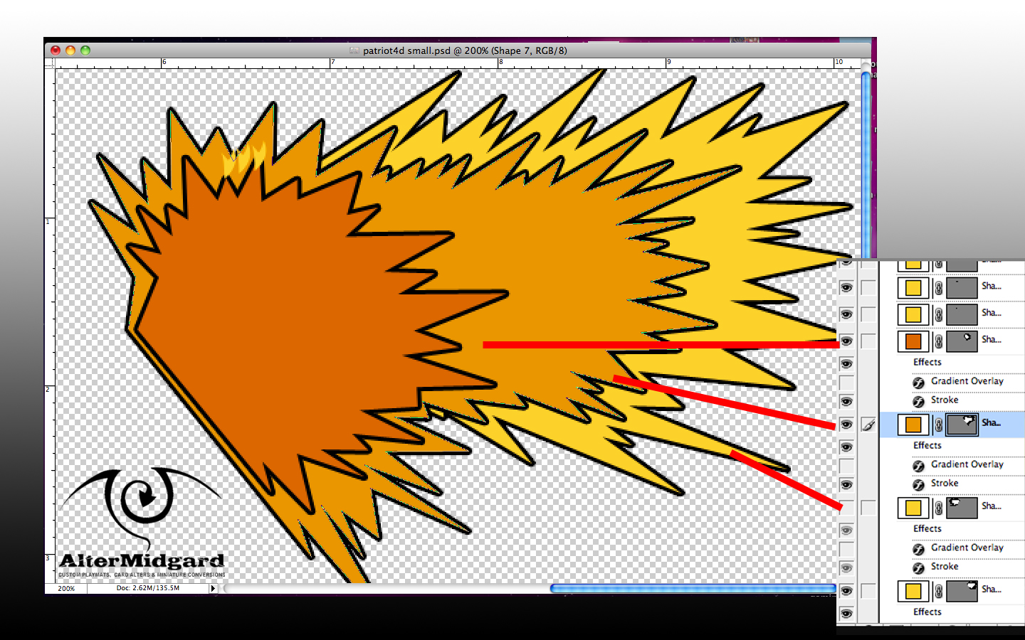
I used all three techniques on this image. Here for example you can see three vector shapes drawn with the pen tool because its going to give me the spikes I'm looking for and because if I was to try and do this with the lasso it would just get frustrating.

Once your done blocking in you should have a group of folders that look a lot like the group for the outlines. You can also now start messing about with how all these blocks of colour are displayed. 

3. Colour Pallets

I'm going to keep the number of colours in this image relatively low since I'm going for something thats a bit pop art in style and near the end I will be adding at least one halftone pattern for a similar effect as the test images in the first part on this tutorial.

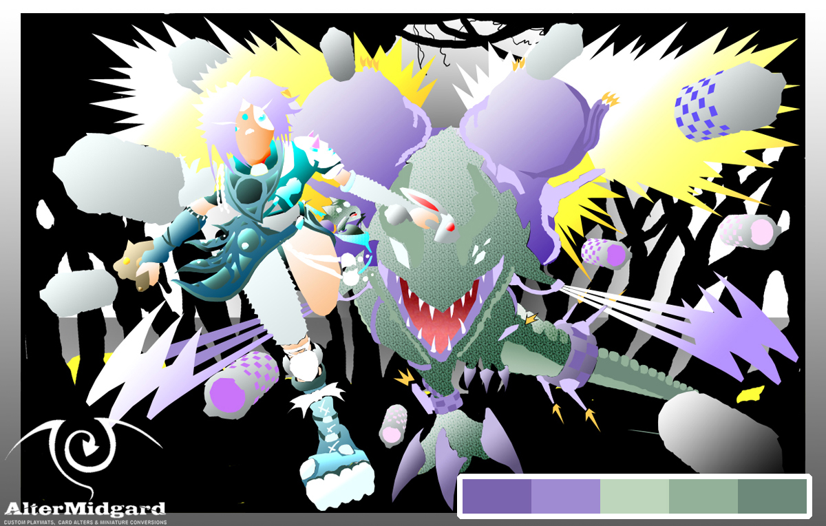
The five colours I've chosen to go with for J-Rex can be seen in this image, Paige's colours, the blues and yellows, come from an additional 5-6 colour pallet although if you go look at the final image you can see I've cut the use of yellow significantly by that point. It's also possible that I should have made the red light sword one of the purple colours, however I stuck with red mostly because the blue/red laser sword rivalry already has cultural weight and meaning. Its a lot easier to tap into context people already understand than having to explain something new.

Looking at the J-Rex pallet there are three greens, a light, a dark, and a mid tone. I could have just flat shaded the whole of his body using these three colours, and technically thats the case but then I decided to add gradients which have filled in all the greens between the lightest and darkest shades.

Next we have the 2 Purples. On the colour wheel purple (well magentas and reds) are opposite the greens so putting them together gives you a high contrast which can be useful for making the image easier to read or in this case more appealing to the eye.

The purples are missing the mid tone in this image but the light and dark purple have been selected to have the same colour value as the equivalent green (the green light and the purple light have the same level of lightness). Again once all the purple areas were placed gradients were applied.

The easiest way to build colour pallets is to chose a colour you like and then feed it to an app or website and it will give you back suggestions for colours that work well together. The blue/teals in Paige's pallet were suggested this way although looking back now I'm not entirety sure its exactly right or perhaps I just needed to add more of it to the rest of the image. Then again because of the way I went about creating this image if I wanted to swap those colours out it would be relatively straightforward as we will see in the next section.

4. Layer Options

Its worth bearing in mind I didn’t see my first proper computer until I was about 7 or 8. what I'm trying to say is that A) there wasn’t exactly much in the way of image editing software back then and B) chances were pretty high that we were as likely to know how something worked in an IT lesson as the person teaching it.

Which is a long way of saying, having taught myself most of this stuff I've tended to use it in a particular way.

Having to teach someone else how to use it though, well thats a whole different ball game and so it was that I suddenly found myself presented with the layer options/style screens in photoshop and an actual understanding of what they were for and how much time you could save using them.

For example you draw a figure and then decide later you want to change the hair colour:
  • You could paint over it.
  • You could add adjustment layers, masks, or mess with the hue and saturation from the menu at the top of the screen.
  • Or you could double click on the layer containing the hair colour and scroll down to Colour Overlay mess with some option and click ok.

Admittedly this last way is only an option if you have separated all the sections into separate layers but not only is it quick it is also infinitely adjustable and most importantly reversible.

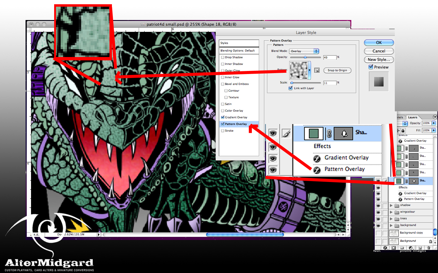
I didn’t just stop with adjusting colours though. The main way this tool was used in this project was to set up gradient overlays because the options provide extremely fine control of size and direction. Also once you are happy with the effect you can drag and drop it on to other layers to replicate it exactly.

In the above example you can see I have also added a textured pattern overlay to the J-Rex's skin, didn’t really have to but since the style panel letter you experiment without really messing anything up it was one of those things that I tried and decided I quite liked.

Once you have set up all your special effects you end up with something a bit like this. There's still quite a lot of work to do on the background which aside from the halftone pattern is done mostly the old fashioned paint it all in one layer style. Theres also quite a lot of fine tuning left to do especially on the missile trails but since everything is set up to be coloured via layer styles it's just a matter of going in and changing a colour here or a gradient there.
And considering the amount of layers and the image size and resolution theres also the fun game of making sure my computer doesn’t overheat.

But I'm going to end this here because you can go back and see the final piece in Part One and more importantly this post has been about the fun you han have getting there rather than the destination.

Next time back to our usual programing (looking at hand painted mats)


24 November 2014

Digital Playmat Design Process: Part One


Something a bit different this time as I'm going to go over the first half of the process of creating a piece of art digitally. Usually you see a bit of this as I work my way through producing a mat by hand but this might be the first time I've shown the process end digitally. In this first post I'll be covering concept art, compositing, and going over the production of 3D elements. I'll save a look at the processes of colouring for part 2.


Step One: Concept This.

Theres no real design brief for this project outside of 'do whatever you want but keep it to the dimensions of a playmat with 0.5 inches around the edges clear to allow for colour bleed' if the design gets printed.'

With free reign to do whatever I like the first decision I make is to do something completely original, I'm going to avoid using existing characters from existing media. This limits things slightly but in the grand scheme of things and with the vast worlds of my imagination to pull from it doesn't really feel like it helps much. We need to narrow the theme down a lot more before be get started on any drawing.

I quite like the idea of working with a limited colour pallet. Since I'm working digitally a super-flat style is an option its a style I've been coming back to since secondary school but always end up philosophising about how its not truly flat until you can produce things one atom thick 

Day at the beach,
warning neon
Trees. 
I start going through a collection of colour pallets, I'm very much aware that none of my art teachers ever really tried to instil in us a proper working knowledge of colour theory, 'heres a colour wheel get on with painting those flowers' was about it so while I'm very comfortable working in black and white having colour swatches, saved pallets from previous projects, samples from films and TV shows and an app that can check my colour choices is rather reassuring.

Finding some halftone patterns in rather garish shades of blue and pink that I quite liked I decided to do some quick digital sketches to see how it might look. Its not quite super-flat but I do like the mix of elements and colours. The idea of having so much black in the image will come up again in part two.

At about the same time I start wondering about the story the mat is trying to tell and end up in a train of thought that goes something like this. Its a design for a competition where I can draw what I like but whats the end result for? Prizes for competitions? Who gets one of these, the winners? The best of the best who have clawed their way up through rounds of swiss and then a knockout top cut? Apex predators? People like dinosaurs right?

Perhaps its about how sometimes you find yourself sitting down opposite a monster, maybe that player who for whatever reason you just cant beat or one of those big fish you hear about who play at the big events. I like dinosaurs. If you strapped jet engines to a T-Rex it would be at least twice as cool right? Maybe thats too obvious? What if the T-Rex wasn’t the biggest monster in the image? What if the T-Rex could fire missiles?

A rather odd chain of logic to be sure but it was enough to get me to somewhere to start, there was nothing for it but to draw a Jet-Rex and some missiles.

The initial missile concept came out of one of the designs I had done for a project at university which involved a round smiling character with weird eyes which even before that had started as a doodle of a potential signature. The T is upside down the M in the form of teeth. You could also say this line of thinking eventually led to the Altermidgard logo but as much as I like logo design that is a topic for another time.

He was called Byte, and now he has some firepower.
At this point I also had the idea that it might be fun to make some elements in 3D which is why I ended up drawing the Missiles from various angles, working out how the thrust vectoring would work, nosecone variations, possible fish based missile launchers and so on. As I drew it became apparent that there was a distinct animals as objects theme creeping in.

J-Rex came fully formed, it took quite a while to work out his pose, I had to go and research T-Rex skeletons before it started looking right but once it did he almost drew himself. The main differences between this image and the final piece is the placement of the head to make him look sleeker and the way the tale wraps around.

On the flip side Paige came about because I had noticed I was drawing animals and so just started sketching armour made out of them. Paige became the real villain of the piece when I drew the mini J-Rex in the bag, 'well of course' I thought, 'she's wearing all these dead animals, why wouldn’t the J-Rex want its kid back'

Then I wondered what weapons she would use, they would be animal based obviously, initially drawing a rabbit laser sword was just a joke but then I drew the cat to make a pair and wondered why not? The fact the ears and tail make very good hand guards was just too amusing not to use. Its not as apparent in the final piece but the reason the weapons are different colours is because the rabbit was sun themed and the cat themed for the moon.


Step Two: 3D That.


It had been some time since I had done any 3D work so this was a perfect opportunity to get back in shape as it were (that shape being a teapot). Since I wasn’t going to be using these models in a game engine or anything and I also didn’t want to spend too long on this step since in terms of the project as a whole it would be eating time while only providing reference for the final piece I therefore didn’t worry to much about optimising the mesh of the missiles. They could have been lower poly especially in the spherical areas but as reference images they would be fine.

The swords on the other hand were done properly. Starting with one polygon and extruding the edges to gradually build up the object until I had what amounted to half of the whole object. Because obviously if you make half of something that looks the same on both sides it takes half the time and you can guarantee both sides are the same when you apply a mirror modifier to it.

Being more confident and having remembered the skills that had lain a bit rusty, by the time I made the cat sword I decided to go back and remake the rabbits spine based on the cat's so as to make the two look a bit more like a pair. they both also needed a bit of rescailing to bring them in line size wise. After that I spent some time messing around with materials trying to find something that would look cool when rendered the glow effects were nice enough but in the end I didn’t use any of them and just smooth shaded them ready for use in the final image.

I also had a go at adding particle trails to the missiles but since I wasn’t making a movie they never looked quite right, I had this idea in my head that stars would make an interesting trail, perhaps I would try that.

Finally in this stage I had to figure out Paige's pose, at which point I got a bit stuck and ended up going back to basics and testing the poses out on a mannequin. I could have got what I was looking for by using a program like Poser but sometimes its just quicker to do things the low tech way with wooden figures Blutack and Gundam weapons.


Step Three: Composite All.

All the disparate elements now created I could start putting things together.

production pipline. Imagine all the images
from above feed into here.
First things first lets work on the sketches. Paige is still a bit basic at this point and I wasn’t happy with J-Rex's head.  Combining the various parts on top of an image full of golden ratio spirals (heres one I prepared earlier) I cut, cropped, rotated, moved, squashed and stretched until I had things lined up where I wanted them, mostly following the patterns of the spirals and points where they intersect. For example Paige is built entirely on the idea her head is placed at the top left intersection of the rule of thirds grid and her limbs and swords follow other spiral lines. Once I had everything set up the way I wanted I went through a few stages of redraws and then the image was ready to be combined with the 3D elements.

On the other side of things I pulled the various 3D models into one scene and placed a box that I could apply the 2D sketch to so as to get a better idea of where the missiles should go. Placing each instance of the missile model became a case of moving them closer or farther away from the camera and rescaling them where required, if you could look at the 3D space in motion it would end up looking a bit like one of those perspective tricks you see on that car advert at the moment.

Placing the swords was a similar process slightly complicated by a slight issue with one of the rotation axis. Once everything was in place I set the render options up to give me a bright background I could chroma-key out later and after making sure the camera was in the right position I rendered the scene in the highest setting I could.

The 2D and 3D sides of the project are then combined, and flipped in the case of the 2D, part to create another image that I will print out at full scale and use to redraw the final image so I can add the final stages of detail. The star missile trails get added, J-Rex finally gets his long metal fingers sorted and Paige's clothes are finished.

Once scanned back into the computer the job of colouring it digitally will begin and in part two I will discuss how much choice of raster over vector influenced the final look of the image, why layer options are so powerful and most likely a number of other things I haven’t thought of yet.

Until next time, roar like a J-Rex.


6 November 2014

Lucario Custom Playamat Or How to Draw a Lucario

While thinking about how I could present this post I realised that for the most part I tend to give a overview of the process involved in creating the mat but very rarely do I go into the details of how to actually draw things in the first place. So this time as we look at the Lucario mat I'll go though some of the stages involved in sketching out the character at the end I'll also go over a few of the other techniques involved in colouring it.

The main idea here is to give an insight into the theory and technical processes at each stage, while I encourage people to follow along its more about the process than a final product so saying its a  'How To Draw Lucario Tutorial' in the title is probably not entirely correct but still.

We have a lot to cover today so with the preamble over lets dive straight in.

Stage One: Starting Somewhere


So you have a rather intimidating sheet of paper in front of you and a pencil and eraser to one side and your stuck because you have no idea of where to start.

Click on the image to enlarge
Thats relatively easily resolved since your not starting here but will first need to go to your preferred connection to the internet to do some research and gather reference material. Two paragraphs in and I already have you doing homework but this stage is important, we could work from memory of course but human memory is incredibility unreliable when it comes to this sort of task I could draw Lucario without reference but how much detail would I be missing and would the various body parts be to scale?. Go to your search engine of choice and do an image search for Lucario.

Well at least now we have a basic idea of what our subject looks like. Lucario has an essentially human body plan with a fox/wolf head and very odd knees and lower legs. I want to liken the process to life drawing, except we aren’t trying to copy the poses or style.

Back at our blank sheet of paper unfortunately nothing much has happened in our absence. We will rectify that by drawing a circle. Don’t get hung up on making it neat, sketchy is fine better at this point anyway. You can see that I've just roughly gone around a few times and got something that is mostly circular.

The next thing to mention are the various digital overlays.

The Green line is where I initially placed the characters feet, the Purple line represents where they will end up by the end of the process but we wont worry about that just yet.

The red box represents the general space that I want Lucario to occupy. Going over the lines isn’t an issue, in reality the box is purely imaginary, but if your too far out it might be an idea to check to make sure the various limbs are actual as long as you have made them.

The blue I-bars represent the length and width of the head and will later show up again used in the characters skeleton. The length/width of the head is a universally important measurement for working out the scale of the rest of the body so its a useful trick to know.

You will notice that my Lucario seems like he is only going to be two heads tall with a bit extra at the bottom thats because I've already drawn the final image and this is a redraw so I know exactly how things will end up looking. Normally you wouldn’t know though and in Image 2 you can see that there are two sets of circles.

Look back at your reference material and hold your pencil up to the image with one end placed at the top of Lucario's head (ignore the ears) Place a finger/thumb on the pencil where the bottom of the head would be then move the top of the pencil down to where the head meats the neck you should notice that the area between the top of the pencil and your finger/thumb is filled by Lucario's torso. Moving down again and the area between them will be the upper legs and then finally the lower legs. This lets up know that Lucario is usually 4 heads tall if he is standing up straight.

In this example though our Lucario is going to be closer to 3 heads tall. Its not because he's short but because we are drawing him in a more dynamic pose causing various body parts to get tucked in behind or foreshortened. Foreshortening happens when elements of an object are closer to the view than others, in this particular case Lucario's head and the front of his upper legs are the elements closest to us and its torso and right arm are further away.

So in Image 3 instead of placing the circle for the torso directly below the one for the head we shift it up, the top of the circle will help us identify where the neck would be (in this instance it is hidden by the head) We can also use the bottom of the circle to tell us where the torso joins the upper legs at the hips.

While in Image 2 there is only one circle representing where the legs will be in Image 3 it has been replaced by two, there are after all two legs and they wont be directly under our character. Much like the torso the lower legs will tuck in under and behind other elements of the body which again will result in Lucario not being 4 heads tall.

Normally at this point if I didn’t know exactly what I was drawing I would just be laying down circles and seeing what positions looked good. We would have ended up with a selection of variations that looked similar to the one in Image 7 but we aren’t skipping ahead to that point instead we are going to go over a process that can be quite helpful when it comes to drawing characters.

So at the end of stage 1 what do we have to show for ourselves? Mostly a bunch of circles and a slightly better idea of the placement of various body parts. In part 2 we will look ad turning those circles into something a bit more substantial.

After the break I will finish off the main tutorial, mention a few other techniques and wrap things up.

Step Two: The Leg Bone's Connected To The What Now?

With the rough outline in place its time to work in more detail. In Image 4 the circles have been swapped out with dark blue I-bars to represent the characters bones. The new smaller circles represent where the various joints and hands would be and the light blue line helps us place the shoulder joint that would mostly be hidden by the head it could probably do with being on the same diagonal as the upper bone on the leg to the right but we wont worry about that to much right now..

In Image 5 I have added the let arm bones in red, the other red bones represent things like the ears, right arm, feet and the weird section that sits between Lucario's shorts and the knees. Its a slightly strange leg layout which is one of the reasons i've hidden them in behind.

In Image 6 we can start to apply flesh to the bones so to speak, the easiest way of doing this is with triangles. The upper legs obviously aren’t triangular, they are more like sausages, but we can fix that in the next step. The triangles however do give us a good shape to work from when it comes time to figure out how the various muscles are going to shape the limbs.

Like I mentioned at the end of Step 1 this stage is more theory than a process that I go though every time I draw a character but at the same time its something you need to know in order that you don’t have to bother going though the steps, you could even take it further and start pinning real muscle groups onto the skeleton building up more and more detail so as to give a better base to work on when it comes to adding the skin you may for example find that where a group of muscles twist in the torso the skin should be under tension. Another stage further and having added the skin you could then tell areas where clothes would be lose or bunching up. Its all about how far you want to take the level of detail and in this instance since Lucario is not exactly the most detailed character to start with we wont be going as far as al that.

Image 7 (which can bee seen bellow) takes us back to our sketching, and we can see that I've rounded out the upper legs and blended them to the torso. Everything else is also somewhat more rounded because its a physical sketch rather then an example done on the computer but you should still be able to make out how the triangles on the arm connect tot he shoulder and hand to look like ice cream cones just like in the previous image.

I have also added a circle to show where Lucario's nose will end up being and a curved line that runs from the top of the head down the middle of the body to help me find the center line which will be handy when I'm trying to get the eyes and spike on the chest in the right place.

Step 3: Splines


Usually I would just get a darker pencil for this next section and draw over what I already had but since that tends to result in something somewhat less than easy to untangle visually I'll start over on a fresh piece of paper.

In the last section we figured out our pose and scale then moved on to an initial attempt at fleshing things out. With that image as a guide we can now go a bit further and start to add more detail and generally be a bit more careful and clean with our lines.

Image 8 shows the first stage of the redraw and I am attempting to keep the lines much more fluid using single strokes. While this might not be the style you choose to use every time (theres something to be said for sharp angles) I am currently somewhat obsessed with drawing everything using S-curves.

This has partly come out of the fact I tend to use a lot of spirals in my layouts and partly because of other artistic influences I have been exposed to recently. As mentioned above you don’t always have to do things this way but one of the benefits is more natural looking shapes and another is that its quite an easy way to draw smooth lines especial on the computer using a graphics tablet.

In any case Image 9 highlights where most of the various curves are. You don’t have to stop at one S either they can flow into each other like the long snaking line that starts by the ear on the right and goes all the way down and around to bellow the elbow.

This Image also starts to show how the body bulges around joints, in a human there would also be more definition in the arms but Lucario isn’t exactly a weightlifter and even the slight hints of muscle I have added aren’t really cartoon accurate since normally the upper arms would be almost flat.

At this point increasing the level of detail is just a process of repeating the last few stages, take the curved image and redraw it again adding things like the eyes mouth and accessory’s (in this case the spikes and the fur around the neck and ears). The hardest part of this particular image I found to draw was Lucario's nose it took a large amount of tweaking before I got the angle right and without the nose in the right place its hard to place the eye on the left. Much like the rest of the image the mouth is just a really curved S, its just one side is much wider and bigger than the other, drawing eyes also involves an S for the brow followed by an elongated circle with the top cut off for the iris.

Step Four: Check, Edit, Enlarge


At the end of the last Step you will have been left with an image that is almost finished, theres just one problem you have have hit a wall in terms of the detail you can pit down at the scale your woking at. The two main option would be to start using a light box and mechanical pencil to create finer lines or to go big, since mats are large anyway my preferred method is to scale up to A2 (if you don't have an A2 piece of paper a piece of A3 set up vertically is also fine in this instance)

First though we need to do a little more editing. You could do the next few sections on paper as part of the last step if you wanted, I've just chosen to split them off and and talk about then here since I will be doing this next section on the computer after scanning the image in.

In Image 10 the blue lines from Image 1 are back I've also added a diagonal grid to check how the various components are lining up and while I like the way the ear in the right leads down to the nose and the leg on the left also follows that diagonal I have noticed the elbow could possibly do with being shifted to the left slightly in order to get the angle of the arm more in line with the leg on the right.

After pushing the body up to the purple line I also notice that the legs and arm might be a tad on the thin side in comparison to the head so I have enlarged them which has had the added effect of hiding more of the leg on the left.

All this messing about adjusting things, including any changes that you notice need making after mirroring the image are based on an eye for detail and form that you will build up over time, much like any other skill its not something that your going to have straight away however if you are looking at something you have drawn and can sense that there might be something not quite right even if you cant quite tell what it is thats a good start.

By now you should have redrawn the image enough times to have a reasonable ability to draw it at a larger, scale either freehand or by printing out an enlarged sketch and working from a light box. The greater scale will give you space to add more detail you could even combine all the methods and add a mechanical pencil to the mix if you were going for super detailed designs .

By this point Lucario had also gained a tail and those weird things that make the black thing over his face look like a mask I had left them out up until now since they didn’t add much to the tutorial side of things but again like the rest of the image they are made up of S-curves this time flowing in the same direction as the special effects to add more sense of movement. Just remember the tip of the tail needs a crook in it. The extra space available has also let me get a more pointed feral definition to the shape of the head and I have spent a bit more time moving the arms into positions I found more pleasing in relation to the ball of energy and the other limbs

When your happy with your finished design you can either go straight to redrawing it on the mat or scan it into the computer and mess about with it more there. Or you could start over and create another or perhaps do some sketches of other Pokemon and add then into the design. There’s really no right or wrong at this point.

That said this brings us to the end of this section of the tutorial, in the next Step I will look at some of the colouring techniques.

Step Five: Because This Tutorial Wasn’t Long Enough.


Finally I'll skip ahead now to the end of the colouring just to quickly go over a few other techniques. Since I wasn’t going for a cartoony look anyway I decided to add a fur effect. Adding the effect mainly involves spending some great deal of time painting alternate light and dark patches, first in lines following the contours of the shape (knowing where the muscles are would be handy here) and then moving up to an area above that line and doing the same thus creating a layered effect.
Similarly by alternating light and dark in larger patches you can create a better impression of realistic lighting. You can use this effect to create edges by having a shadowed area follow a line of light or vice versa.

Taking the idea one step further you can create quite realistic metallic objects especially if your careful with your gradients and make sure it looks like its reflecting the environment around it.

Step Six: Wrapping Things Up


I realise its been quite a long post today but I hope that perhaps others may have picked up at least one or two things along the way. As it turns out it was quite a useful exercise for my own learning also since it forced me to try and find a way to get the various concepts that I take for granted across through the use of images and text.

It also showed me why many people charge for teaching others things, because putting together all this stuff can take quite a long time.

Next time, hum the adams family theme, or the musters for that matter because we are going ghoulish with the Wright family.

17 December 2012

Lightsworn Playmat

After completing the Scrap Heap final trophies, which I will probably talk about later in the week, I had some free time between projects to work on something for myself so decided to finally get around to turning the Lightsworn sketch into a mat.

It has definitely been a long time in the works, January the first 2003 if the date stamp on the original image file is to be believed, which its not of course all it actually indicates is the image was created during my PC's 'I keep forgetting the date and time' phase. Still its a good few years and quite a bit has changed in that time.

After the jump I will discuss just how I went about finally finishing this design.

14 August 2012

Tytannial Game-Mat / Design Tutorial

Today I'm going to talk about the latest mat I have completed, and following on from the Starscream mat talk a little more about design.

I went through quite a lengthy sketching process before i finally got to the design I was after, I had a pretty good idea of what I wanted to do in my head but getting the view from above right was quite tricky I wasnt even sure the arms were in the right place until I had finished it.

For a long time I also resisted the urge to fine line it, the reds and greens were doing a very good job of marking the edges and there was very minimal use of black on the whole mat (this image for example was scanned before I added the line-work). After leaving it for a week though I finally decided to go ahead and add in the black detail and I am glad I did as it really makes the characters pop (the yellow background helps) and look a bit more traditional anime as well.

So last time we looked at the initial stages, today we start at a point just before we start working directly on the mat


About here in fact (Ignore the creases they are from folding it for easy transport). So lets start on the mat propper then. 

No wait there is something important we are forgetting, cant quite remember what it was...


...oh right, yeah thats going to be a problem.

See as most people tend towards left or right handedness they tend to draw with a slight bias one way or the other as well and the brain tends to ignore it since its usually pretty good at filling in gaps and making stuff up, especially faces. Its only when you flip an image over that your brain goes wait no somethings not quite right here that you realise the image you have spent all that time on only looks ok one way around, which is fine but since other people are likely to look at your work and they wont have the same mental picture you do you want to make sure they don't look at it and go, 'theres something not quite right here'.

In the case of this image as I am right handed the left side tends to be more accurate than the right, you can see on the flipped image that the side of Tytannial's face in the box isn't a mirror of the other side. so now we know that we can either modify it digitally to match or even just go back into the original and tidy things up. Once thats done you flip it back and hope it looks right that way around still, if not you alter it a bit more and continue that way until it looks ok both ways.

You can also see I have changed Effect veiler's pose as there were far to many different perspectives at work.

Thats about tit for now but the moral of the story is always check you drawings mirrored before moving onto the next stage, it could save you from have problems later in the process.

7 August 2012

Starscream Game-Mat / Design Tutorial

Today we are going to look at one of my recent pieces, the coronation Starscream mat, and more specifically how i go about the initial designing of things. (things being the technical term for all the arty pictures and logos and stuff as well as things like game design which we wont go into here because thats not the target audience).

The first thing your going to need is either an idea or someone with one who wants that thought brought into a more physical plane of existence. In this case we have someone who would quite like Generation one Starscream decked out in his coronation gear on a mat. 

Next up we need to spend some time doing research and getting some references together, sure you could just move onto the next step but this bit is very important, Leonardo da Vinci didn't pull image of human and animal anatomy out of his head he spent quite a bit of time studying the subjects he was interested in. The same applies here, do good research and get a better idea of your subject, in this case research meant watching clips of the 1986 animated movie which by research standards is a quite fun thing to do. I do also have a masterpiece Starsream round here somewhere which could have been helpful but I would prefer not to take it out of the box (ah the wonders of die-cast).

So you have your idea and your reference material what now?


Take a piece of A4 paper divide it up into about 9 sections and start scribbling, at this point the smaller the designs the better as it gives you a clearer idea of what works and what doesn't, its interesting to note I favour the left of the page in most of these designs even at this stage, subconsciously I know that he's going to look better weighing that side of the image down. turn the paper over and keep drawing start on a clean pice and do the same until you pin down the general poses you like the most and then we move on.


This is a slight cheat as I have combined pages but in this next phase you take a sheet of A4 and divide it into 4 then take the ideas you like most from the last section and make them bigger. You can see at this point there are only really two poses I'm considering and the main issue I am trying to resolve is the placement and angle of the arm on the right (for-shortening is always there just waiting to catch you out)

After this its up the the individual I tend to go up to the 1:1 scale, you sort out the background and all the little details and finalise the design, in this case there is still something missing though. So we know all the weight of the art is on the left and while we have congratulated ourselves for using the cape to draw the eye around the image and up to the main focus theres still something missing, didn't the person who wanted it say something about text? Well not specifically in regard to this design but we were paying attention and theres still some space to fill so some text and maybe a logo might look nice and fill the right side of the page in one fell swoop. Now what would Starsream say? Back to the research! 

So we watched the coronation scene again and that combined with having watched everything transformers ever (though we weren't fans of japanese headmasers, in either language) leads us to believe the text in the final image at the top of this page is in character and you could probably make it up of things he really did say relying on the fact that people tend to remember things wrong to make them seem cooler anyway (just ask Kirk, Bones, or Scotty) 

And finaly we add the Decepticon logo, we have the final image on the computer at this point so we can mess around with placement and decide that it looks better on the right.

From here its all we have to do is get the design on the mat and colour it....

Yeah thats a tutorial for another time, or you could check out one of my making of videos on my Youtube channel!