16 June 2017

MTG Honored Hydra Embalm Token Sock Hydra


Sometimes people ask you how you come up with your ideas. obviously if your doing something based on guidelines that's easy but what about the rest? Well I can't say i have the answers to that, sometimes neurons fire combining various streams of thought and you end up with hydras made out of socks. It seemed to make sense at the time. The light is really what makes this piece for me, there's an almost realism that's just not quite there but is enough to cause you to stop. I think blurring the background helped too. The other ting that this did was inspire a series following the same theme but those can be for another time. 

And at least we finally know what happens to all your lost socks.

12 June 2017

MTG Honored Hydra Alter - Snakes in a Drain


A very straightforward extension, it's dark there's not a lot you can change but at the same time you don't want to ruin the atmosphere. You also don't want this guy in your hand, once you have him in the graveyard though what are you going to use to represent Embalm? as luck would have it I've got you covered, check back Friday to see how.    

5 June 2017

MTG Drake Haven Alter: Drake Air force


When they wont let you Astral slide in standard This is probably the next best thing so naturally i wanted to have a go at altering it. weirdly the yellows on this one were much easier to match, the pyramids turned out really well. the blue was a little harder but the really difficult part was painting the two new drakes, the one on the left even ended up being turned around as the composition wasnt working. ok now they might fly into each other but it's become one of my favorite alterations. its subtle but at the same time interesting.

And who doesn't want an army of 2/2 Drakes?

29 May 2017

MTG Wandering Servant Alter - Day at the beach


A trip to the seaside is just what the doctor ordered. Sun-cream is rather unnecessary however. the beach umbrella is a nod to Resident evil. This wasn't the direction I was going for at first but colour matching sand is a pain so the less of it there is the better. I wonder if he will ever find his way home.

26 May 2017

MTG Manglehorn Alter : I'm on a boat

Lets be honest, you wouldn't try to stop her. Although I;m still unsure if I should have given her an Electric Guitar.


13 March 2017

MTG Tempt with Discovery Shenron Alter


Something a bit simpler this time around since this is just an art extension. Its worth taking a moment to think about whee we would be standing is this was out view. We would either have to be in a taller tree than the ones in front of us or on the edge of a mountain. Either way that leave the area at the bottom of the image rather dark with just a hint of foliage. It also means we will be looking almost straight on at the clouds and that means we should be able to see the tops of them. I say that but initially I had them extending off the top of the card I knew something was wrong though and luckily realised what it was.

I didn’t want to leave things at that though. So I summoned a dragon. It could be Shenron, perhaps if your more MTG inclined it's Jugen or one of the other Kamigawa dragons. whatever the case it was very tiny details. 

10 March 2017

Roadhog Craterhoof behemoth MTG Alter


Trying something a bit different with this one. Once I had a layer of grey primer done in acrylics I decided to paint the actual image using Ink's. It ends up being one of those pieces that work in person but when you present a scanned close up you get to see all the tiny bush strokes and any flaws.

Anyway I really like the way the Ink lets me colour the text boxes, being thinner than typical paint means I don’t have to worry about going around the text as unless I go really dark it will show through.

The downside of the medium is that once you build up a few layers the Ink decides it doesn’t want to mix anymore and will start to clump. If you ant to do any blending do it right on the first few passes is what I'm saying. 

8 March 2017

Cardfight Vanguard Custom Playmat. Dimensional Police Blueprint


 You get used to doing things a certain way. Sometimes things come along that force you to stop and look a little differently. Today we rotate 90 degrees to look at my first mat in a portrait aspect. 

Not so Brief.

Super robots are tall. Something of an understatement but accurate. The point is if you just want one on the mat your either going to end up with a lot of free space around it on a typical horizontal mat.

You could always cut the lower half off. make the top the focus and fill the mat with a flashy dynamic pose. No, not what your after?

Let me think about this then. Hmmm. How about doing the mat vertically? Bear with me you want the whole robot on the mat right, well he's pretty rectangular and mats are rectangular so if you turn one of the two 90 degrees both will match up right, you can fill the mat completely.

You want it to look like a blueprint? OK, even better, a skyscraper would be doe this way too right? I don't want something too static though, how about making it an exploded diagram? You know so we can see the inner workings. Yes? Cool.

Mass Production Type.

You want to know something else about Super Robots from card games? They tend to be low on reference material and/or high resolution images. finding reference got so bad I even watched the episode of the cartoon this guy shows up in and there were still parts of the body and more importantly aspects of the transformation mechanism I wold have to make up. It's a good thing I know my transformers.

As for the design itself there was a lot of revision. Getting the angles and perspective right took some time. it's exaggerated further in this image but the main way you make something look tall is to place the viewer close to the bottom of the page looking up. this has the effect of lengthening the legs and shortening the torso, a useful trick for both robots and humans. The bigness is further emphasized by placing a silhouette of a person in the image. as humans we know how big people are instinctively placing one beside the robot helps describe scale. other scale popular scale animals include birds and fish.

If the pose looks familiar I thought it would be cool to have a nod to a previous mat. Place them next to each other and they can have a pointing contest. not that Starcream would be happy about it.

The hardest part of the process though was that blank mats being as they are, blank, meant that in another twist from normal I was going to have to colour everything but the lines. Worse the bulk of the colouring would be limited to a single colour. I was just going to have to go vey carefully, it quite tricky to make something white again..

Near the end I added the boxes of darker blue to push certain areas back giving the image more depth. the leg on the right does stick out a bit but I wanted to make doubly sure. Plus it breaks up the large aeas of the same blue. Text and symbols were added to tie the mat as callbacks to the original card.

And Finally.

Something else I discoved while working on this project? its quite difficult to photograph a mat this way around without losing detail somewhere so apologies for that. It was a fun challenge, working with shape to create line is something I enjoy, the whole vetical thing though? Probably best saved for situations that really need it.

Next time, things stay this way up, but get rather a lot smaller.


Update  

I found the scan I made of the mat so heres a better angle


1 March 2017

Great Expectation - Pokemon Praposal


When I get asked to create something, for the most part, I tend to assume its because the person asking has some idea in their head they want realised, a cool concept they can't quite bring to life by themselves perhaps or a thought they need solidifying. This can take you on fun and interesting journeys but once you have taken on the mission you start to realise there are expectations beyond those set out in the brief you must also meet, expectations that come from ingrained cultural trends, expectations people aren’t even aware they have since they are subconscious but if you were to leave them out they would know there was something missing.

Today's story is one of meeting expectations, working digitally, and getting a rhino to sit.

So whats the brief?

Two Pokemon: A Drowzee is proposing to a Rhyhorn. The style should be more like the early anime than the modern designs.

Two clear expectations then. The first a conscious desire to replicate a particular look, 1995 era cartoons in this case. The second the unconscious expectation of what a proposal should look like.

Lets take them in order.

Here's the finalised background. Why have I painted the whole thing rather than only the areas that will be viable? That's not really the right question. It should be. How would they have produced backgrounds back when they still used cells and paint?


Your going to have several layers of clear film. The top most layer is going to have the character on it, you could decided that on the lowest layer where your background will be painting the bits that are under the characters would be a waste of time, I mean no one will ever see them right?. Or you could look at it the other way. Why add back in the areas the character moves away from when you can draw the whole background once.

Well its the same thing with digital. Most drawing programs have layers, if i'm going to get that old fashioned feel I might as well take advantage of them. More importantly it means that if I decide to modify the figures in some way, make them smaller or move them about for example I'm not going to have to keep going back in and fixing the background,

The colour pallet for this piece is a bit of a mix. I've made sure to choose colours that match those the characters would have been originally but the background takes most of its cues from modern digital pallet. Did you know that when the show switched from analog to digital colour the staff were worried the fans wouldn’t accept the change? So worried in fact that they deliberately damaged the image quality with special filters. Over time they reduced the effect so by the time they removed it the audience had acclimatised to the new look. I mention this because while the brief was to create an old school feel the human brain is a fickle thing. They’ve been using the digital colours for over a decade now, colours which would have been chosen based on the paints they originally used. Subconsciously these are the colours you expect to see, the originals are the ones that wont look quite right. For another example go back and watch an early versions of the Simpsons, are those the colours you associate with the show?

Background painted its time to release the Pokemon.


Have you ever seen a rhino sit down? I can't say I ever remember having done so either but luckily for me they can because I needed Ryhorn's front legs free.

Have you ever seen someone propose? That's more likely to be a yes but even if you haven’t I bet you can imagine the scene.

What did you imagine? The man down on one knee holding out the ring? The woman with a look of surprise, hands moving subconsciously to protect her face or cover her mouth?

Yeah you and everyone else.

So that's the scene that's expected but how do we do that with one monster who doesn’t really have knees and another that stands on four legs?

We take liberties that's how, the pose is more important than fake creatures anatomy. At least thats what i thought until i started looking up reference material and found rhinos can sit down in a pose that's much like that of a teddy bear.

That frees up the front end now on to Drowzee.

The designs of Pokemon have evolved over the years. Pikachu is the most obvious example starting out pudgy he's slimmed down considerably. Luckily for me Drowzee hasn’t undergone quite as radical a change. He doesn’t really have knees in the original but we can use grass to disguise that we have added some. It's a bit like those images where circles and other shapes obscure parts making your brain fill in the gaps with what it expects to see. More important is to fet the face right he used to have a more pronounced curve in his nose.

I'm painting the characters in a very similar way to  how they would have done back in the day. I create the lines then move on to painting the blocks of colour. It's just I've done the lines in a vector drawing program so they scale to any size without loss of detail and I'm painting with colours that have an undo function if I mess anything up. I could have done the colouring in vectors too but to avoid too crisp and modern a look I decided it was best to stick with old fashioned pixels.

As for the choice of colours for the Mon's. This time I will be pulling from the originals, they aren’t all that different to be honest perhaps a tad warmer, it's more that there used to be more variation between scene and episodes because of noise on the film.

Thats actually the last piece of the puzzle. Once I've got the image finalised I'm going to want to add blur and noise to create that feel. Not too much though we don’t want to lose the detail. The filters that do this have been around almost as long as the drawing programs themselves, its certainly quicker than trying to get the same look using paper (Since, you know we are trying to imitate film)

Putting it all together the last expectation I need to meet is that this image might end up being used elsewhere. What if they want to use it as a wedding invite or on their website? If thats the case the text should really use a fancy curly font. A clean white boarder would also seem appropriate but a square image seems a tad uninspired.

To keep things interesting I go for a non standard edge to the image, making the white background feel more connected to the image by turning it into the silhouette of foreground grass and the edges of the trees This phase is really where working digitally saves time and opens up options. With access to almost limitless numbers of fonts (Don’t go to crazy) theres bound to be one that suits your project. Not only that but you can move them around and resize things until you get everything just right, I don’t envy the designers who used to have to build magazine layouts by hand.

When you think your finished you send it to them and hope you met all the expectations you needed to cover. Digitally, via email or message obviously. If you haven’t, well you have your file still, its easy enough to make changes.

Like I did to this post's introduction. Originally I was going to concentrate on the working digitally side of things. By the end it was obvious it wouldn’t have met that expectation.

Thais all for today.. expect a more analog related post in the future.

14 October 2016

Daenerys Targaryen and Dragons: Maureen Custom Game of Thrones Playmat Sketch Flowchart


Over on my Facebook page (Here) I recently released an image a day showing the process of coloring my latest mat. So since I've already covered that lets do something a bit different

How about showing how the final sketch came together, using the medium of flow charts and annotations.

Warning it's going to be a big image and you will likly have to zoom in.


There was much use of a lightbox involved in this process. Without it I dont know if i could have added this much detail so its a very useful tool to pick up if you dont have one.One of the modern thin LED ones I mean, the old fashioned ones could be a bit bulky to move.

One of the other neat things to come out of all this is I got a new logo out of it, the wonders of the design process!

That's all for today, see you next time.

29 August 2016

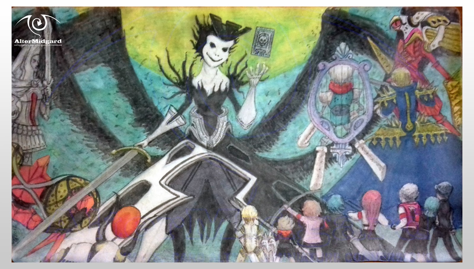
Refreshing a Custom Playmat: Persona 3 Nyx Mat


Chances to upgrade a piece of art don’t come along that often. After all by the time anyone gets around to even thinking about it your probably several hundred years dead. On the other hand Playmats are art that has to withstand the rigors of constant use, occasionally they may require a bit of a spruce up. Thats going to be the topic of today's post as we take a look at what was involved in refreshing the Persona 3 Nyx mat..

Four years in the breaking

It's been a while Persona 3 Nyx mat, how've ya been? Bearing in mind I had no idea about sealing mats at the time I think it's done well for 4 years of use. What we are seeing is that the colours have faded slightly and there is understandable wear around the edges, both from use and living loose in a bag.

A tiny bit the worse for wear but overal you've done well soldier

It's the black thats faded the most. Which is interesting since usually its the paler colours that are the first to go, must have been something to do with the fact I was using two different mediums. That aside the most striking change is the loss of that vibrant neon.

Here's a little secret though. This image, the contrast has been pushed up to make the blacks darker and the image easier to read, the original was never quite this dark in the first place. Why push the contrast so much? Well you see at the time I didn’t exactly have all that decent a camera and it helps to offset the low resolution. That said with this refresh I'm hoping to get the mat up to this level of colour at the very least. Think of it as finally matching the original vision. First though we need to know why the mat looks as it does not after four years.

Why do things fade? Well there are two main reasons.

Reason one: Wear.

Want to see what a mat looks like without its backing? Any mat thats is, even the printed type? Heres a pic.

Best not to ask why I have the fabric of a mat and not the rubber under-layer. There was an experiment...

Yup its essentially just a bit of fabric, not a particularity thick piece of fabric either and yet one that has to withstand all the card flicks, elbows, greasy fingers, and rubbing from other objects in a bag that occur during a mat's life. It would be like if you only had one tshirt, You wear it wash it then put it on again, over and over for four years. What happens to any images on it or the seams and edges?

Thats right Wear, Luckily unlike clothes the rubber backing of a mat keeps it from falling apart we still have to deal with wear to the image though.

Reason rwo: light.

The sun is trying to kill the colours.

Over time light breaks down the pigments, less tiny pigment particles less colour on the human eyes scale. This is more like a river carrying away the individual particles ,with less of them left behind its impossible to be as bright as before the river appeared.

On the plus side unless you leave your mat on a windowsill while your not using it light is less of an issue. Also gaming stores aren’t renowned for their sunroofs.

On this mat what we are seeing is mainly a wear issue. I can feel the fabric isn’t as thick as it used to be and there are more frayed fibres around the edges. One of the things we will be looking to do near the end of the process is to bulk the mat back up a bit.

Beyond that it's a straight re-colour.

Well it would be but I've come a long way in four years, I think we can do better than that.

The reunification.

In this image I'm about halfway done with the refresh.

There are a number of things that still need fixing.

You can already see things have begun to tighten up. If I was to draw a graph showing level of detail over time there would definitely be an upward trend, I guess thats what you get with practice.

I've been removing as many Tangents as I could find, we've covered this before but to recap. Tangents are where lines meet and form shapes they shouldn’t and in doing so they confuse the viewers eye. In this image for example the way the bow, spear, and Nyx's dress interact caused some confusion originally, at least I wasn’t happy with it at least. Theres still a bit to do to work them apart but you can see the beginnings of the refinement of each object and my atempt to move them apart..

Another thing we can do to improve readability is make sure that dark edges are followed by light areas and vice versa. There are a lot of very small details on this mat, for example the gold spikes, and we can increase the crispness of their edges without putting a black line around them if we use this technique. I've also changed the lighting, on the original I use a grey to shape the black clothes of the characters but if the moon is the primary light source then doing so leads to confusion, where is the light coming from to make their backs lighter than their sides? Just fixing this makes the figures feel much more a part of the rest of the image.

Finally I've begun darkening the edges of the image in order to create an oval of darker colour. This pool into witch we are drawn should help to keep the viewers eyes within the bounds of the image where before with all the figures at the edges it could be quite easy for the eye to wander out.

At this point I'm not sure if I want to outline the everything or not.

0.3 to 0.8

I've outlined the everything.

I'm not sure which I prefer this or the top image.

Had to in a way. Ceaser is all grey, at some point near the edge of a surface your going to need to go darker to create the outline and once you've done that then you start thinking 'well lets just see what the guy next to him would look like' and it's all a bit of a snowball from there.

What I didn’t want to do however were boring lines that were all the same width, you know like I did the first time around because I didn’t have four years more experience. So keeping the Rarity mat in mind I set about outlining everything, making sure to vary the pressure of my stroke. To make doubly sure I went back and added even more thickness to certain areas I wanted it to be really obvious. Then I got an even thicker brush and drew big black lines around the characters.

But that was too much so I undid most of it.

I'm glad I did add the line-work in the end, not only does it make those areas that had lines originally more dynamic but it really helps to make the character pop.

I've been talking about techniques to sharpen the image for a bit now so I guess it's past time to mention colour.

Colour me unsurprised.

In the original image the sky is something of a teal, one I no longer have access to. This turns out to be less of a problem than it seems since the moon is green after all and as I boost it back up to its neon glory I'm naturally drawn to blending out from there using greens rather than teals anyway.
I want to bring more of the blue from the dress into the left of the image as the right is a bit heavy with it so start to tint the greys with a blue shadow. Th blue Itself has held up well over the years, theres no real surprise there its what blue does. Still I want to add in some dynamism so work the dress up to a darker shade and blend out to create folds in the fabric

In the same way I want more blue on the left, the areas that were red and orange before are all now shades of one colour to draw your eye from left to right. There's a nice curve there I think it should be used. Equally the yellows are better matched now, I really wanted to cut down a bit on the number of colours involved, less can be more after all and if it helps strengthen the overall image all the better.

I debated weather or not to add purple clouds. It would have had a nice contrast to the green but theres no taking that back, the sky isn’t really the focus anyway so had I not liked it I would have been stuck with at best very dark green clouds.

Just to add to the eeriness factor I've left Nyx's face without shadows, clearly she can self illuminate somehow – perhaps she is a nightlight. I also altered the smile and reshaped the head. It wasn’t that far off before but you should have been able to see more hair on the right and now she looks like she's enjoying herself more.

Deepen the blacks on Nyx. For obvious reasons we do the black last (hint we don’t want to be trying to put yellow over it) lets also sort out the boot on the right not sure what went wrong there but its not the same size as the one one the left even if you cant see most of it. I could go darker with the wings but as we have learned we want things in the background to not be as bright/strong.

Bring in some green shadows and highlights to tie the figures and the sky together and we are done. Not quite the same style as before but possibly closer to the original anime intent overall, especially on the humans.

Next up lets do something to keep this mat going for even longer than four years.

CFC Free.

With the colouring done its tim for detailing.

Not as in adding detail, more the polishing a car up to make it look as good as it can.

Here that involves:

Trimming any glaringly obvious frays: Being fabric we don’t want to go to crazy it might un-knot.

Painting the sides of the edges of the mat: if it's green at the edge we don’t want to see white over the lip.

And adding an undefined number of layers of sealant.

This last point involves a spray so you will want to do this outside in calm dry weather. Here I've gone with a mat sealant, mat as in not gloss rather than specifically for mat's. As I mentioned earlier I want to improve the mat's thickness so it takes a fair few coats to bring it up to where I am happy with it. Adding the sealant helps for three reasons. First it locks in the colours, second it takes the wear before the mat itself and third a decent sealing product will have some form of UV protection or be lightfast in some way.

Basically it helps slow the process of ageing.

For art that is, I advising against any attempts to use it in any other way.

Once this is dry your done and ready to once again take to the battlegrounds.

...

I just wish I had a blacklight, see one of the ways I got the brightness back up was to use glow in UV colours. It woulds be nice to know if the sealing process turned them off or not.

Obviously thats a story for another time, until then remember art isn’t ever a finished thing theres always room for a refresh.

Although I'm not sure how I would feel about someone else messing with my art 100 years form now.

22 August 2016

Update

Back to a more standard blog layout. The last two posts made it clear that the way the other template skewed the images was making things look unprofessional. On the plus side the new layout will load faster and it brings it more in line with my Tumblr page

If you prefer the old layout, check out altermidgard.wordpress.com which will be my main site going forward.

3 August 2016

Narset Enlightened Master Alter

Much of the art that ends up on cards is cropped in some way. It might be to zoom the image in or adjust the focus of the image, or perhaps they just didn't like that tree.

Whatever the reason art that's been cropped makes extending a peice of art much easier, lost a tree? Paint it back in.

Narset isn't one of those pieces of art. The image fits the art box exactly and theres very little scenery around the edges to work with. 

So instead of trying to force a background I've decided to add a magic spell effect. Theres a very nice spirally quality to this image and I wanted to emphasis it.

The spell has flecks of metallic in it too so when you move the card about it catches the light.

28 July 2016

MTG Alter: Seige Rhino to LOTR Elephant

Here's a Siege Rhino who's got a bit lost and wandered into the LOTR universe.

She's also wearing an elephant disguise, like you do.

Yellows and Purples are notoriously difficult to match so I'm very pleased about how this one came out. I've been uing a wet pallet lately and thats helped a grest deal in colour mixing, it also gives greater control over paint thickness and preserve colous between sessions.

With hindsight I should have changed the logo into the eye of Sauron, at the time, focused on the art I didn't even see the text box.

Frodo and Sam are going to have a long walk with this new desert in the way.

21 June 2016

Cardfight Vanguard: Double Sided Power Marker Tokens


Last time I mentioned we were going to take a look at digital art in this installment. I originally had another piece in mind however I think this is a more interesting story so today we are going to look at a set of six images that make up three double sided foil Cardfight Vanguard power level markers.

We will be exploring the concepts behind each pair and looking at how I took those concepts from initial sketch to final piece.

!. Setting the Scene.

Three foil tokens, double sided, with six unique pieces of art.

The three pairs will consist of:
Ichigo & Kenpachi (From the anime Bleach)
Deadpool & Judge Dredd
Nero & Dante (From Devil May Cry 4)

The Characters on the left will represent 5,000K and those on the right 10,000K.

It's, a lot of work to be honest. Not only do I have to create six images I have to develop a way of making two sided foil cards and sure it's just sticking two regular cards together but the important part is making sure they are the same size. We wont go into that today but like many of the challenges I'm set this one definitely resulted in a number of improvements to my process.

2. Whats the Story.

On top of all that I wasn’t just going to draw six characters with no thought of where they are or what they are doing. Each pair would be a story and the set as a whole would be tied together by an overarching theme.

And! Just to complicate things further each pair would use a separate art style but a not completely unrelated colour pallets.

As with many card game stories these are ones of power and conflict. Easy for people to quickly understand, which is good since I have two panels to explain everything. We aren't expecting to squeeze Shakespeare on here.

3. Ichigo vs Kenpachi.

This pair's conflict is a head on collision both combatants rushing towards the viewer and each other.


Ichigo's pose came quite quickly, I've drawn him before after all. 

I'm going to be sketching all of these characters digitally, there will be no paper involved in this process. This has been made possible mainly due to finally finding a set of digital brushes that allow me to draw and paint as I would with their physical counterparts.

Here in the first image for example I'm using a pen brush, this pair of images will stay close to the anime style these characters come from so I figure I may as well start as I mean to go on. Its sketchy for sure but thats sort of the point and not having to scan anything in means I can rapidly move on to the second phase (making sure the character is actually 3D and sorting the proportions) and the third (blocking in the background)

The first colour pass is all airbrush brush. Not something I use much in the physical world but highly useful here for laying down large areas of colour and smooth gradients. 

At this point the lighting is a bit generic and all over the place something to remember to fix later. We also need to draw more focus to the center of the image and come up with a way to tie the image into Kenpachi's. 

The final piece takes everything we have done so far and refines it. The lines are slimmed down and have weight added and removed (see here for more on that) The light source moves behind the figure so all the highlights and shadows have to move also and all the rocks get lightning connecting them, a hint that something or someone is causing them to be sent in Ichigo's direction. 

Originally the final image had the sunset in the background mirrored in the ocean but it looked rather like he was flying through space so I added a green tinted curve to the lower half suggesting the ground.

In contrast Kenpachi took much longer to pin down. Many sketches using everything from a pencil brush through to charcoal. It was always his sword that was the issue somehow it kept finding ways to escape the page. Like Ichigo the later stages of line-work use the pen brush, there are many types but the one I prefer works much like a cross between a fine-liner and an ink pen, good control with variable width and opacity.

This image was much more traditionally blocked in, flat and with few colours. The ground beginning to break up gives us our connection to the other image but there's going to be a lot of work needed with the airbrush to get from here to the final piece.

Like the other image the light is behind the character. But then it would be the ground has gone all explode'y (technical term) with lightning. I'm really happy with the way the skin turned out on this one the airbrush is very good at skin and by swapping between a very large broad brush and a thin detail one you can build up the image quite quickly. The last thing I did was go back and check my reference, a good thing too because I had almost forgotten the little diamonds and circles on his cloak. It can be the little details that solidify the final image.

4. Deadpool vs Judge Dredd

The Dredd vs Deadpool conflict is one of chaotic irreverence vs stoic order. Dredd looks down out of his image and towards the highway bellow from where Deadpool smiles back up at him, clearly having done something knowing it would wind Dredd up.


This time both sketches start with a blue pencil brush. The blue is a throwback to a time of analog animation but we tend to still use it as it makes it easier to tell original sketch from more finalised work in black. Both sketches are quite close to their final pieces too, not necessarily in terms on exact pose but at least in layout.

I'm going for a graphic novel / western comic style with these two so back comes the pen brush, this time slightly broader and more ink'y to fill in the blocks of black. The Dredd blocking in was essentially a redraw as you can see from the massive jump in detail. The best way to do this is to make the previous image transparent and use it as a guide, that way to can focus on the details.

As you can see there was originally a car in the Deadpool image I dropped it for two reasons. Firstly while the angles were right it was a little flat, it needed to be taller but then would have taken up far to much space. Secondly it distracts from the main image, the white lines on the ground tell us its a road so we may as well remove the car and have the blood splatter more dominant there.

When it came time to colouring once again the airbrush is the primary tool however once we have the initial colours in place I start using a series of pattern brushes to add textures. Deaadpool gets carbon fibre armour for example while I add brick, stone and metal layers to the areas of both images that seem most appropriate. At the same time a gradual process of upping the detail occurs until I'm happy with the results.

5. Nero vs Dante.


With this pair I was trying to capture them mid combo. Originally Dante would have been focused on the right attempting to shoot Nero down but I didn’t like the pose, it seemed odd that he was ignoring , over the course of the sketch it gradually evolved to be front facing and shooting both ways. This probably leaves it the weakest of the connecting stories but it does mean if Nero tries to attack from either side he's getting blasted. Nero's pose changed a bit too, in the end I wanted to have a nice C curve to the pose and the leg on the left was really disrupting that line of motion creating more of an X and a static pose.

Sketching starts out the same way as the previous pair but quickly moves away from lines in favor of a more artistic style. Usually both images would have been done in grey-scale first but for some reason I started in colour on Nero and just kept working that way. It's quicker, you just have to be more aware of you colour choices.

I'm using the finished cards here as the last images because these are the two that needed the most typography work and editing after their images were finished and for that I had to switch to another program where those edits could be made more easily.

Also here's a bonus image of the city background stage for both pieces. 


You cant actually see it on the Nero piece, I pushed it right back to focus on the foreground, but the idea was there would be enough room for both of them to share it.

6. All and Nothing.

With foil being a hard effct to capture here's a quick video of the finished cards. 


As for the link 'that ties them all together? Well I've mentioned it a few times already. Front-Back, Up-Down, Left-Right, yup they are all pairs of directions. Why? Well when your doing double sided cards any Easter eggs should be three dimensional right?

And that's all we have time for today, next time, well we'll see but it's likely to one sided.

16 May 2016

Jiraiya Custom Playmat / Colouring Line Work

Last time we focused on line art and a number of ways to make your lines more dynamic and interesting. We continue where we left off, with the lines set out on the mat itself and ready for what we are going to be talking about today, how best to go about colouring.
But first, a slight rewind.

Before we dive into colouring I just want to mention our starting point this time around. This image should have been the final sketch before moving onto the mat proper, it's the one I sent to the person who asked for the mat at least, all the elements are there but after moving from pencil to pen the fact the proportions of the body are all over the place was bothering me. A large stack of revisions later and Jiraiya is looking more human, more 3D, and ready for prime time.


There are many ways to check to see if your design looks right, from mirroring and flipping to changing the media your working in. It's best to figure that out before laying the lines out on the mat though, since theres no going back after you have.

Which is one of the reasons I tend to leave any lines until last. Something that may have happened this time had I not done the Rarity mat just beforehand.
Line and colour don’t mix

That heading is misleading, lines and colours do mix thats sort of the problem and another reason I tend to leave lines until last.When we do decide to start with the lines we have to understand how the two are going to interact or find ourselves having to waste time redrawing the lines at the end.

If your anything like me your going to be using Fine-liners for the lines. Brushes are great for large areas of colour but for complex designs or small details you want control and crisp spread free edges. There are plenty of options for this phase, sharpies will do the job if that's all you have access to but I prefer to have access to a verity of nib sizes so use something more specialised.

The main thing to make sure of is that whatever you use is going to have some resistance to water and wear, a players palms resting on the mat is a good example of both.

What you wont be able to do is find something that resists water and the colours we tend to use. Sharpies for example will resist water but not wear or other sharpies.

We still need to know how the colours are going to interact with the lines so heres a handy picture.


Different colours have different quantities of pigment.

The light colours: Yellows, Pastels, etc,
Have the least pigment so if you brush them over a line they are the least likely to cause it to fade or spread. That doesn’t mean you get a free pass yes you can be less careful but press too hard or build up too many layers and not only will the line spread it will be really obvious and is the hardest to fix.

The Mid colours: Most Reds, Orange, Greens.
With more pigment comes greater risk one pass could be enough to cause spread and it could be quite a distance, worse these colours are still light enough that its going get noticed.

The Dark colours: Blues, Purples, Black, some dark Greens.
Spread becomes less of an issue as you get darker as your not going to see it. That doesn’t mean you can relax though since these colours introduce a new problem, Fade. If anything Fade is worse than spread since you can hide that with darker colours, Fade on the other hand is essentially the colours removing the lines you spent all that time on earlier sure we can go over them again but with care we shouldn’t have to.

The other issue should be obvious, if we are using black next to a black line we probably don’t need the line in the first place, or if we do, we need to make sure there is a gap between the two.

Which leads neatly on to the next section how do we do that? And more importantly avoid Spread and Fade in general?

It helps to have good eyes and a steady hand, or a magnifying glass and patience.


Here's a look at an early stage of colouring. While technically an anime inspired mat Jiraiya's design is inspired by kabuki and I'm quite interested in getting a more traditional Japanese art style into this piece. I didn’t take it quite that far in the end but after looking at the legs and red areas I did decide I preferred gradients over flat shading.

Anyway your here for tips to avoid damaging the liens so moving on. You can see in this image the green areas currently leave a slight gap between themselves and any nearby lines. We know this light green wont Fade or Spread the liens that much but when we are blocking the design in quickly we don’t want to take any chances especially around those thin lines.

The red on the other hand runs right up to lines. Here I have figured this material isn’t going to change much over the course of colouring so have spent the extra time getting it to a more finished state. You can colour as you like at the center of the space but as you approach the edges your going to want to use the way the red spreads to your advantage, you don’t need to go up to the line to get the colour there it just takes some practice to judge the distances.

Even so you can still see how reds tend to cause Spread in the corners with the most black ink. Luckily the corners are probably the places you want darker reds anyway but we will have to do a bit of a cleanup later.

Using the enemy to your advantage.

While we want to avoid the lines spreading or fading there are some times you are going to decide you no longer want a line where it is. Thats a bit of a problem when you want them to be permanent but there are a few things we can do if we need to.

We have seen the first way to remove the line already. Just cover it with a similar colour and it will go away. Ok now you have a large black splotch rather than a line but at least its gone and if you have planned it right the splotch looks natural where it is perhaps its part of a shadow. (you can see I have used this method to reshape the lower body of the large red frog)

But what if it doesn’t look right?

The next method takes things more scientifically, we want to use the buildup of pigment to fade the line but we also need to know how lighter colours can sometimes overwrite darker ones. In this example we cover the line with a deep blue until its faded enough to no longer be visible then use a lighter blue to cover that. We can do this because the lighter blues tend to have as much pigment as the darker ones. They wont erase lines but they will erase darker blues (which is why its easier to blend from light to dark blue than the other way) With a lighter blue in place next we can blend into other colours we have to be a bit careful it doesn’t all go muddy brown but if we really need to change things this way will do the job.

Next time a look at digital design, until then try an stay inside the lines. 


2 May 2016

MLP Rarity Custom Playmat


The one thing I said I wouldn't do right at the beginning of all this was to make black and white mats. At the time I perceived it as a way to set myself apart from everyone else, a commitment to always do full colour.

So what do you do when someone asks if ou can just do the lines for them because they want to colour it themselves?

Like they say, rules are meant to be broken, and sometimes doing the thing you said you wouldn't can improve then things you said you would. 

I'll be going into more detail about that next time. Today since the opportunity present its itself I'm going to go over the basics of working with lines, mostly simple steps you can take to make an image more dynamic, like last time the majority of this post will be explained through images.

...


Funny how discussing lines has led to a lack of colour in this post.


As an aside you may wonder why I went with this style over the previous one. There are two reasons. The first being that as a mat based on cartoon horses I'm aiming for a certain flatness from the style and secondly while the light source as I imagine it is in the background dead center thats not necessarily how the person coloring it is going to perceive things.

Also the vanishing point is somewhere way off the page to get the diamonds to look right so there's that.


At the office once we were set against one another to imitate someone who was no longer there's style. No one won, we pick up quirks as we steal techniques and work towards our own style you can get close but I guess to an art director the differences are glaring.

The fact I was a programmer at the time  probably didn't help my chances.


0.05's are actually thinner than the mat material threads or near enough, you have to be careful because the texture is going to throw the neat lines your trying to draw off.

next time we move from the basics to how being forced to take the path untraveled helped with the next mat. No more horses for now, no next time its all about coloring frogs.

Until then, I wonder how all these images affect google hits.


11 April 2016

Winged Kuriboh LVL10 Custom Playmat


 It's rare that someone comes to me knowing exactly what they want, today's mat is one of those rare cases.  Text this week is going to focus on expanding on ideas covered in the images.

... 

(Conversation shortened and dramatized for added drama)

'I want that one.'

They were looking up at where the Majora's Mask Mat hung from the ceiling but that's not exactly what they meant. 

'That design, but with Winged Kariboh LVL10 on this side.' They waved in the general direction of Link and the tree I waited, it seemed best to let them finish.

'Then over here Winged Kuriboh's going into lighting and Kuribandit's coming out.' They looked up at me expectantly I had to ask for more detail. This wasn't your typical briefing.

I managed to get a more detailed description. They liked the design of the Majora mat so it seemed only natural to them that they should be able to get the same design but with other characters. Well I wasn't going to say no to a challenge even if it wasn't something I had ver though about doing before, the first step would be to look at the characters I had to work with and see how they matched up with elements of the Majora mat.


The main question was how big to make LVL10. The size I settled on flips the weigh of the image keeping the underlying design but mixing things up so it's not just a carbon copy and also means that there's going to be a guaranteed level of detail even if we do loose one wing off the page. 

Another question is how small can I make the other characters Ive got to tray and get eyes on all these puffballs.

With the initial sketch sorted its onto digital colouring, something I've been doing more of lately since it clears up things like where the light source is before I get started on the mat propper.


Like last times My Little Pony Mat this mat sees me trying to implement things we all know at an instinctive level but that can be hard translate into art without someone actually explaining it to you. Here I wanted to make sure the sea faded into the distance. It's funny how the sea ended up being a very similar colour to the hill in the Majora mat, I hadn't meant to make that connection it was just the way things developed.

With the colour sketch sorted it'd a skip ahead to the final mat.


If you look back at the Blue Eyes Ultamate Kariboh Mat and compare to this it's very obvious how far I've come in terms of both coloring and drawing small characters. Turns out that hair is one of the easiest things to get right this way. Even more helpfully it works just as well at small scales as large so you can get a lot of detail in without relying on outlining the image.

The tree got transplanted to the other side of the mat. it was apparently an important element to keep and while it would have looked odd growing out of the water it serves quite well at joining the top and the bottom of the image together on the left side. I wouldn't have kept it but again they were very clear on what they wanted and I do like the way it ended up

An interesting question is: Had I not had such specific instructions how different would the design have been? It's possible I would have done something that was more of a callback to the Blue Eyes Mat. There were also a number of early sketches that focused on a more aggressive pose for LVL10, we could have seen something more flight orientated.

Next time I look at something a bit rare, until then remember new designs can come out of existing ideas.