19 June 2013

Naruto Custom Playmat 2

So this mat is based on a scene from the Naruto manga, even so I spent some time looking at various versions of it mainly to give me a better idea of the movement and action of the image and also partly because I have only watched two episodes of Shippuden and wanted to be more acquainted with the art style. The end result is therefore a bit of an amalgam of ideas from the manga and the anime.

One of the things I found interesting is that there isn't a great deal of difference between the two characters outlines. As someone who hasn't got to know them over the course of several volumes/episodes they are basically two guys with long black hair and red armour, most of the differences come from their accessories.

Making sure your characters can be easily identified by their outlines is one of the most important elements of the design process, if people can't tell characters apart from their silhouettes then those characters need more work done on them, and if that means giving one of them a gunbai and the other a big scroll than thats just what you do. Its also why the Pokemon anime can do the whole 'who's that Pokemon' thing because aside from the ball shaped Pokemon and the butterflies the vast majority are easy to tell apart, not an unimportant factor when you have 500+ to deal with and only a bunch of small sprites to render them (at least originally).

To alleviate the problem for people who don't know them you place them on the correct sides of the image and have the backgrounds match whats going on in the top frame, I've also had element from the top image run into the lower ones, some of the trees for example and the way the fox's tail follows the shape of the hair. I have also slightly exaggerated the style of the characters hair making the one on the right marginally more thin and pointy while on the left emphasising the curves 


There are a number of things a mat does not like, any piece of art really for that mater, and the two biggest are direct sunlight and oils from human skin. Which is why you will find important paintings behind special glass and while thats a little unreasonable for a playmat there are a number of things you can do to alleviate things.

Originally my mats were au natural it would take the colours days to set, the blues especially with their higher pigment counts would take forever, there had to be a quicker way. So I just started experimenting, I had a relatively good idea of places to start but as you can imagine after spending time creating something using it for testing can make you slightly apprehensive.

The first layer of defence I added was therefore based on observation, it takes time to set the colour is there a way to speed that up? Thats all the reaction seal is really about, speeding up the drying time, it also has the added benefit of removing excess pigment that the mat couldn't absorb.

Seal layer one got added at the beginning of this year, it adds some water resistance and UV absorption and acts generally as a stabiliser for the colours. don't use hairspray though contrary to what teachers tell you that doesn't actually do much and in this instance can damage the colours depending on your medium.

Seal layer 2 has only been used on two mats so far and was more of a gamble, you cant use lacquers or varnishes directly on the colour because depending on your medium they may melt it. Still I wanted something extra on top so whent for a product thats meant to add a sort of plastic layer to things. Again it adds to the water resistance and UV absorption, its also supposed to be a gloss finish but is a little hard to tell after adding the previous layer.

The mat and the colours themselves also have a element of water resistance built in, the only thing you should avoid is getting the mat wet and then rubbing it to hard.

In the end the main factor of the lifespan of a mat like any piece of art or clothing is how well you look after it, don't leave it in direct sunlight to long, and try and avoid to much rubbing.

Next time, er, I dunno 2013 mat 10 I guess, and maybe i tell the story of how I number things.
13 June 2013

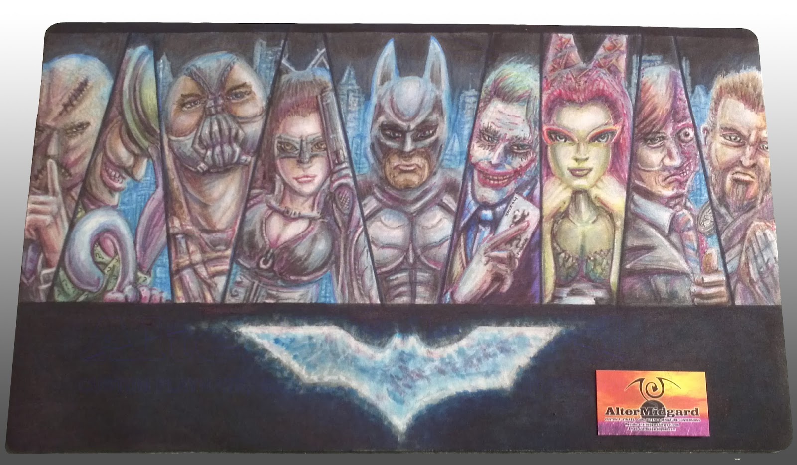
Batman Custom Playmat

So I had planned to do a post on art in general but it turned into something of rant, I think, so that can go on my other blog over at Infinity Flawed. The general Idea of it though was that I have come to the conclusion that I could probably teach people how to draw, the basics anyway, so instead of  'telling' like I do in that post I decided to 'show'.

With that in mind today I'm going to look at the production of the Batman mat and hopefully give some insights into it's production and things like shadows and highlights. but I'm getting ahead of myself lets start at the beginning.


1. I start by masking off the areas I don't want to get colour on just yet, this is something I have been doing a lot more of lately and helps in the creation of sharp lines. I mentioned on the muppets mat that you would start seeing more complex cut outs and heres the first of them where I'm using masking tape to create the shape of the logo. Its a little bigger than the logo needs to be but then the colour has a tendency to expand anyway even under tape in some cases.  

2. I find it helpful to start with a light colour and just block in the important detail. the other option is to go in and do all the line work now but the problem with that is that you can find yourself having to redo the lines at the end anyway. You can see that the colour got in under the tape and into the area I would have preferred it not to. This was because the background colour isn't pure black, I was going for a cloudy blue effect and that meant keeping the colour quite wet. Its not really an issue we can sort it out later when we start using the second type of colours over it. I will discus colour flow in more detail in a future post.

3 & 4. It seems to be quicker to get the large colour blocks out of the way first, in this case after the hands and faces there is quite a bit of grey in the image. The same goes for the green. While having one of each colour is ok having a full range of greys or greens from light to dark makes things so much easier, especial since if you make a mistake with the dark colours the lighter ones will often go over it to change it back. The only thing you have to watch out for is that you dont overload an area with colour since no matter how many times you add a lighter colour it will start to go muddy and you wont be able to get back to white without using the remover. 


5 & 6. You can see that the characters that are most complete were the ones that were mostly made up of the large blocks of colour from earlier, Joker's face is white so I have to be careful not to add too much colour to quickly and Scarecrow is brown so he's only got as far as the same shade of Bane's coat. Catwoman has a big hole for a face because I didn't like how the sketch turned out and decided to redraw it. 

All the characters are based on the actors who played their movie versions, while most of them are from the Nolan movies Riddler and Ivy are more like composits of their actors from the older films with elements from the comics. I do a fair bit of research when making these mats and this particular one requited a quite considerable amount. Its also useful to have a mirror about, in this case Scarecrow's, Joker's and Two Face's hands are all based on poses of mine.

7 & 8. I have done a few of this style now and while its nice that people like it I tend to like mixing things up a bit. Which explains why while the first two mats had glowing blank backgrounds this one moves things forward slightly and adds a cityscape, albeit one that is slightly disjointed.  From the beginning I knew I wanted the background to be the inverse of the first two though, it is Batman after all, the idea for the glowing buildings came later and the blue is quite nice as it turns out since it ties that section of the mat in with the logo. You can see I have also started to blend the blue into the shadows and highlights to make the characters fit a bit better into the world they inhabit, the shading on Riddler's cane or Batman's chest for example has become a lot more natural between 7 and 8.

9. Poor old Raz got left until last, somebody or something always seems to. One of the things I noticed when I started working on the mat was his sword was up to high on his chest, it was an odd position so that got fixed. On the plus side he does benefit from everything else I have learnt on this mat and he is one of my favourite elements especially the hair.

10. Finally, like so many of my mats, I work on the eyes I also go around darkening the shadows and doing the other line work. After all the time i spent on the shadows I don't really want it to be to obvious but because of the way the colour flows there is a certain amount of tightening up that has to be done.

Thats the stages of production out of the way now lets look at some smaller sections in more detail. It's worth remember thing though that these are blown up from camera images so the resolution would likely be higher had I remembered to scan the final mat in, have I mentioned I would like a scanner that was playmat size?


Not that easy to see on the prior images due ti the way I have displayed them this time but there is quite a bit of incidental detail on this mat. Wether its the tiny question marks on Riddler's jacket or the face on the coin, even Scarecrow's tie is more detailed than it probably needed to be since you can barely see it. The areas I like most though are things like the end of the gun, places where light and shadow come together to give an impression of texture using the technique described bellow.


I'm still not entirely sure why it works, something to do with our eyes most likely, since the real world doesn't really work like this. To get more natural results if the edge of your image is light add a dark line to it and vice versa. The end of the gun, for example, is just a dark cross hatch structure but because each cell created has a small light line on its upper edge it trick the brain into thinking thats the direction from which the light it falling on it. In the case on the edge of the faces the two girls are more successful while the guys cheeks are almost there but I don't think the light area on the opposite side of the dark line is quite light enough, at least not at this size and cut out from the rest of the image.


Additionally dont be afraid to shade using colours that arnt anthing to do with the base colour of your image, metals especially pick up shadows and highlights from the lights and other objects around them, Riddler's cane, for example, is picking up the purple of his gloves and the blue of the lights of the city, there is also a slight hint of green from his coat. Also skin looks a lot more interesting when its not just shades of pink, people don't tend to be pink anyway not really. 

I'll leave it at that for now since this post has run quite long, next time I will look at the constant quest to find ways to keep mats safe from the terrors of human skin and the oils it produces 

1 June 2013

South West Yugioh Champion 2013 Playmat

I'm pretty certain its the fist bump that does it, taking something slightly absurd and pushing it over the edge. I'm the one who designed it and even now I find it slightly disconcerting, even more so when it was fresh from having been initially sketched.

Still thats about what you want from something like this, a one of a kind prize has every right to also be something of a farce, attracting attention is one of its main duties.

We may as well begin at the beginning and while most of these posts start with the first traces of colour on the mat lets roll it back two stages further.


Just after the full scale sketch is done I start adding in any other elements digitally in this case the SWYC logo. Its also an opportunity to move things around, see what works, and change the scale of things. The flip horizontally command is of primary importance at this stage.

I also took this as an opportunity to make sure the logo was the same on both sides, it was actually pretty close before but I decided since I needed to change a few things around anyway I may as well nudge a few things slightly here and there.  Also missing this time are the spikes on the top, removed since otherwise they would have obscured the faces.

You will notice there are some major changes between here and the final image most come down to me realising that I wanted the design to be based on a pair of overlapping V shapes.


I wont bother covering the first few stages so moving ahead slightly I have reorientated and am much happier with the syringe and have decided on the style of the center circle, this time a nod to the spiral from the 2012 mat background, On the other hand I'm still not completely happy with the perspective on Lilly's body and still have to come up with a place for Dark Magician's staff. 

I have been accused of, er, over inflating certain aspects of characters anatomy in the past and while this is something of a jest I would prefer not to draw to much attention to that area in this instance, this thing is silly enough as it is.


I'm not entirely certain why I suddenly went crazy and started on the black at this point, perhapse I had been looking at the mat to long. More likely I wanted to block the wings in and fill up more of the space.

I should probably point out that those are real people depicted on the mat, perhaps you know them, their face's size on the mat are quite close to that of those on the One Piece, Muppet, and Batman mats. This isn't a coincidence as I like the balance of size verses detail that this scale allows while working in my preferred media on these projects. 

For some reason I decided to have the light coming from either side on this mat with the shadows in the center, since both photos that I was basing the faces on had the same lighting that did tend to make things slightly more tricky than it probably needed to be when I finally got around to finishing the faces off.


I had planned to do the background green as a callback to the first SWYC mat but aside from helping me figure out where to put the staff I wasn't really that impressed with the results, it wasn't so much the colour as the lack of anything going on. The black has also been softened quite a bit by this point, more because the other colours have been darkened than anything else so now it wasn't so jarring.


I still have the faces to do but they can wait until last, not happy with the background it gets a pair of red circles with crosses in them and then finished off with a dark blue background featuring swirls that mirror the center spiral. The crosses are meant to reinforce the double V shape, or perhaps the circle with the cross in means they are X-men? 

Or maybe they are hazard signs 


22 May 2013

One Piece Playmat

Welcome to 2013 also know as that point in time where I drew quite a lot of people standing in small randomly shaped boxes. Today we look at where all that started.

Sometimes people just know what they want and in this instance it was this image exactly, I cant take any credit for the image this mat is based on so in this instance its more about trying to replicate the original under the constraints of the materials I work in and the shape of the playmat. 


That didn't stop me suggesting alternatives, sketching it out also showed me that the original image was going to need some tweaking to stop it looking stretched out of shape. At this stage its quite obvious some of the faces are really not right but I'm more interested in trying different layouts at the moment.


The transform tool can be a dangerous thing, and if we had gone with this layout the characters would have needed another redraw. I do like the style though so you can be quite sure there will be a mat that features something like it at some point in the near future.

In the end I didn't even try to match the digital cell shaded look of the original and went for something with a bit more texture. Its slightly amusing really a long time ago I used to have this idea that at some point I wanted to create an image so flat it was only one atom thick, but the more i learn and practice the more I find working with light and shadow creates better results than simple solid blocks of colour. A bit like finding out Lichtenstein's graphic and precise dot drawings you see in books are actually massive wall spanning pieces and the dots are anything but uniform. 

Getting the luminosity in the background was probably one of the trickiest things on this project and used up quite a bit of the substance that can remove the colour from the mat, I really need to find a cheeper alternative on that front especially since the darker the colour your trying to remove the more remover you require.  

Don't even get me started on what happens if you let it run, but more on colour flow on playmats another time.

This style has proven quite popular and I have done a number of mats based on it recently which I will discuss more in coming weeks. Until then its worth remembering sometimes you find good ideas in one piece